Every four years, a similar debate re-emerges around the iconic red and blue electoral map. For the last week we’ve watched as the states changed color from TV broadcasts, social alerts and website homepages. It’s a familiar picture: blue states on the coasts with a red center (and a few other blue states scattered about). But it paints a highly confusing picture of the electoral college because land is colored without regards to the actual voting power of each state (without even getting into the wisdom of the electoral college).
This is not a new concern or argument. Indeed, it’s been one the news graphics industry has recognized for at least twenty years. Yet, news organizations continue to default to this misleading (and ultimately, unhelpful) data visualization. For the election this year, we confronted the same challenge in our work with PBS NewsHour — and found an effective and simple system to solve it. But first, let’s look deeper at the problem and what’s been tried before.
The problem with the Electoral College map
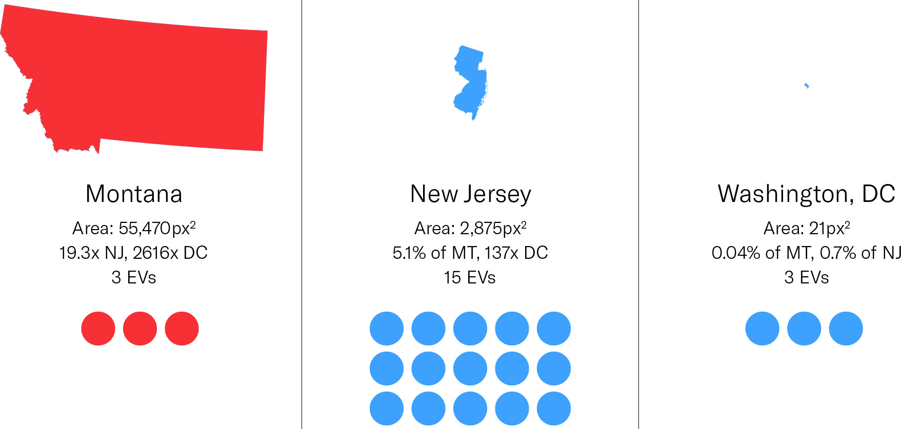
This map paradigm, while familiar, masks the relative importance of each state. Montana has three electoral votes while New Jersey has fifteen. So is New Jersey 5x larger than Montana? No, just the opposite. Montana appears 19x larger than New Jersey. The gap is even worse comparing apples-to-apples: Montana has the same number of electoral votes as Washington, DC. However, on most maps it’s over 2500x times as large as DC (if DC appears at all).
The act of constantly showing these maps during an election (and aftermath) gives readers/viewers a distorted picture of who’s leading or won (and by how much).
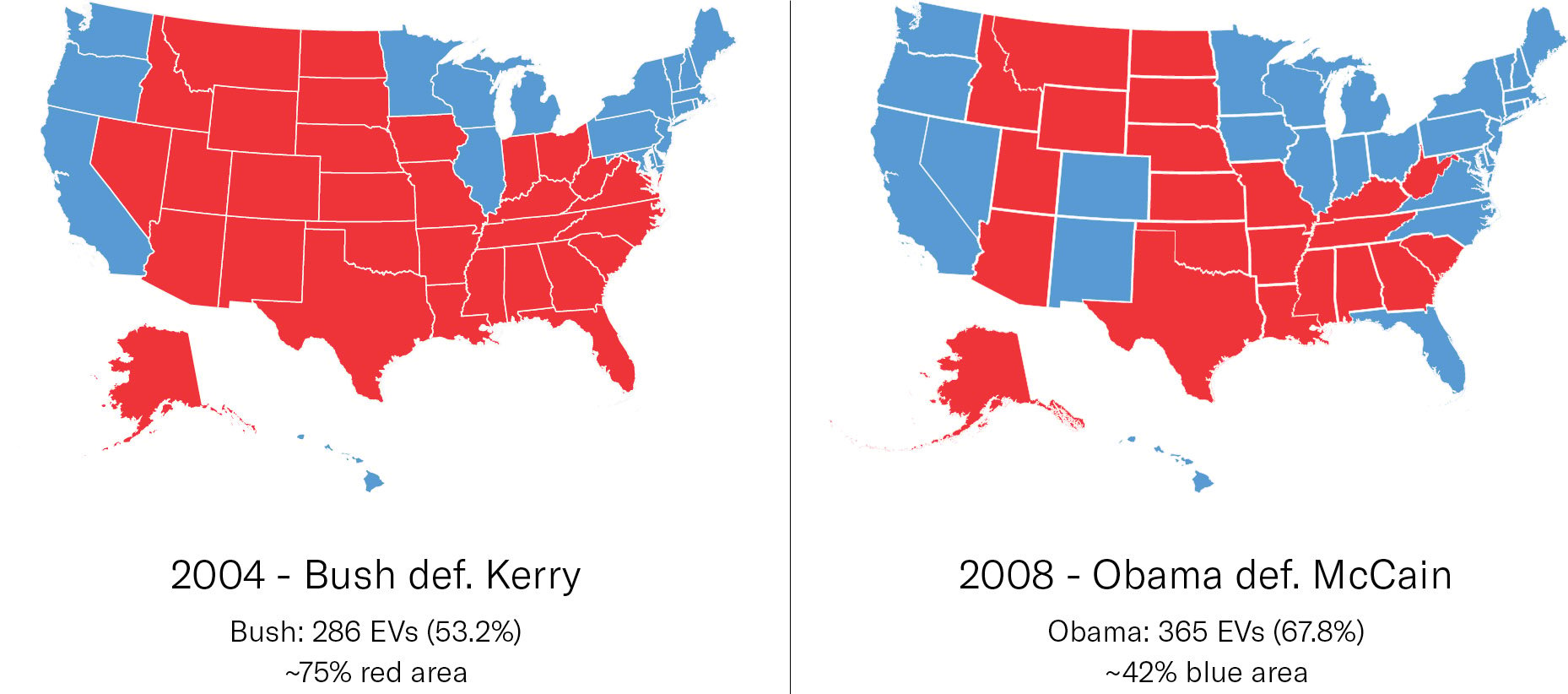
Let’s look at 2004 (Bush re-election) versus 2008 (Obama election). 2004 was razor-thin (both in the electoral college and popular vote) while 2008 was a landslide. Yet, the area of the maps would make you think the opposite. The 2004 map’s red area uses about 75% of colored space (exact number is dependent on how Alaska is included). In 2008 Obama’s blue area occupies only about 42% of the colored space.
The standard map, in other words, doesn’t successfully show who’s won or how much they’ve won by. What good does it do? It reminds you that Montana has more land than New Jersey. But land doesn’t vote.
Alternative approaches
So why do networks, websites and newspapers keep using this? It’s recognizable, but also the alternatives aren’t obvious (at first). One of the simplest solutions is to pair the map with a simple shared bar chart :
Fivethirtyeight created an expanded “snake map” incarnation allowing them to label and sort the segments for each state.
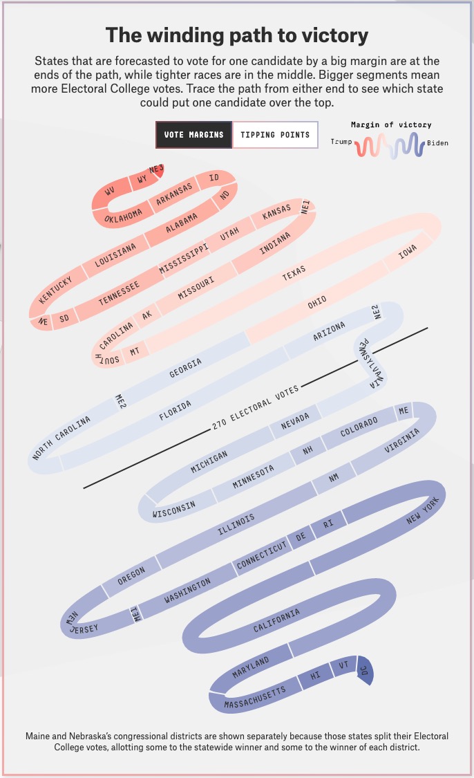
While this is great for keeping score, it strips geography from the picture. How did New Jersey or Montana vote? I have to scan through every state name until I find them. It turns out a map is actually very helpful to locate a state or recognize regional patterns.
So if it’s a map you want, one of the popular approaches is a “cartogram.” These redisplay the states into blocks and arrange them in rough relationship to the geographic map.
Of course, the problem with these visualizations is: “what the fuck is this?” The political die-hard might get it, but what about the other 95% of the population? A successful visualization shouldn’t require a narrator to explain why you’re looking at a map of the USA on LSD.
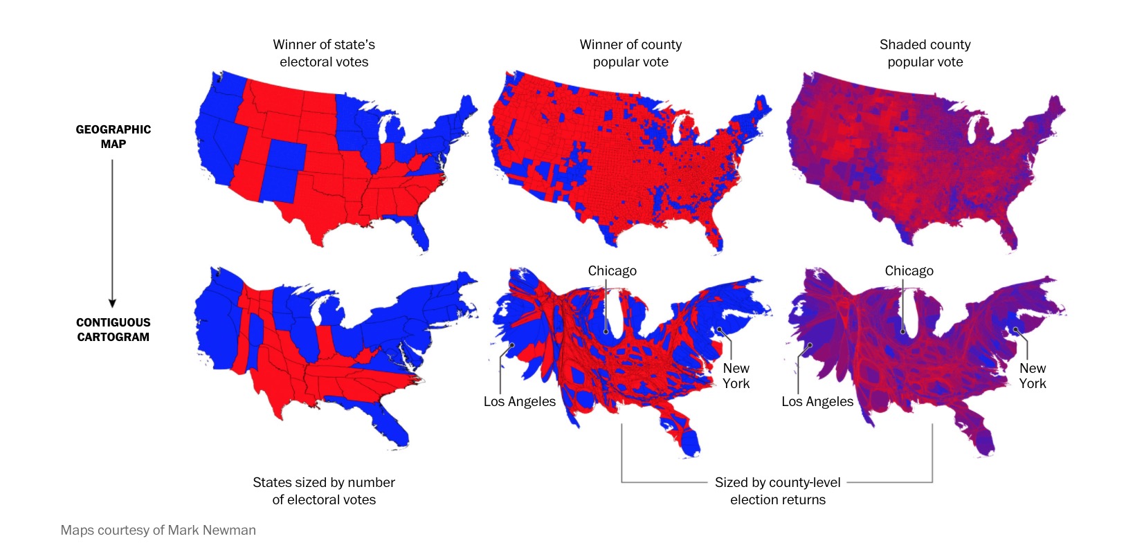
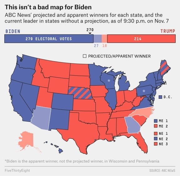
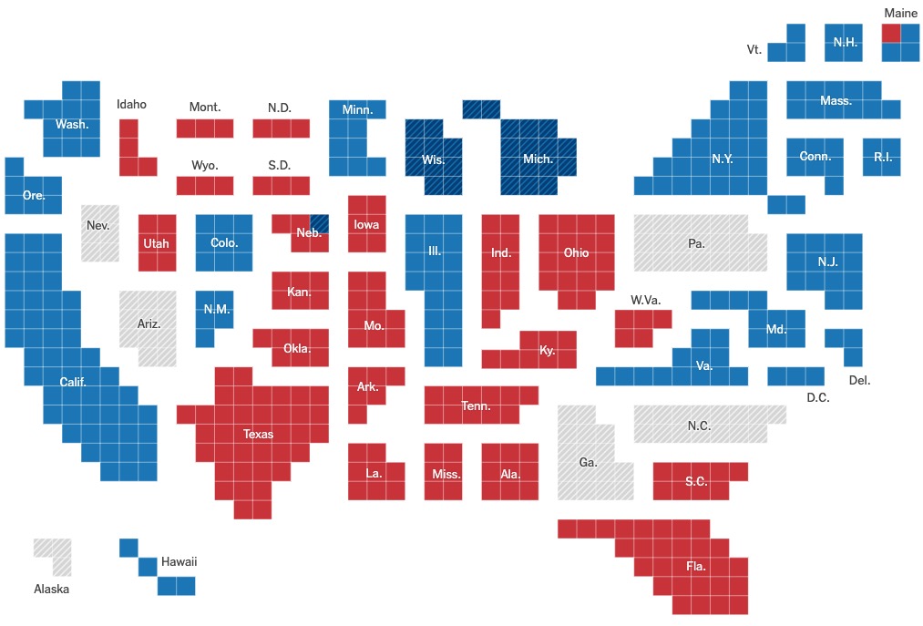
Even if you solve for the electoral college, the problem intensifies when carrying this system through to county-by-county or other population-level results. The reason The Washington Post has to label major cities like NY, Chicago and LA on this map is because their location is so skewed. And if you have trouble finding Los Angeles, you can forget about finding Peoria.
A better Electoral College map
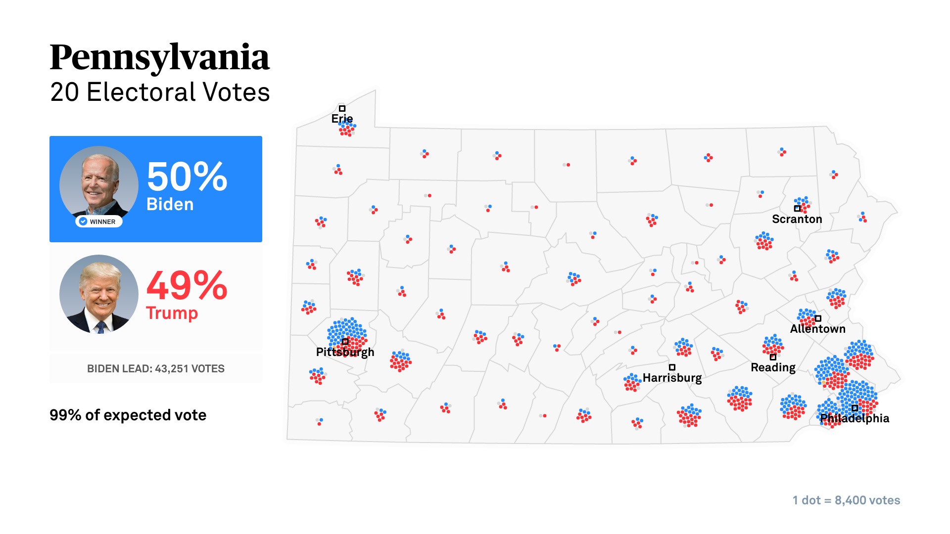
We approached the challenge this year when developing election graphics for PBS NewsHour’s 2020 coverage. With consideration for NewsHour’s non-partisan audience and ethos: how could we make a visualization that accurately conveyed the electoral college results and was instantly understandable to a PBS viewer? The solution we arrived at was familiar, scalable and simple. Dots.
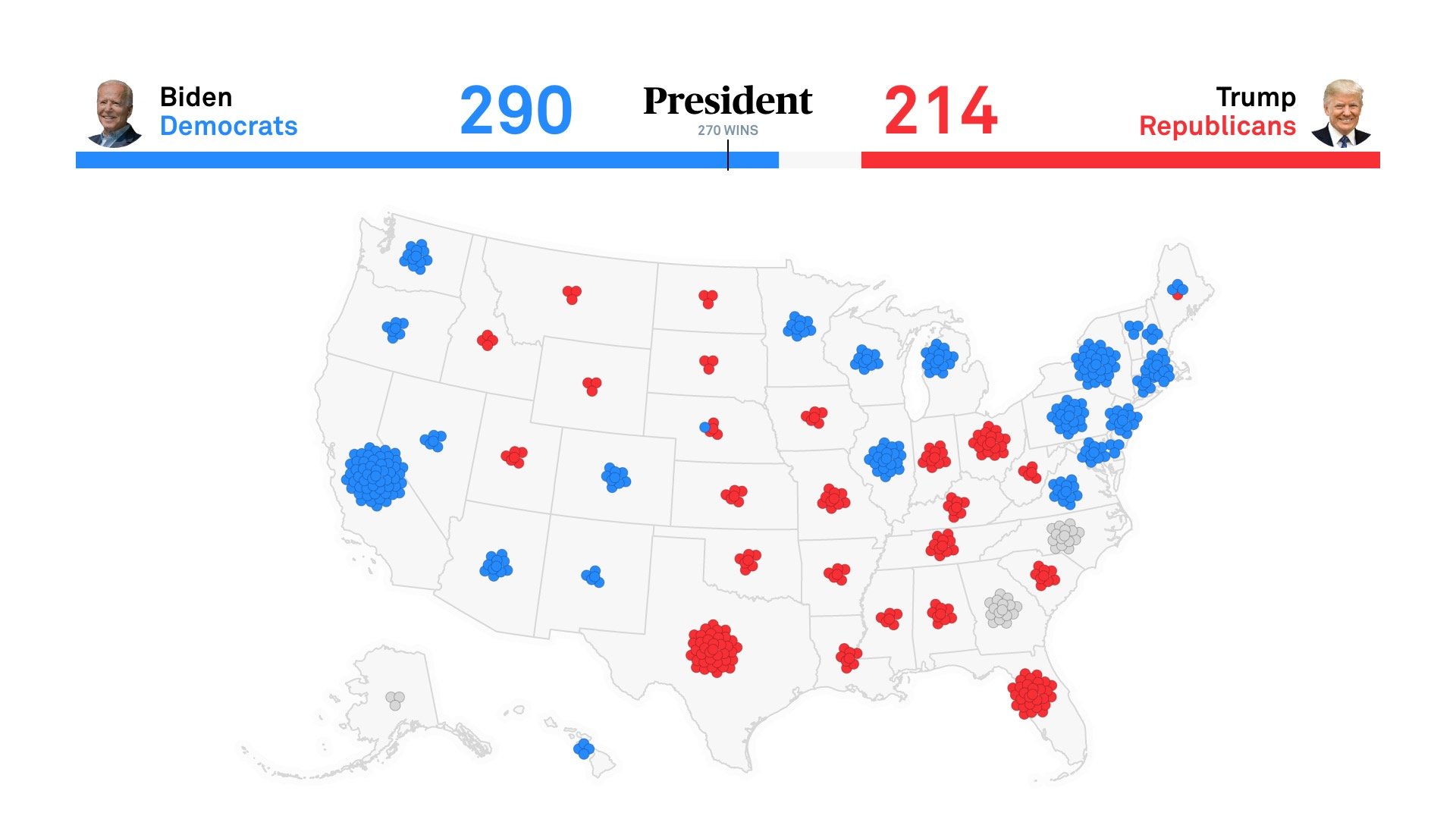
The dot system takes advantage of what both the other approaches do right. It uses the familiar geographic positions and areas from the “normal” map — and marries them with the proper weighting seen in a cartographic map. At a glance, you can not only see that New Jersey has more electoral votes than Montana; you can easily locate both states and follow as an election unfolds.
For 2020, we built a suite of election graphics tools for NewsHour to deploy this system to the web, social and TV.

Dots have another advantage: they provide a tool to represent both absolute values (like an electoral college vote), relative values (vote differentials) or comparative values (Trump versus Biden within certain counties/areas).
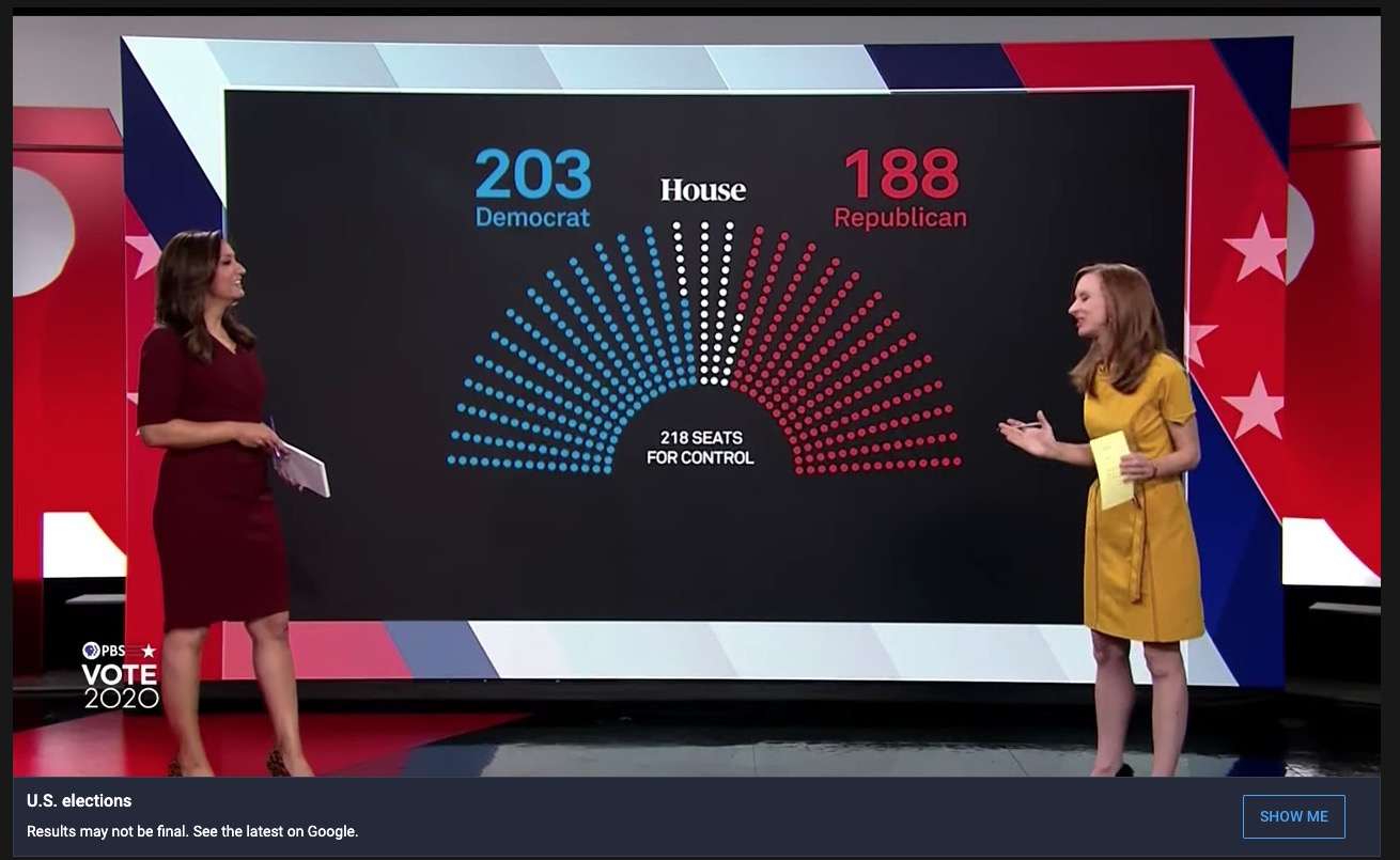
They work great for maps and the same dots carry over into more abstract concepts like the House or Senate balance of power:
The app allows NewsHour producers to browse from a visualization gallery and then select the particular race, style and other customizations they need. It builds upon a comprehensive system we started with them for the 2018 midterms and 2020 primaries. NewsHour now has a suite of tools to cover every major type of federal election with consistent styling across their distribution platforms — all of which build upon the comprehensive Design System and WordPress Editorial Website we originally designed and architected for them in 2017.
The dot was the simple mechanism that “broke it open” for us. It provides not only a mechanism for PBS NewsHour, but a methodology other news organizations can use or build upon to ensure the results of the 2024 election are better conveyed.