This interview is excerpted from our Art Direction Show series. Visit us there for more interviews, inspiration, resources, and avant-garde mayhem.
Did you go to school to study typography? We know you do a variety of work apart from Kometa; would you consider type design your specialty?
I’ve always gravitated towards typography as a way to express myself during my Digital design studies, but only dabbled in type design here and there. When the time has come to figure out what my master’s thesis will be about, I realised making an actual usable typeface would be the perfect excuse to dive deeper into it—that’s where Labil Grotesk (the font used throughout this site) started to take shape. Ever since then my specialisation has been gradually shifting from web design & development to type design.
Can you tell us a bit about how you came to start Kometa / your own studio?
I’ve been freelancing as a web designer for over 10 years now, with stints at graphic design studios in Berlin and Gothenburg—those experiences have been incredibly valuable to me in allowing me to grow both as a designer and a person. Still, I relished the idea of being my own boss again and thus decided to start KOMETA a little more than a year ago. With my type design practise–somewhat surprisingly–taking off, the challenge for 2020 is to transform KOMETA into a studio combining both my type design and web development efforts and invite more people to collaborate.
“In a certain way every brief is a dream brief because it allows you to create something original.”
Christian Jánský
You borrowed the name Kometa from a local hockey team. Do you play hockey, or why did you borrow that name in particular?
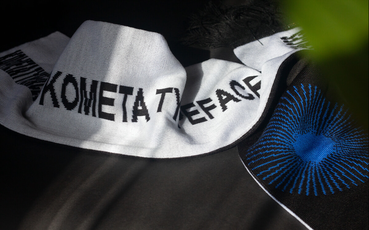
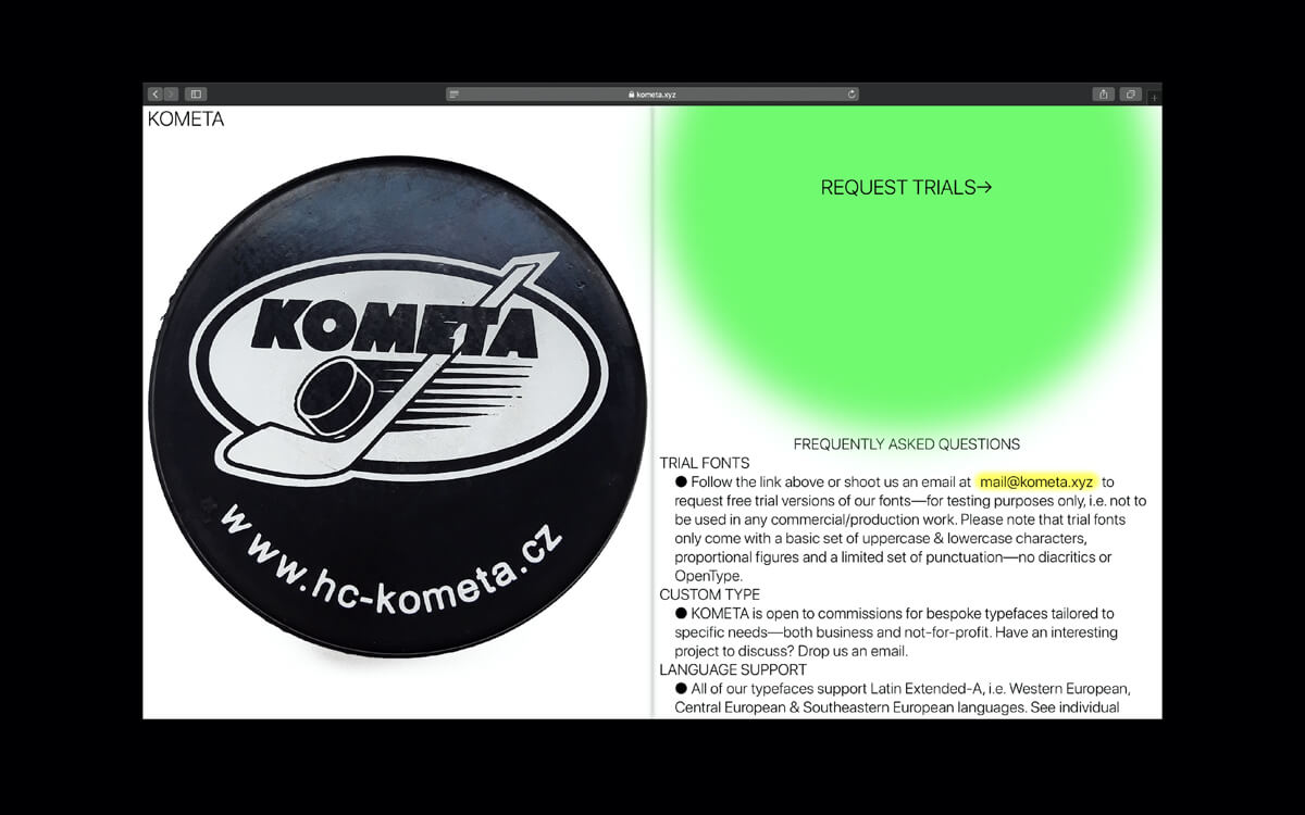
Ironically I am not an ice hockey fan (at least by Czech measure), but I admire the enthusiasm surrounding it. I took an artistic liberty in borrowing a name that has such a cult following here in Brno and tried to transpose it to a completely different field—effectively blurring the lines between a sports team and a graphic design studio. Both are a team effort, so it only made sense to make a KOMETA Typefaces scarf, right?
How do you start a project? Sketching by hand? Researching?
I am a little more analytical than I’d like to admit, so it’s usually a little detail I come across and think “This could be made into a typeface!”, or I take a stab at a genre that I haven’t tackled yet and try to fit it stylistically and conceptually among my other typefaces.
“I am a little more analytical than I’d like to admit…”
Christian Jánský
What are your top tools or software?
Generally speaking, I try to utilise my web development background and make mundane tasks–like kerning–easier by programmatically automating them, so lately I’ve been trying to learn more Python. As for software, I wouldn’t even start with type design if it wasn’t for the amazing Glyphs app—so hats off to Georg Seifert and his team. Also, Font Gauntlet by Dinamo is an indispensable tool in modern font design.
You describe your typefaces as ‘functional’ — what does this mean to you? How do you walk the line between functional and display?
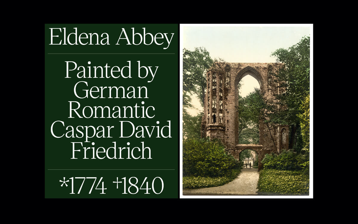
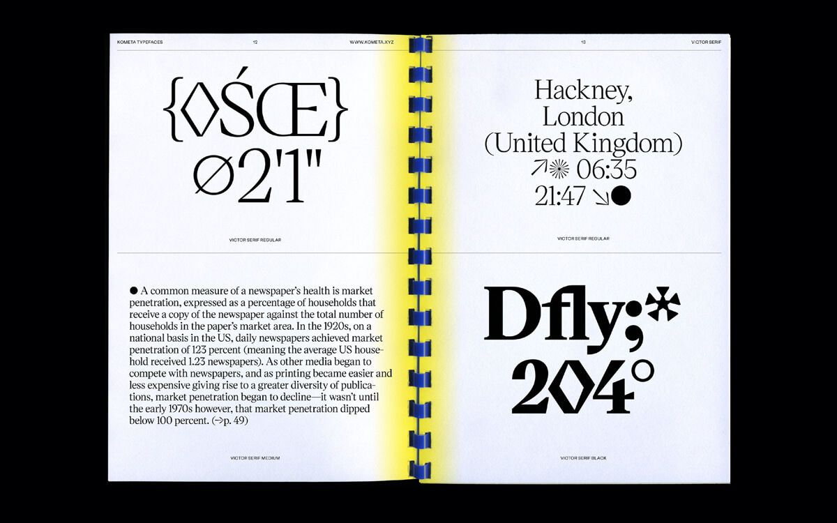
All my typefaces so far started by taking a rather traditional (functional, in a sense) typeface skeleton that I infused with a quirky idea in an attempt to make it look more contemporary. For instance, when I set out to design my first serif typeface, I liked the idea of imagining Victor Lardent and Stanley Morrison designing Times New Roman today rather than in 1931—and that is how Victor Serif came to be.
What is a typical brief? Are most projects of your own volition or client-based?
KOMETA as a whole started out as a completely self-initiated project–whilst being bored in between web design/development projects–but it is shifting into more bespoke commissions territory these days, which feels great! The tricky part for me will be to maintain a healthy balance between these two.
What is a dream brief for a new typeface?
In a certain way every brief is a dream brief because it allows you to create something original based on healthy constraints and tie it together with your past work.
What drives your self-directed personal projects?
I like looking at projects in retrospect and seeing what I’ve learned from them. As I think of KOMETA as one huge self-initiated project, it is the joy and thrill of making something so complex by putting little pieces together. It’s not just making the typefaces, but also developing the website and figuring out licensing terms and pricing of your work. That makes it very rewarding to see it all come together.
We love the tilted characters in Labil! This seems like a challenging choice, can you speak to the process of that?
Thank you! Frankly, that was the first typeface I’ve ever made as part of my master’s thesis. It pretty much sums up my approach to type design—putting a timeless font (a neo-grotesk typeface) and an absurd idea (letters falling onto each other) into a blender, so to speak. The result is both ridiculous and charming, I think. As for the process itself, it was incredibly challenging for me to actually draw the glyphs right initially–being my first serious type design project–and to maintain a reasonable scope of character set to realistically finish it all by one, inexperienced person. Luckily it seems it paid off!
With many type foundries using modernist and minimal styles for their websites, why did you eschew that for a more expressive and provocative space for your typefaces to live?
It’s actually not that long time ago that I thought of myself solely as a web designer, so instinct tells me to try and keep challenging myself in that area. I consider the KOMETA website the perfect playground to test any ideas, interaction patterns or UX approaches that might make the experience better, more memorable and fun to use.
Check out Kometa Typefaces here.