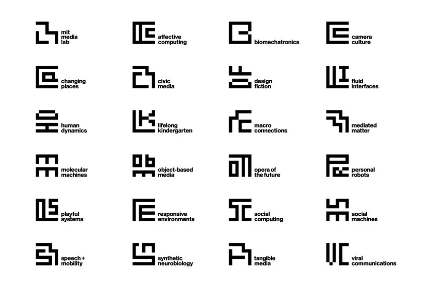
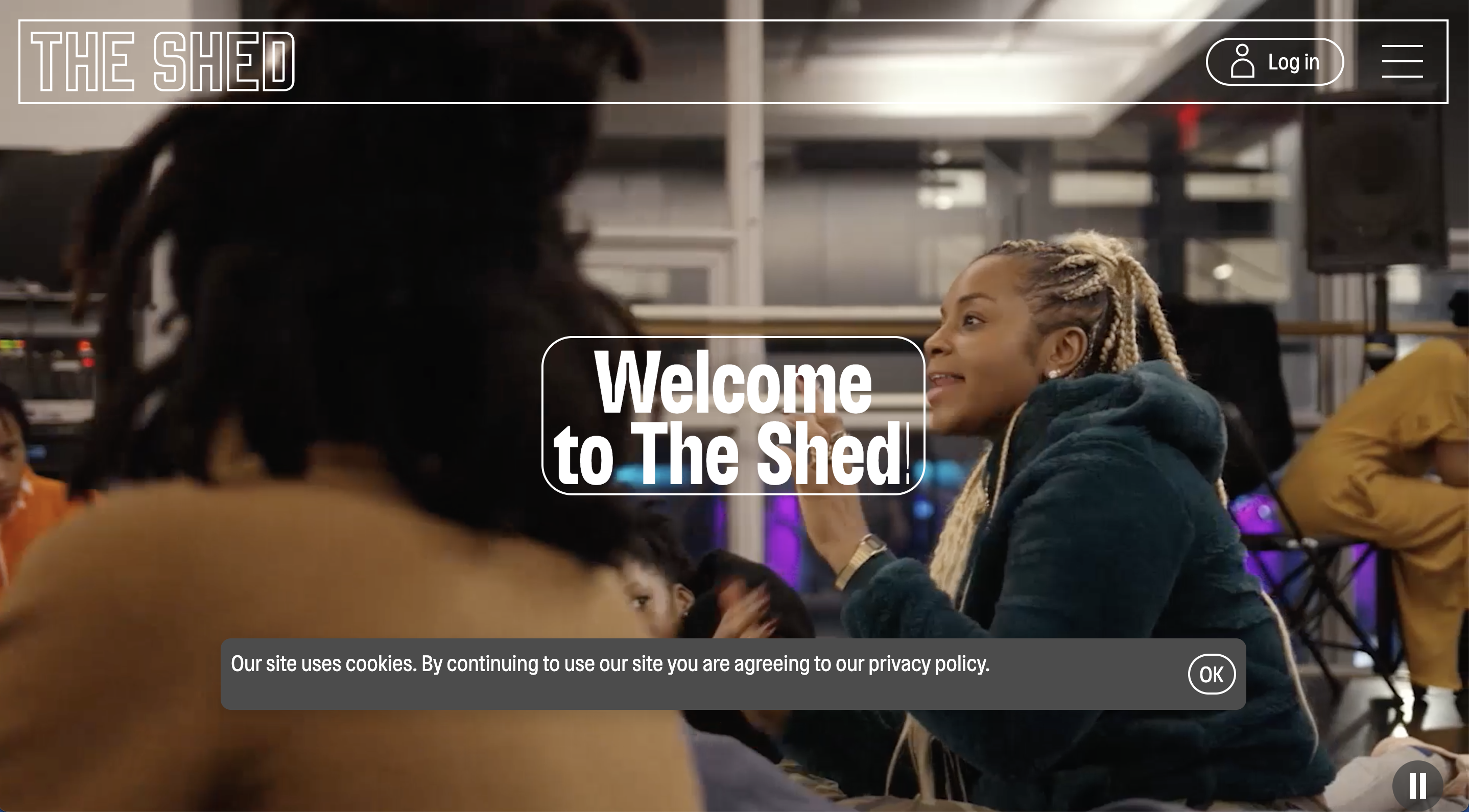
We create many different types of work at Upstatement, from mobile apps to institutional websites to editorial experiences, but our goal is always the same: to make memorable, meaningful interactive experiences. We do that by treating every project as a meaningful brand expression, an approach we call brand through digital, because a brand’s online presence is the primary way our clients connect with their audiences.
“Brand design” is often associated with logos, or with rules for the styling of type, color, and imagery. But good branding also deals with meaning, memory, and association. When your audience thinks of you, what comes to mind? What traits and values are you associated with? A brand takes all the things that differentiate you and then translates them into a memorable form. There’s nothing new about that, of course. It’s been happening since the dawn of advertising. But digital-first brands require brand expressions that prioritize the defining trait of interactivity: behavior.
Whether you’re designing expressive surfaces, like posters, or informative systems, like subway maps, design is a tool for making meaning. Visual design translates idea into form. When I was a student, in the days before interactive design was even offered as a course, I mentally categorized the designers I admired as landing somewhere on the spectrum between two poles: surface and system.
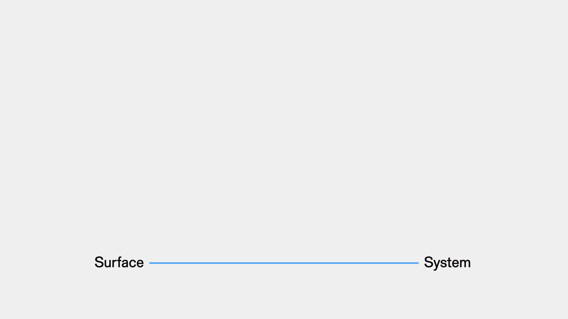
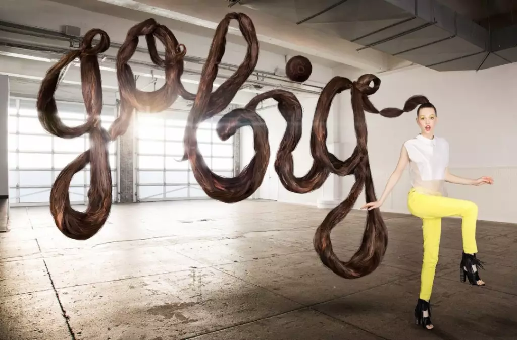
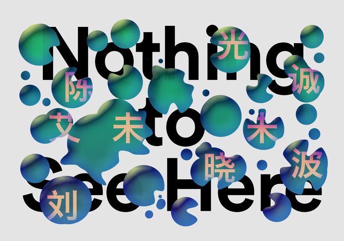
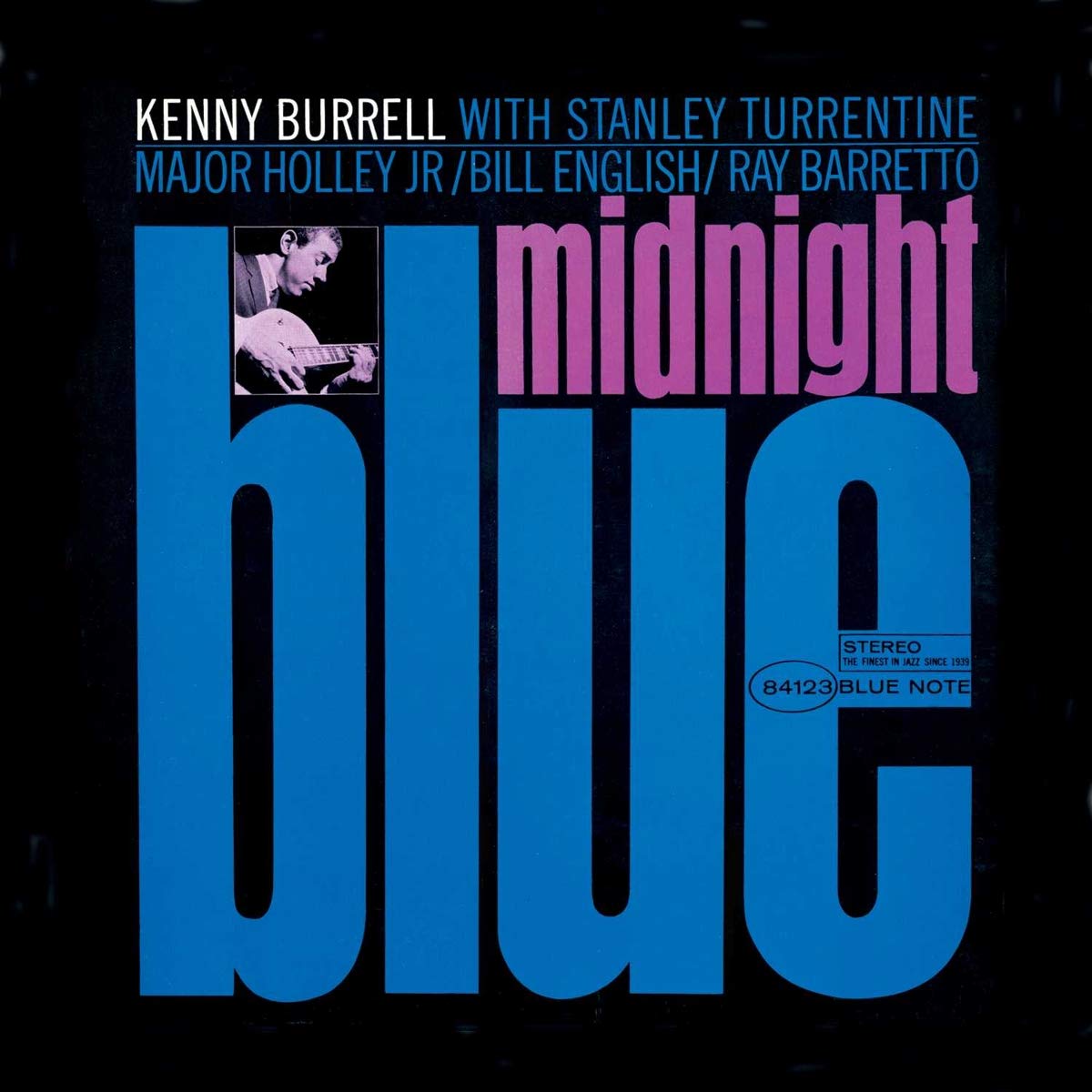
Surface design is formally expressive in its use of type and imagery. But even at its most painterly, surface design still expresses meaning through reference, context, and gesture—in other words, style. Style is often dismissed as hollow, but I think of it more as a coded language intended for specific audiences with a shared literacy. Surface design is seen.
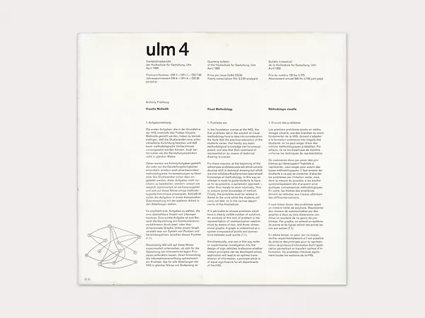
On the other end of my mental model is system design. As the name suggests, system design creates meaning through its structure and organization, and the relationships exhibited within. Sometimes this approach is required due to constraints of material or audience; other times the constraints are inventions of the designers’ own making, like the rules of a game. I think of system design as being read.
Obviously this isn’t a binary—‘surface’ design has hierarchy and composition, and ‘system’ design still requires stylistic choices.
When I left school and began doing more interactive work, I realized there was another distinct category, behavior.
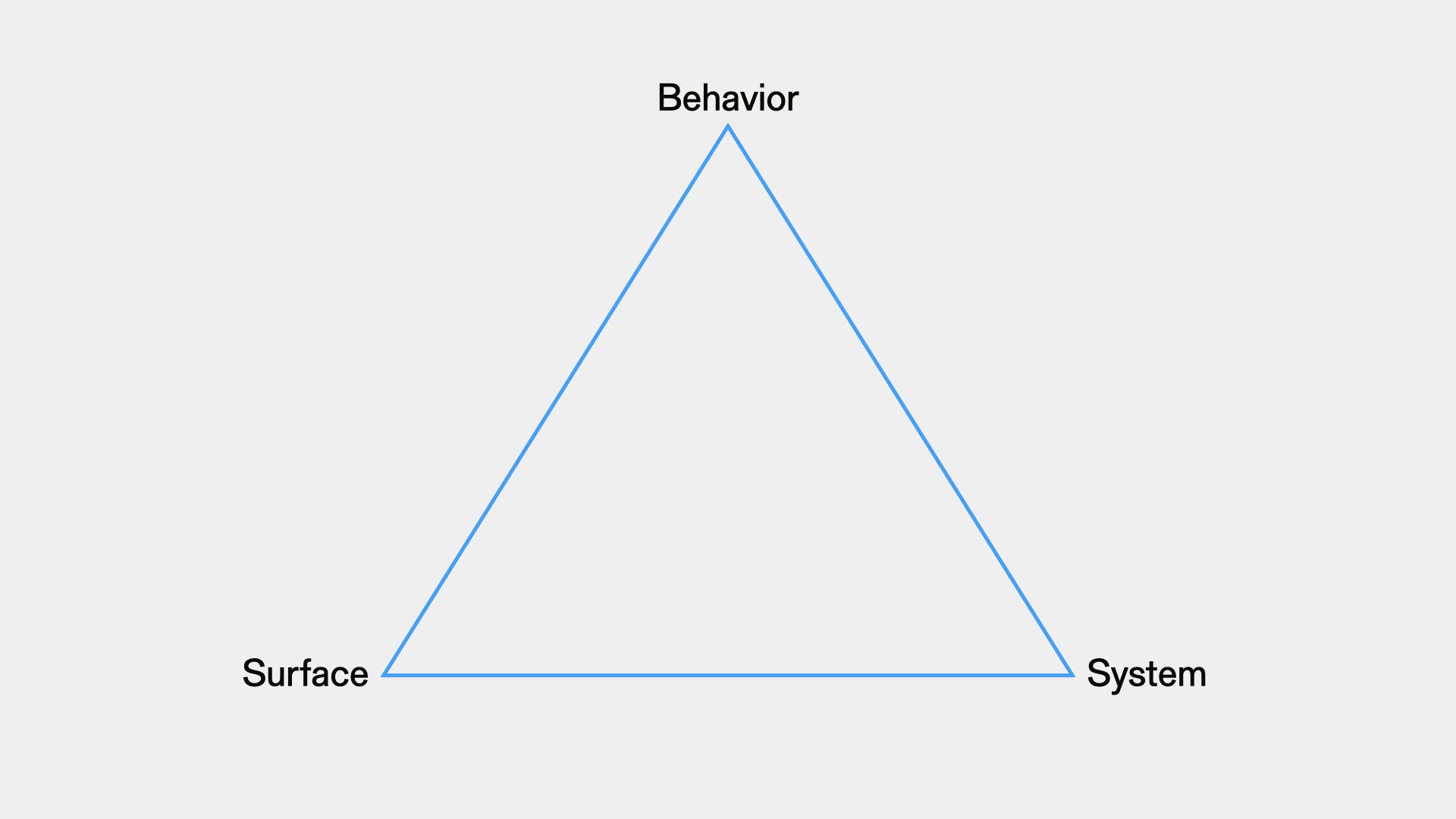
Behavior is seen in the way design is experienced over time. The design itself changes, usually as part of a feedback loop in response to user input. Just like with style and surface, behavior is meaningful—in fact, it’s the defining trait of meaningful interactive design. I think of behavior as how design is experienced.
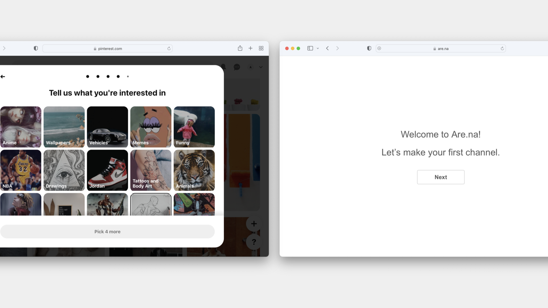
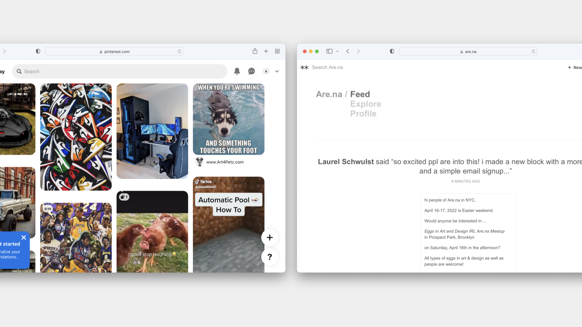
Consider two notable image-archiving apps, Pinterest and Are.na. Functionally, they’re similar. Both allow users to save, organize, and annotate collections of images. But their behaviors set them apart. Pinterest’s onboarding is rooted in algorithmic suggestions (sneakers! vehicles! tattoos!), which it spins up by asking questions about the user’s age and interests and presumably using data pulled from other social media platforms. By contrast, Are.na’s onboarding offers me nothing but a suggestion to begin my own collection, and trusts that I’ll stick around to learn the tool and find my community.
These experiences suggest two dramatically different brands. Pinterest is broad and generous, a brand for normies who like memes. Are.na is arcane and specialized, a brand for true heads.
Brand encounters were once primarily physical. This was before the internet, of course, when physical brand expressions were the only options—consumer goods, storefronts, printed matter, and so on.
Now brand ecosystems live mostly online. Websites and social media are where audiences meet and interact with new businesses. It’s where people form their understanding of companies and products, and how first (and last) impressions are made. So, of course, the nature of branding changed to suit.
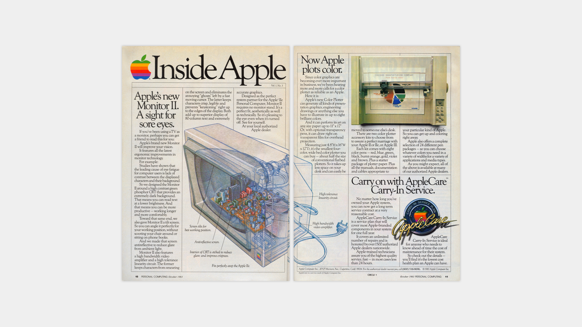
Consider an ad for Apple products circa 1983 alongside a recent Apple marketing site for new hardware. The ad is read and seen, combining applications of surface and style to convey technical sophistication. The marketing site, though, is experienced. There are moments of big type and colorful shapes throughout, but it’s the behavior of the page conveying the story: Apple products make remarkable things happen. Just look what happens when you simply scroll!
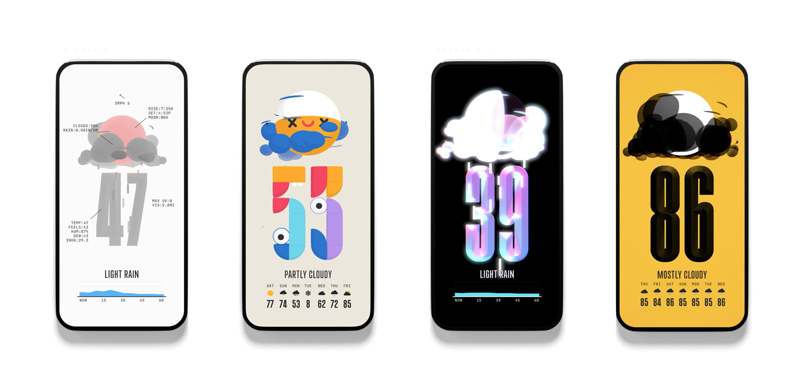
For companies without physical products, the entire brand ecosystem lives on the web—the product and the brand are one and the same. Consider weather apps, most of which use the same data sources. What sets these brands apart is their design and/or behavior, not their content. Not Boring Software addresses this explicitly with their weather app, which asks (and answers) the question: Why can’t utility apps be fun? What if they felt more like games? In other words, the differentiation is the experience—and the experience is the brand.
At Upstatement there’s little separation between designers, strategists, and engineers. Small teams work on each project, and individual contributors often practice multiple disciplines. This helps ensure that we keep brand-through-digital thinking top of mind throughout the design process, from discovery through production. But given the variety of our clients, the specifics of our approach change with each project.
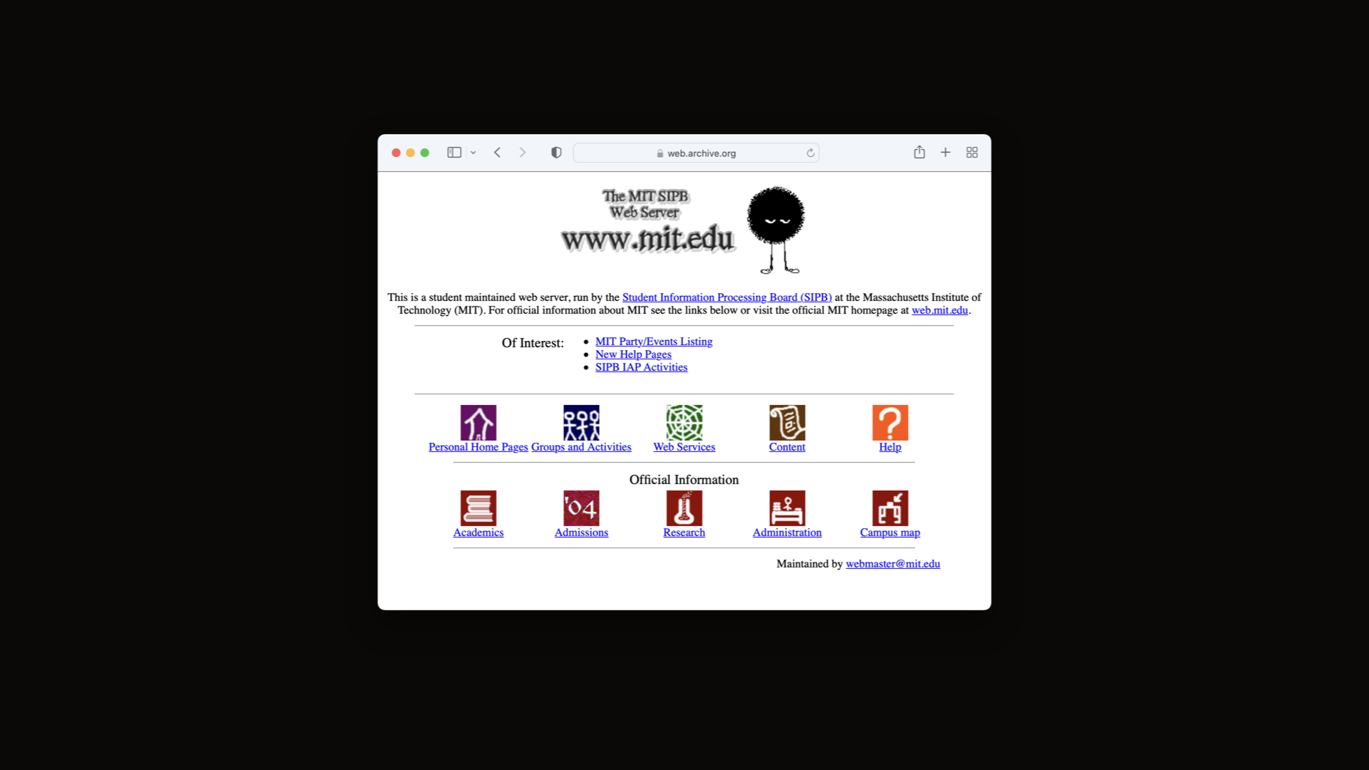
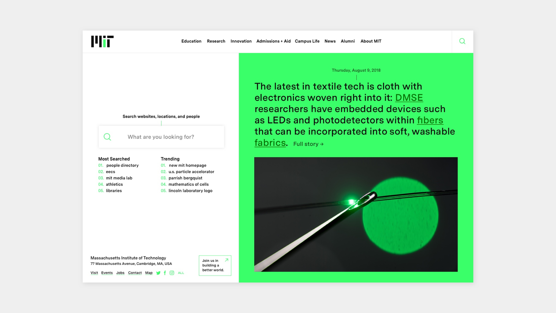
When we designed MIT’s new website, we began by asking questions of the students, faculty, and administration. What did MIT mean to the people that mattered most? One thing we learned was that the school’s community has been building websites since the dawn of the internet. Official or unofficial, trivial or serious, the pages and micro-sites scattered across the MIT server were a living archive of the school. We realized that this was the brand—this distributed, decentralized collection of material said more about the school’s approach and values than a logo or typeface ever could.
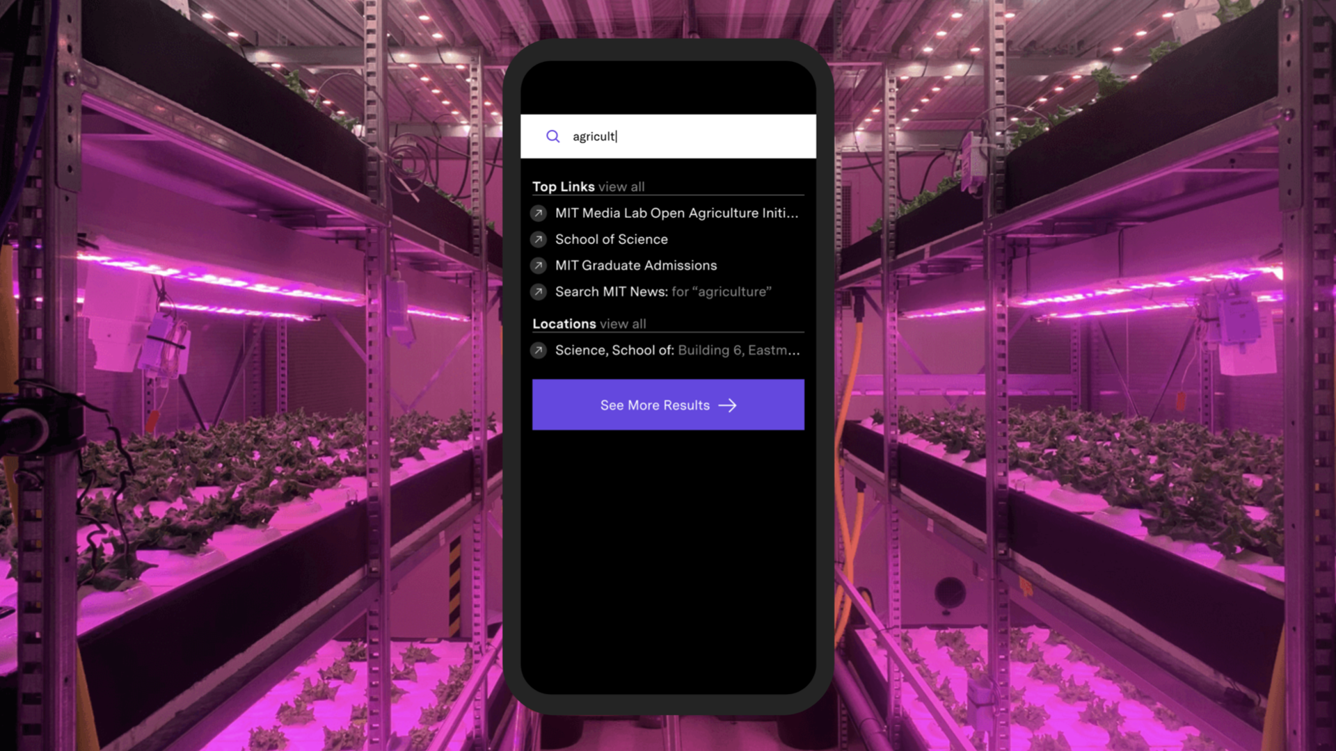
We decided that exposing this content was critical. Given the depth of the archive and the unique needs each visitor would bring to the site, we emphasized the search experience over the browsing experience. The search had to be fast (obscenely fast!) to offer requested results while also encouraging discovery of content that visitors didn’t know existed in the first place. This used behavior (the search experience) to emphasize meaning (MIT is limitless). Each link is a door to something totally different.
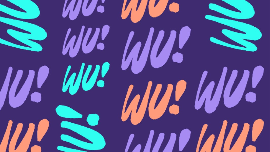
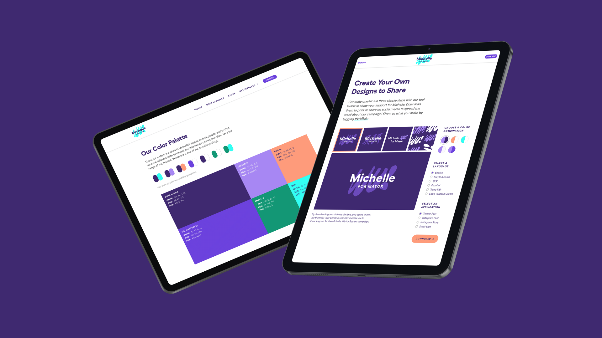
Another example is our digital brand for Michelle Wu’s Boston mayoral campaign. For MIT we had months—for Wu’s campaign, a total of seven weeks. This timeline left no time for workshops or formal research; instead, we conducted a handful of interviews and got to work.
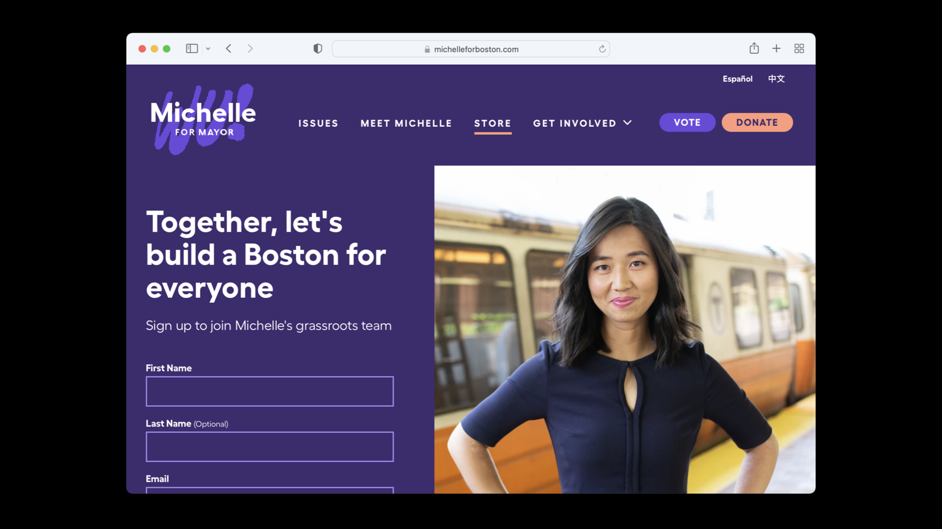
The visual identity came quickly, inspired by a mix of sources such as the candidate’s penchant for color and the handmade signs at her earliest rallies. The brand system had to be flexible enough to work online and off, in any of five languages, and be implemented by a team of volunteers with little or no design training.
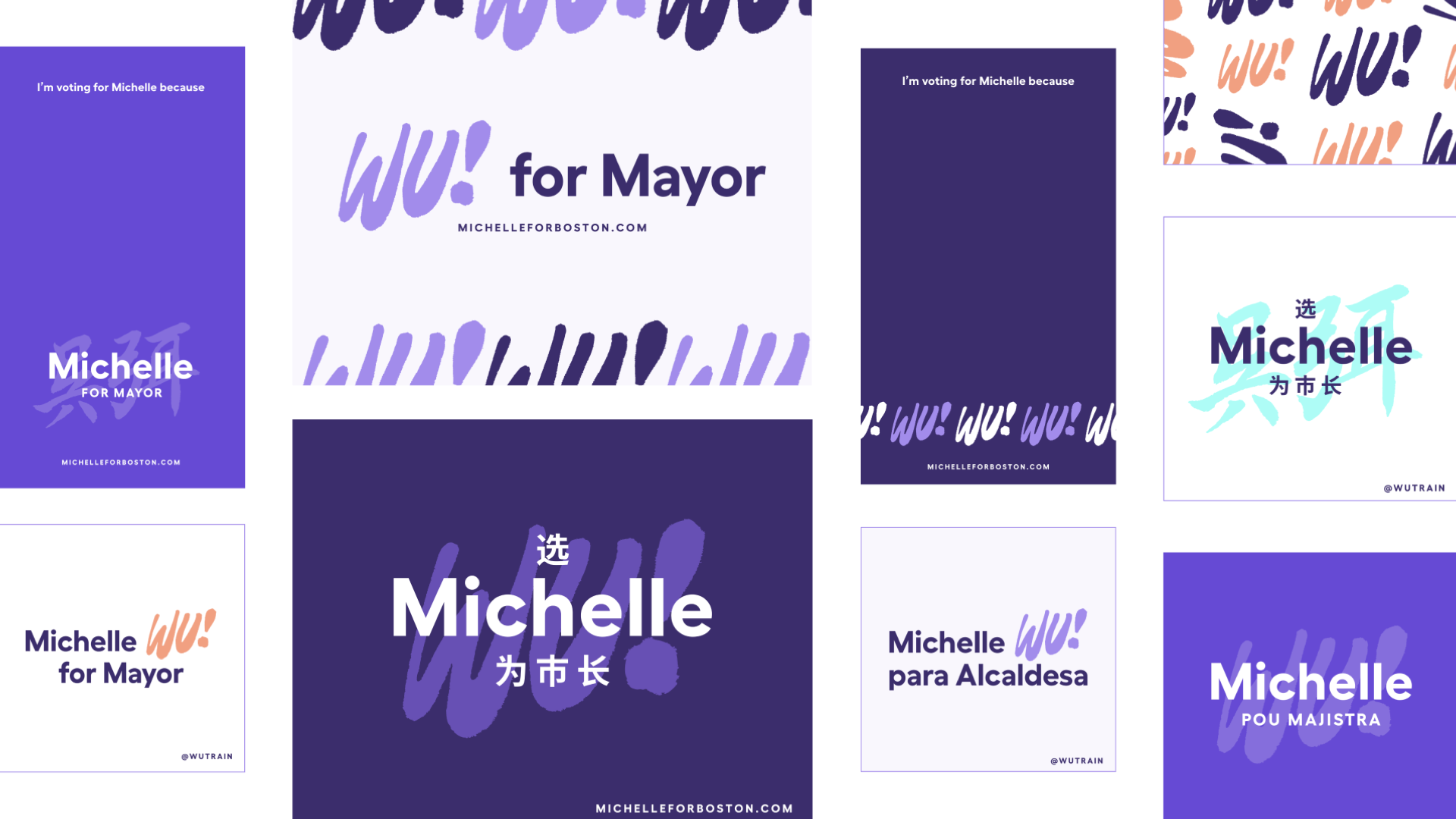
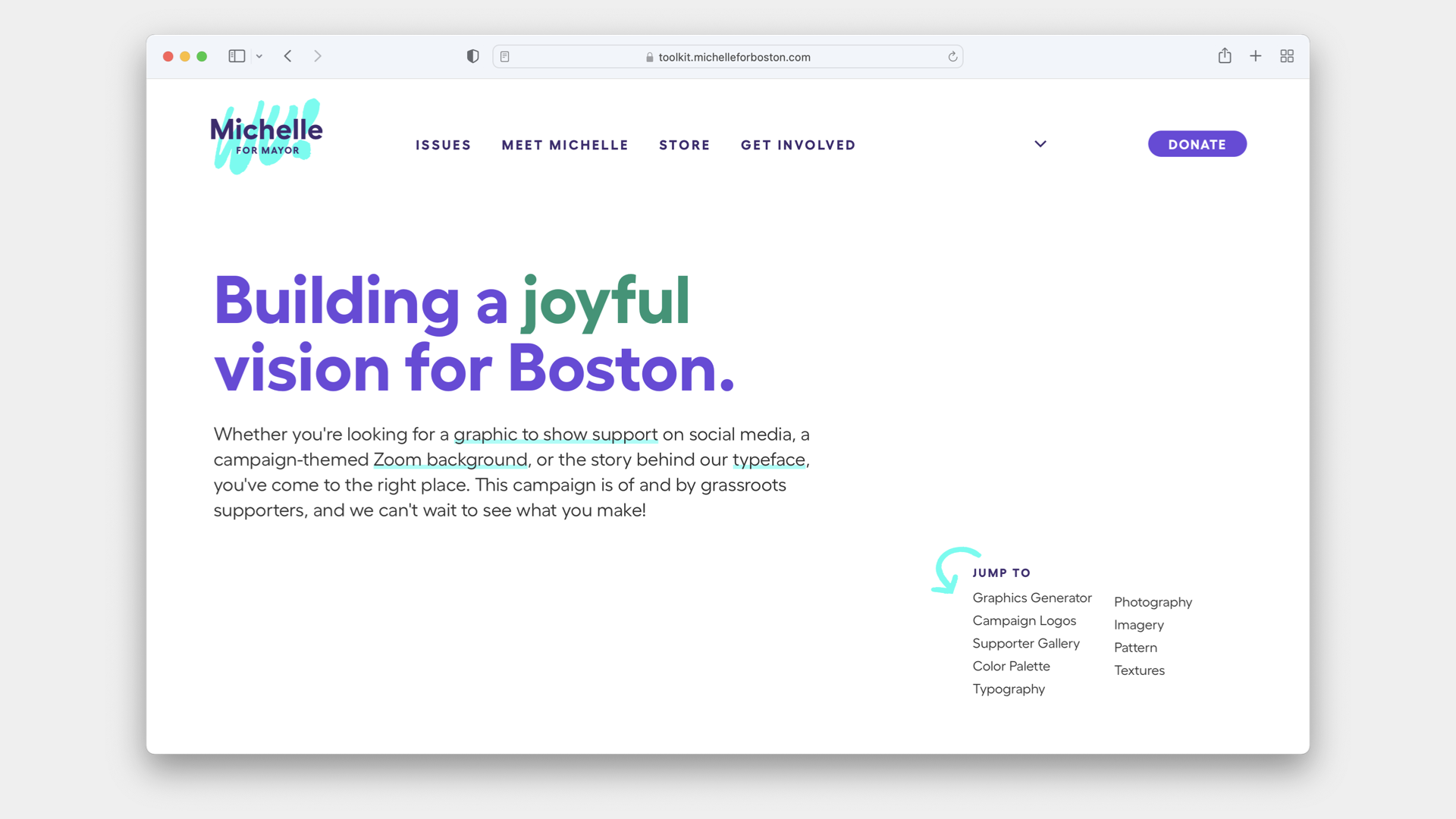
Traditional political campaigns tightly police their graphic output, but Michelle Wu’s campaign was built on grassroots energy rather than cohorts of paid consultants. Not many political volunteers can afford the monthly subscription fees that certain professional software companies charge. Upstatement built an online tool that volunteers and supporters could use to produce their own customized campaign material—a toolkit that put the campaign’s designs into everyone’s hands. This was a campaign identity that lived offline, but was only made possible via digital means.
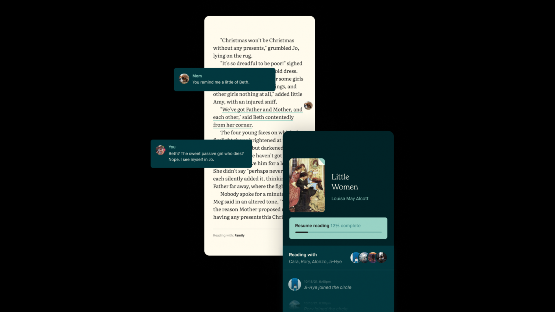
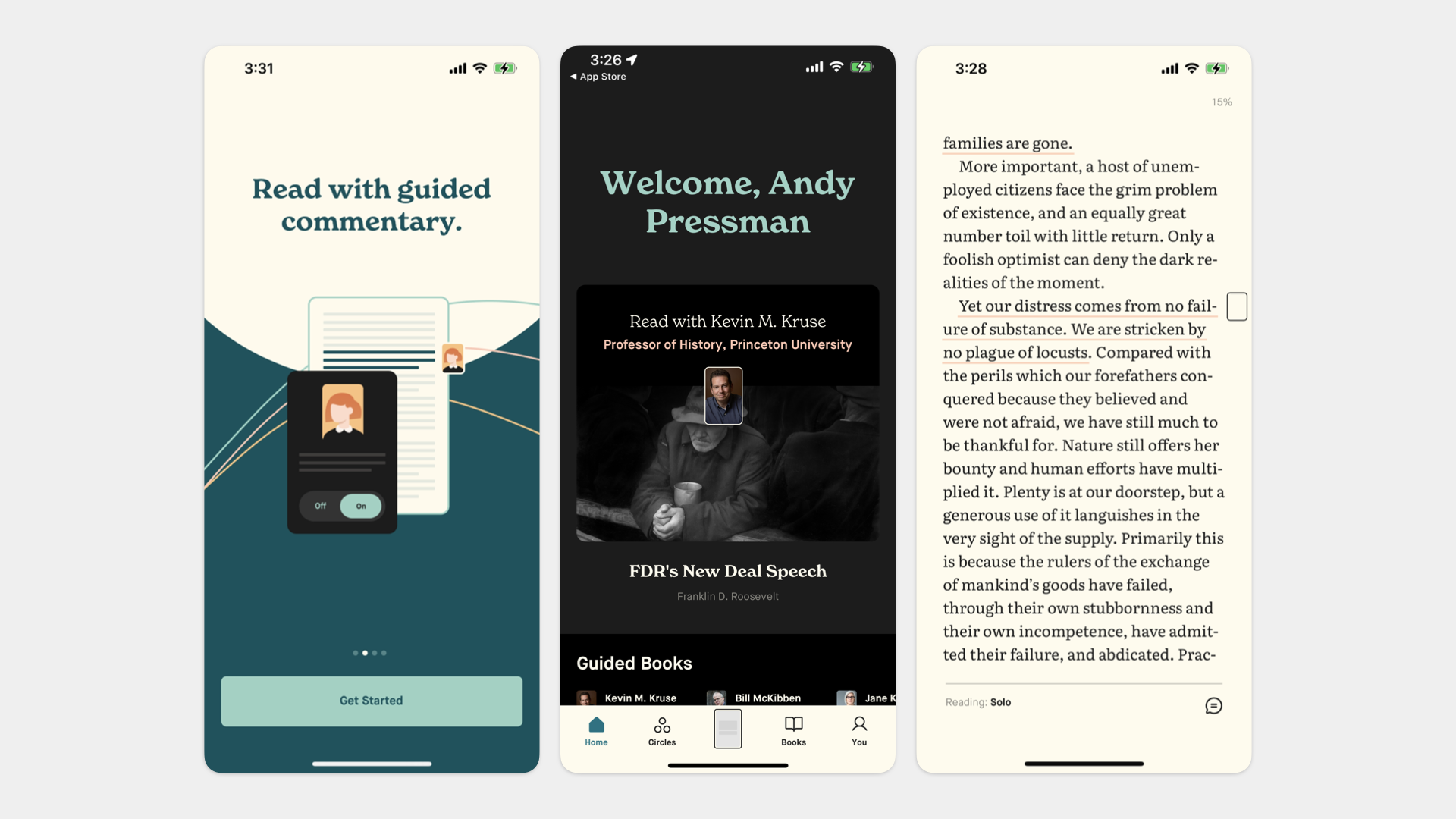
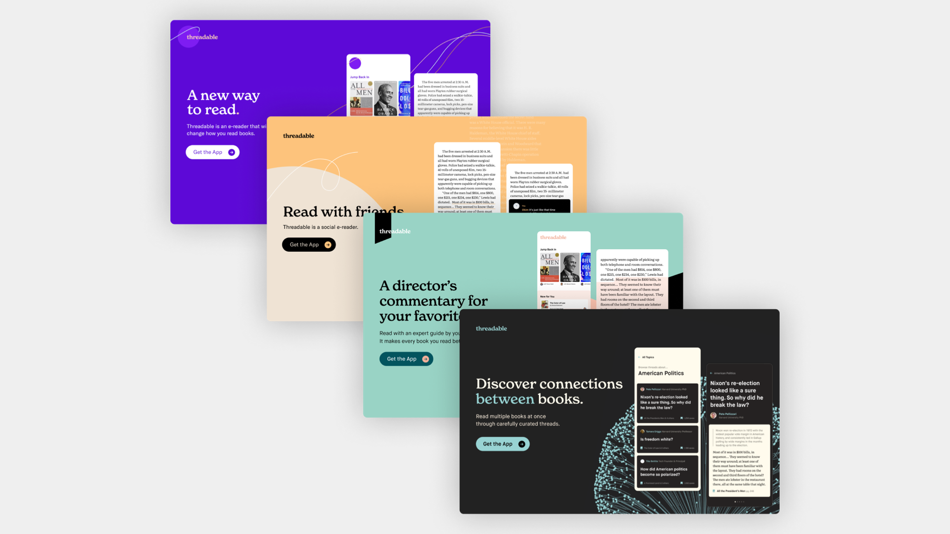
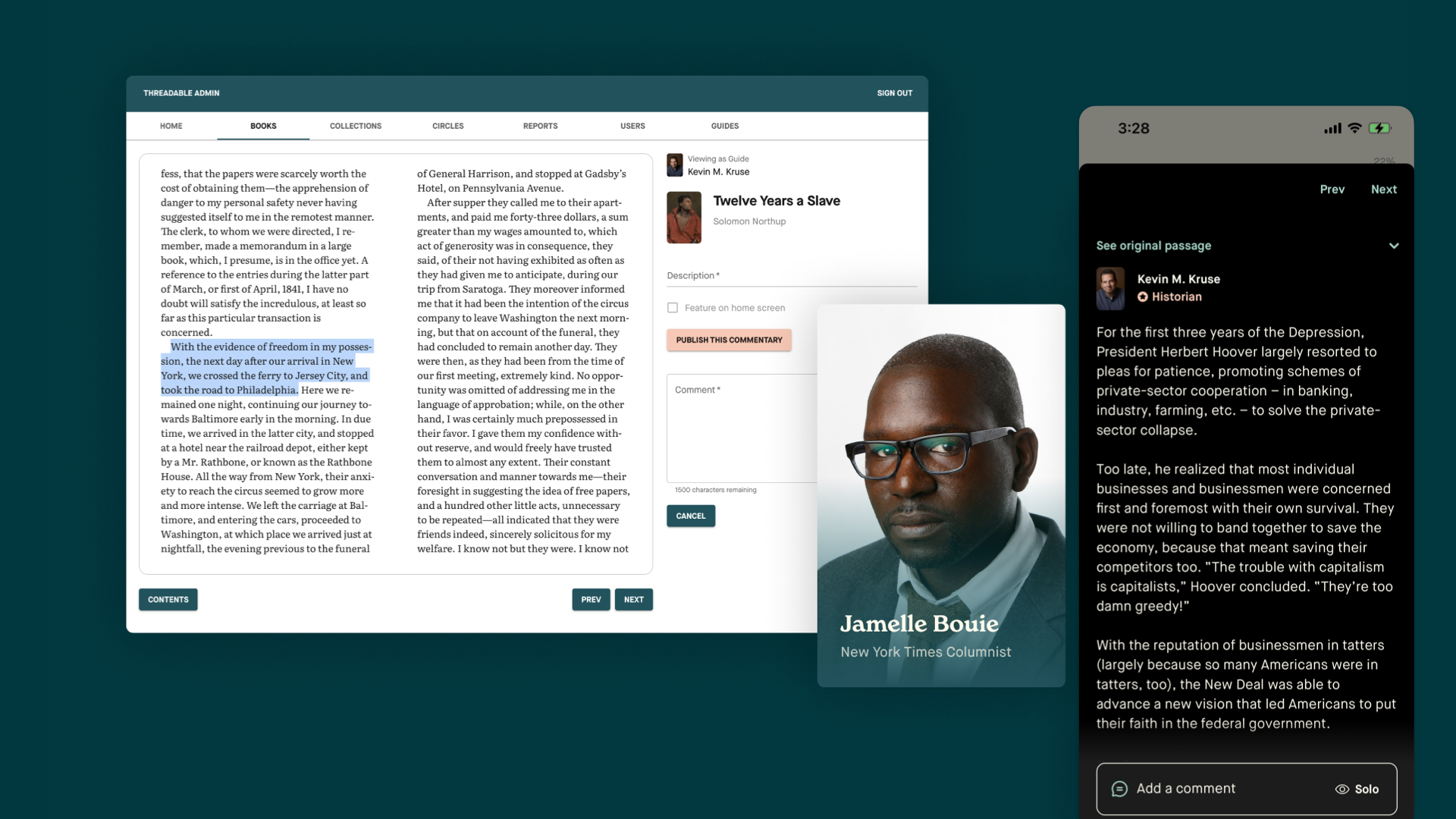
The final example I want to highlight is Threadable, an iOS app. It’s a social e-reader, where you can read and comment on books with a small circle of friends or follow along with expert guides. It’s available on the app store now, though we’re continuing to expand what it does and how it works.
When clients hire us to build products, it’s often on a different timeline than website projects. We typically begin working without knowing when the product will launch or what features will be built when it does.
For Threadable we took the unusual approach of starting with brand ideas, and then let them guide the function. In this case, we knew the app could allow readers to leap from book to book, reading across texts for deeper understanding. But that could be so many things! To narrow it down we made “future marketing sites” for product variations, each with little more than a headline and description. We used those to conduct interviews and research with potential users, asking the question: Would you download this?
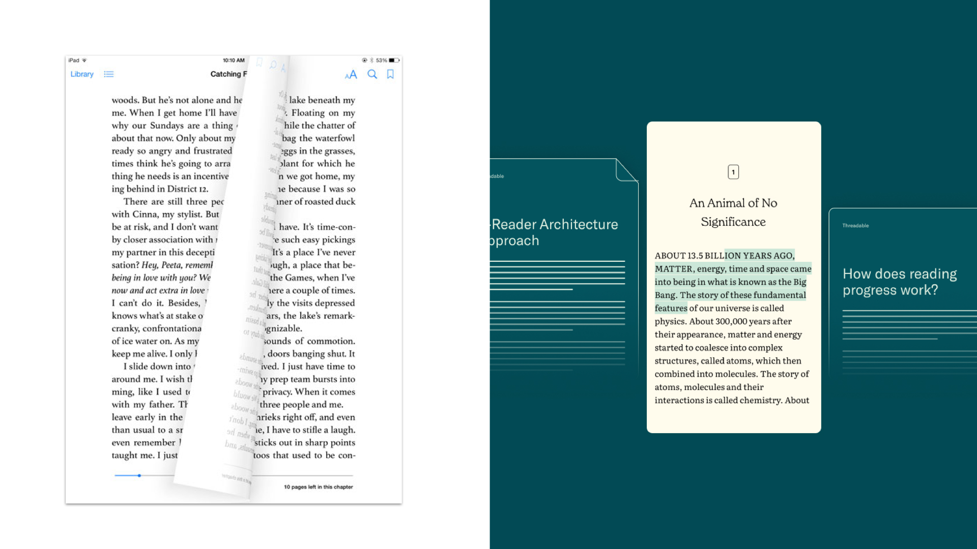
When building an app intended for long-form reading, much of the user experience is pre-determined through years of convention. Unique behaviors, like the animation of turning pages that early iOS reading apps used, can feel aggressive, and they directly impact the way the product feels. Interventions into the ‘default’ are what make for memorable experiences, both good and bad.
In the case of Threadable, the interventions we made are few but significant. They’re about how users read and how editors create content—this is what sets it apart from the default reading experience. Those few decisions make Threadable, defining it not only as an app but also a set of associations and meaning—in other words, a brand.
As we deepen our brand practice at Upstatement, our brand-through-digital mindset is our guidepost for how we can best serve brands and users, no matter if we’re building unifying design systems or inventing the future of reading.