Andrew Garcia Phillips tells stories with data. After years at The New York Times and Wall Street Journal making graphics, he moved into data visualization for sports superfans at Chartball.com, as well as freelance projects for newsrooms and non-profits. He recently came for a Friday Talk at Upstatement where he shared his process and answered a few of our questions.
Do you have any guiding principles for interactive data visualization?
My advice is, “Don’t expect users to do too much.” There was a great talk that Archie Tse did at the New York Times about how users don’t interact with UI. Even if it’s a simple button, they don’t push it. People want to scroll, and they don’t want to do anything else.
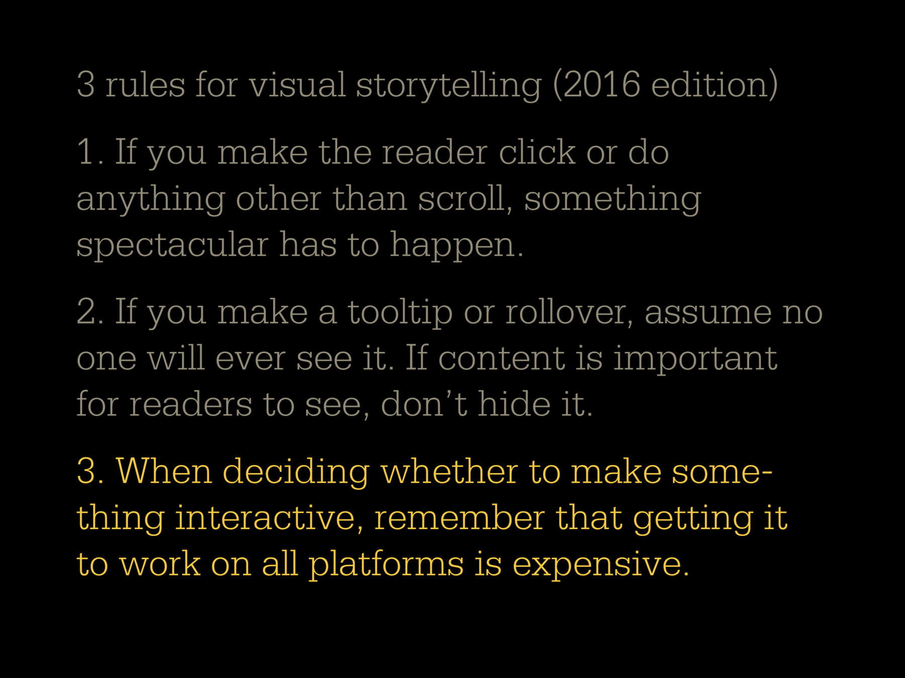
Back a few years ago, we would do a whole bunch of little dials and and drop-down menus. Nobody does those things anymore! The default state has to be really rewarding for people who never go beyond looking at it and scrolling.
How do you think about the relationship between your data journalism work for clients and your sports graphics for Chartball?
Sports are a good place to try out different data visualization techniques because I intuitively understand the data. The data is very accessible and it’s free to use in most cases. The baseball statistics are probably the best organized set of data that exists. It goes back a hundred and twenty-five years!
More recently I’ve realized that Chartball is my marketing tool. It is my way of showing the kinds of things I can do. When I publish something, clients call me. I have new ideas for things I want to do in Chartball all the time!
I don’t aspire to do only sports stuff. I understand that this is kind of trivial, unimportant information. I like to do some things that feel more meaningful, and my client work fills that for me.
Where do you see new opportunities for data graphics?
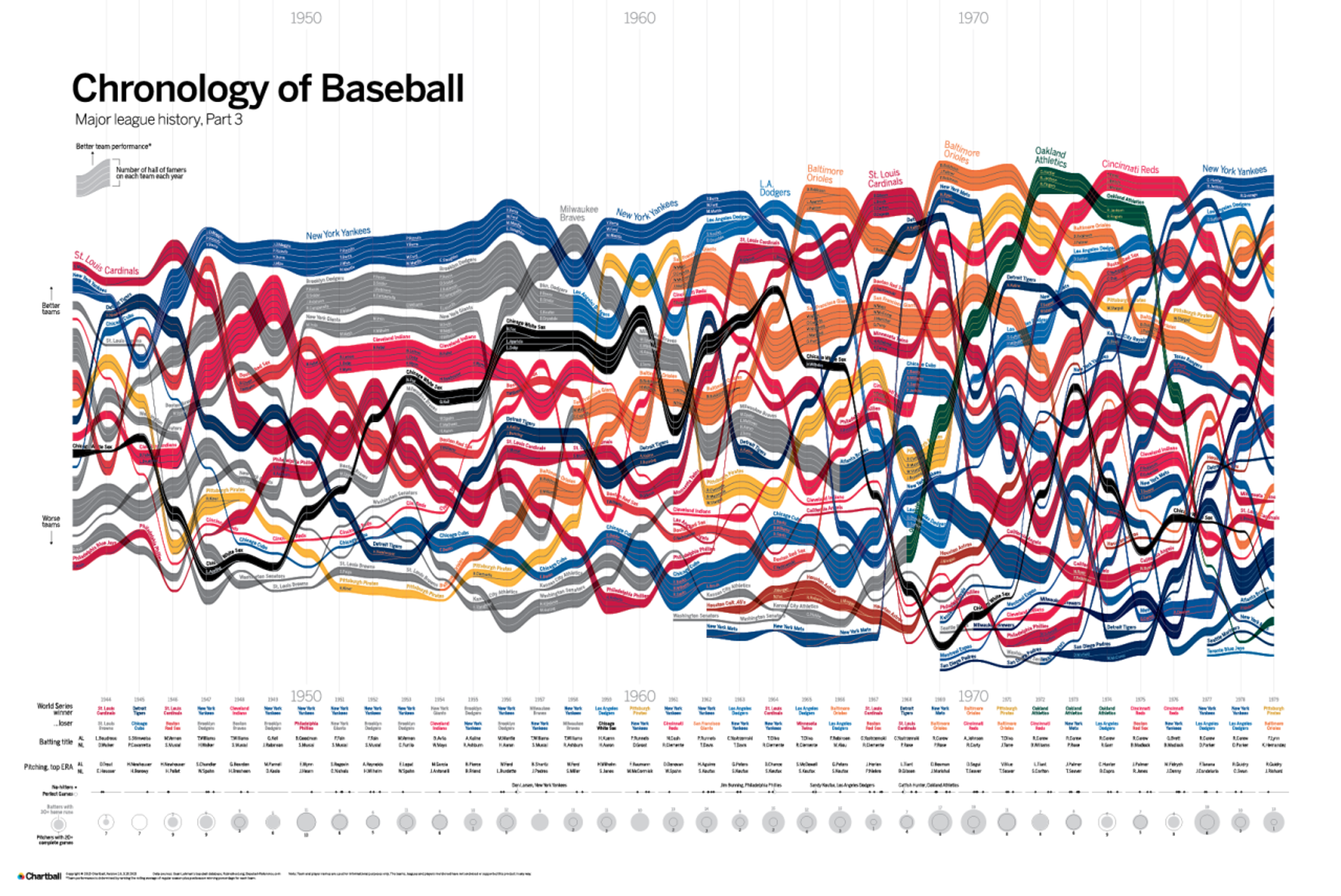
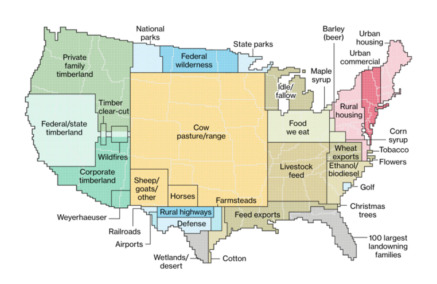
I read my news on Twitter these days, and that’s an opportunity to do smart charts. It’s a different format and size where you can easily share videos and images. We all saw that map about US land use and the chart that shows different companies competing over time. Good things still break through!
How much time do you spend wrangling data vs. thinking about the visualization?
I would say it’s about 75 percent managing the data. Everyone thinks they have a clean data set, but they don’t!
Are there any tools or technologies that you’re particularly excited about?
I want to do some AI stuff! I don’t know exactly how that fits together, but using AI to be able to sort through data to find patterns or conclusions would be interesting.
Thanks to Andrew for coming up from New Jersey for a great talk. Check out his sports data posters and follow @chartball on Twitter.