The existing MEA website was complicated and unclear, lacked a clear path to booking a workshop, and was difficult to update. We set out to refine the MEA story and launch a modular platform that evolves the brand, speaks to the next generation of students, and serves as a springboard for growth.

The MEA sales process needed to be rethought and simplified on all sides. The new homepage and language centers users and psychographics. Ambient, looping video helps create a sense of movement, place, emotion, and story. Rather than trying to sell users on MEA, the language speaks to users’ needs—how they feel about their lives, how they want to feel about themselves, what they aspire to—and presents an opportunity, driving them to enroll in a workshop.

When a user does proceed to booking a workshop, they find a streamlined shopping experience built out of MEA’s course catalog. The old website drew artificial boundaries between MEA’s online and in-person offerings and was only built to feature workshops at the Baja campus. With the Santa Fe campus opening in 2024, we rethought the hierarchy for clarity, accessibility, and conversion. The new enrollment interface is durable and scalable for future growth. It gives users a way to browse all of MEA’s offerings in one view, with the option to use filters to explore specific locations or dates, treats online as a location equal to the physical campuses, and highlights core workshops.

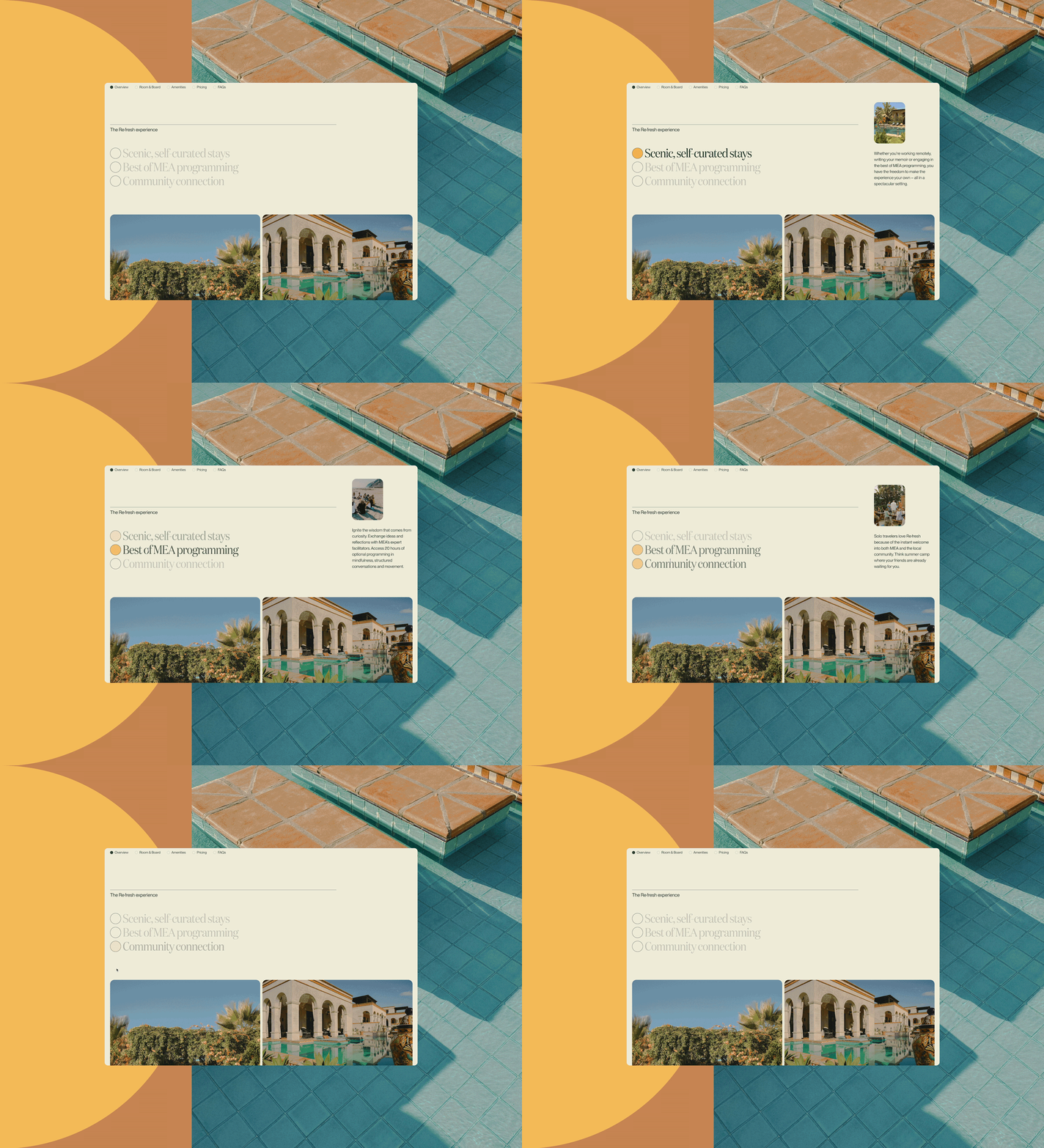
With the introduction of the Santa Fe campus, it also became important to provide potential buyers with a clear sense of physical place and showcase the amenities associated with each campus. MEA’s Baja campus is located right on the beach and is bursting with tropical plants, local artwork, and colorful tile; in contrast, the Santa Fe property at Rising Circle Ranch is tranquil, quiet, and full of mountain views. The website both connects and differentiates these two environments, using an updated color palette and giving lots of play to sweeping images and ambient local video. We only slightly tweaked their existing brand palette, and yet the difference between the new site and the old feels profound.

A critical component of the program extends beyond a user’s singular experience and into the MEA community. Students go on a journey of growth alongside strangers who ultimately become dear friends. In our research, we consistently heard how important these connections are to the overall MEA experience. The worldwide alumni program has twenty-six dynamic chapters, offering plenty of activities, volunteer opportunities, and chances to connect.

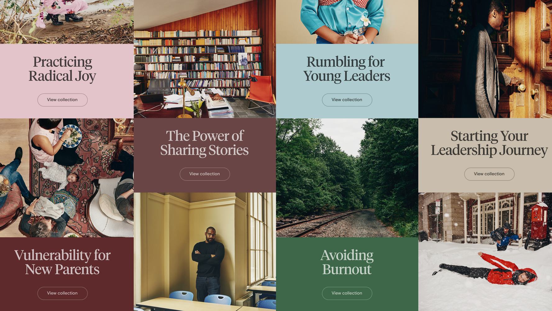
We devised a strategy to showcase firsthand alumni testimonials in quote and video modules throughout the site, allowing alumni to sell the impact of the community on MEA’s behalf; we also designed modules for short- and long-form alumni stories, a new content type for MEA. Our art direction emphasized community as well, with guidance towards photography and videography that depicts people collaborating together, rather than only depicting the scenic campus settings.

The user-first, design-forward ethos of the process resulted in a transformative product for Modern Elder Academy; the MEA platform tells a new brand story that showcases and empowers both client and community.


