How we define quality, why we consider things to be good, bad, or ugly, and what it means for design.
Everyone wants to make good things. Not bad things, not okay things—good things. But “good” is subjective, right? Do we all have the same definition of what’s good, and what’s not good? Looking around, I’d say emphatically: no.
“Good” is too crude a word; to be more precise, we’re talking about quality. We want to make and own high-quality things. We want to have high-quality experiences. Companies tell us they are “obsessed with quality.” Does anyone really even know what it means?
We each have a personal definition of quality, and even if it’s not explicitly, consciously defined, it’s something we feel. We evaluate the things we come in contact with and at critical junctures—like making a decision to purchase—we decide if they’re high quality or not. Despite the fact that everyone’s personal sense of quality might vary, in general, the definition of quality has some fundamental properties that are universal. Good craftsmanship is good craftsmanship, not something coded to a specific culture, time, or place of origin. Whether it’s an ancient pot or a gaming keyboard, both can be high quality.
Dieter Rams called details the “baseline of quality,” insisting that nothing works without details. This is a bottom-up definition of quality that holds up over time and across mediums. If a creator controls the details of their work with painstaking care, and guides the details toward a consistent whole, the overall effect is one of quality at different levels of inspection. How many times have we seen something that appears to be quality from a distance, but turns out to be lacking after a closer look?
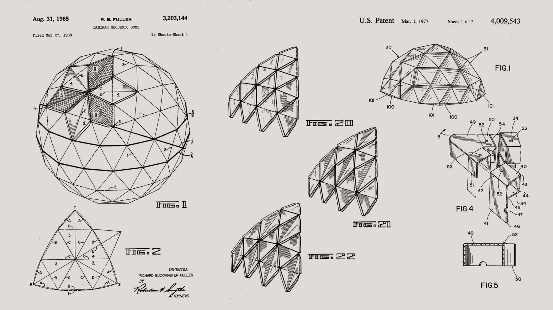
Working with the same mindset of detail-driven quality, Buckminster Fuller once commented that when he was working on a problem, “I never think about beauty, but when I have finished, if the solution is not beautiful, I know it is wrong.” If all the details are taken care of, a certain beauty is sure to appear. Beauty as an indication of quality helps explain why we gravitate towards aesthetically-pleasing products.

The fashion designer Donna Karan, dealing exclusively in beautiful products, focuses on the emotional appeal of quality: “Design is a constant challenge to balance comfort with luxe, the practical with the desirable.” This angle seems especially apt for fashion, and her brand of it, where we want to connect with a piece on a deep personal level. A mishandled detail like a poorly-placed seam is not only prone to falling apart, it can cause an awkward drape and an unflattering fit: not beautiful, not quality.

Let’s consider a product on the opposite end of the consumer spectrum from DKNY: WD-40. A friend of mine called the WD-40 can “typical of fugly American industrial design.” He was referring to this can, with the bulbous red integrated straw. Damn, it’s ugly.

But why exactly do we consider it ugly? It’s not just that a can of WD-40 isn’t really an exciting purchase. As brands like IKEA and MUJI have shown, everyday objects and interfaces can be considered beautiful. Their thoughtfully-designed products celebrate the utilitarian, and browsing the harmoniously simple MUJI desk accessory section inspires a sense of peace. But the WD-40 can has a few bad things happening. Most glaringly, there’s the visual dissonance from a new design language grafted on to the classic can. It doesn’t work that well, either—there’s a physical awkwardness for smaller-handed users when attempting to grip the can and push the spray button simultaneously. It’s as if we can intuit the dysfunctional user experience on sight, and our subconscious warns us away by translating the whole mess as simply “ugly.”
We don’t want to design the website equivalent of WD-40. When we’re designing and building digital products and brands at Upstatement, we ask ourselves certain key questions to stay grounded in quality.
- Will it last?
- Is it new?
- Is it influential?
- Is it valuable?
- Is it logical?
- Did it make an impact?
- Does it make you smile?
- Are you proud of it?
- Is it cohesive?
- Is it elegant?
- Is it fast?
- Is it smooth?
- Is it easy?
- Does it work?
- Do people like it?
- Will people try to copy it?
- Does it reflect well on your coworkers?
- Does it solve the big problem?
- Does it make new things possible?
- Does it teach you something?
- Is it unique?
- Is it desirable?
- If it were to get deleted, would anyone notice or care?
Creating quality products requires that we go beyond our instinct for “good” or “bad” to understand how and why things work. We’re always making things with different mindsets, audiences, markets, and goals, but we have a shared definition of quality embedded in our company culture, and that’s how we get to good.


