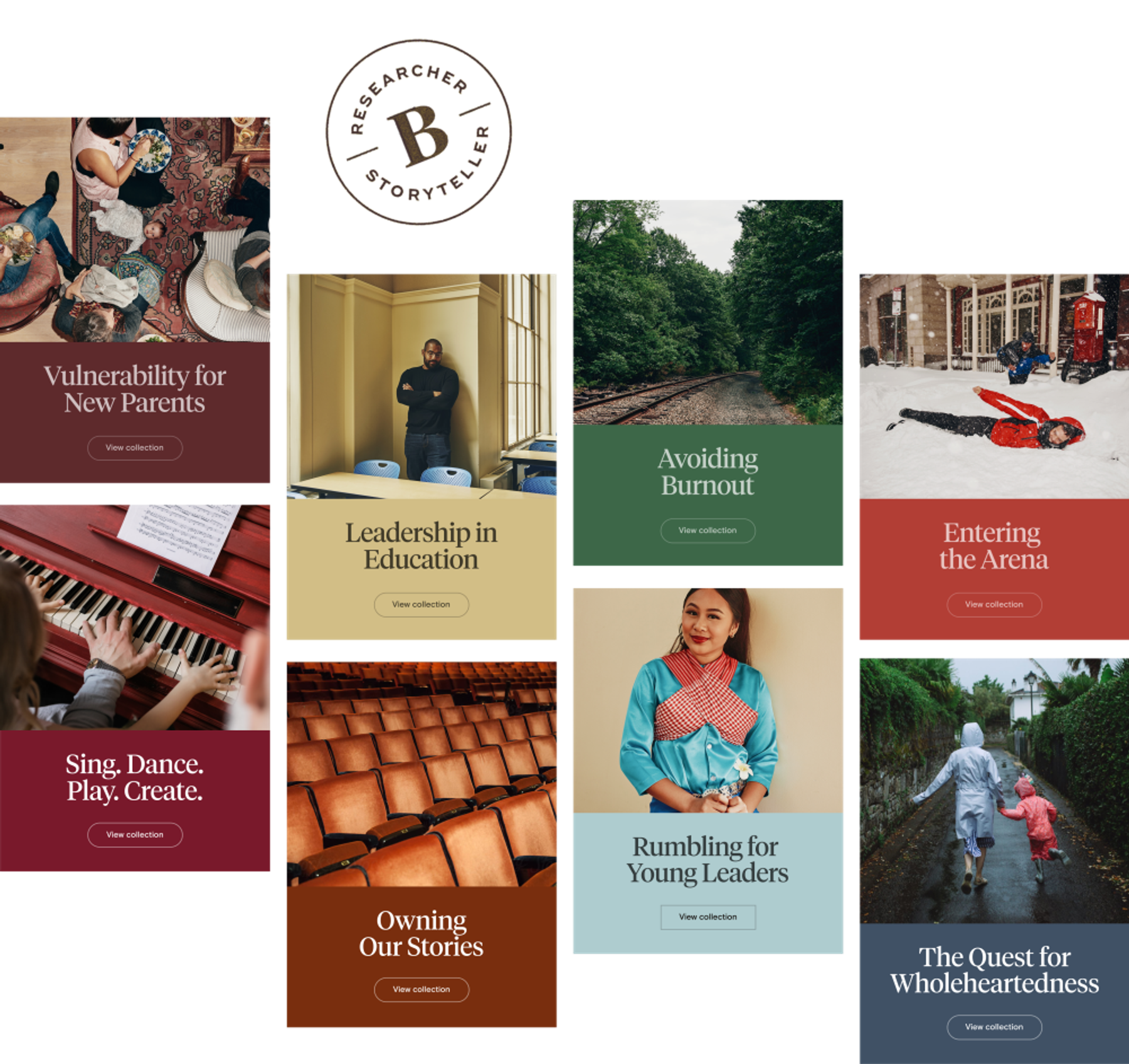
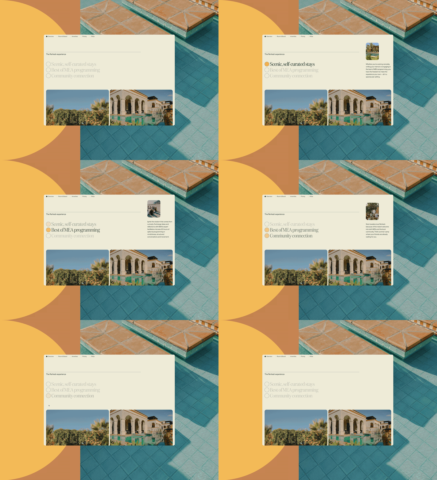
We approached this project like Brené approaches her work: with a strong back, soft front, and wild heart. For a website redesign, that meant starting by listening deeply and conducting research that involved the full client team and gave the audience a voice. This helped us establish a shared vision and develop goals that built on the Brené Brown organization’s belonging statement:
- Be brave with the brand. Create a warm, welcoming home for the work that’s accessible to all and true to Brené.
- Design a platform that serves the work. Meet people where they are and connect them to what they seek.
- Build tools that will take good care of the team. Develop a sustainable platform that maximizes the team’s effort.

We developed organization systems and structures that facilitate exploration and engagement for users. Collection and Topic pages allow the community to browse content by theme, and Book, Hub, and Podcast pages (paired with a redesigned article reading experience) help visitors dig deeper into specific books or shows. Add in a newly powerful search and a more streamlined navigation and users now have clear pathways to the content they seek—and plenty of opportunities for fresh discoveries and deeper understanding.
It’s hard to listen to people deep enough and wide enough to build something that, when they see it, they’re emotionally moved. That’s a very, very rare thing…I have never seen it done better than this.
Brené Brown![A woman with short blonde hair smiles warmly at the camera. She is wearing a blue denim jacket and large, ornate earrings. She stands next to an aged wooden fence, with a blurred background of green foliage and dappled sunlight.]()
To back it all up, we developed a resilient architecture. It serves the publishing team’s daily workflows, while remaining flexible to scale smoothly over time, evolving along with the team’s longterm vision and goals and the user community’s needs.

This was all a lot of change for a loyal community, and we hoped that suffusing the site with updated and welcoming brand touches would help them feel at home. Working on branding in tandem with the rest of the site development, we sought out sensitive art direction to suit emotionally intelligent and intuitive users. We curated an image library that inspires honest and real emotions, and asked Tal Leming of Type Supply to update the logo to feel graceful, direct, and timeless.


If you’re new to Brené’s work, try the Getting Started hub for a good overview. Whether you’re in the mood for a podcast, a pep talk, or an enlightening interview, you can experience it all at brenebrown.com.


