
Modern Elder Academy: A redesign that makes midlife something to aspire to
Work
How do you transform the digital identity of one of Silicon Valley’s most successful venture capital firms? Learn who they are and lean into it.
E mergence is warm, personal, and laser-focused on its mission: to find and support visionary people who are going to change the way we work. With Salesforce, Box, and Zoom among their portfolio companies, they’ve got the track record to prove it too. We worked closely with their team to build a site that better reflects who they are today, starting with a refreshed identity that emphasizes Emergence’s core values, human touch, and unique approach. You’ll see it reflected in everything from the beautiful illustrations to the fast, friendly, modern tech stack. We also wrote new positioning statements, designed a destination for their big ideas, and answered the question: What makes a website feel friendly?
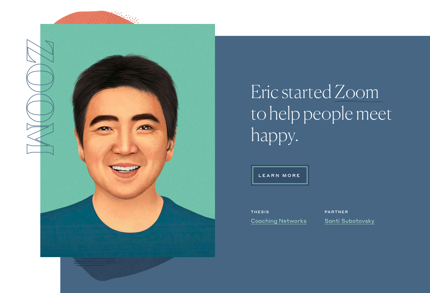
It’s the VC that really does care about people, so we centered the design on striking illustrations of the iconic CEOs they back. Leading with their CEOs reinforces their founder-focused culture and affirms their ability to identify visionaries. Organic patterns complementing the illustrations allude to Emergence’s personalized approach.
We set out to craft a new identity that differentiated Emergence from the crowd. Their competitors’ sites were a sea of sterile, monochromatic designs. Tech can be a cold space,but Emergence prides itself on its warmth.


Emergence needed a snappy marketing website that was performant, SEO-friendly, and easy for their non-techie team to use right away. We chose the JAMstack (JavaScript, APIs, and Markup), a modern architecture that’s super fast, scalable, and secure. For our specific stack, we selected Gatsby as our static site generator, Contentful as our headless CMS, and Netlify as our hosting service. This combo met our goals, and also aligned with the company’s cutting-edge image.
For more detail on our technical approach to choosing and using the JAMstack, read our 3-part series on our blog
Emergence staff edits the website through Contentful, the site’s web-based headless CMS.



Gatsby, our static site generator, grabs the content from Contentful via a GraphQL API.
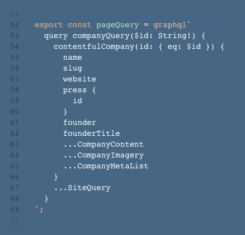
Netlify automatically deploys the updated static site assets: simple, fast, secure!
We also worked with the Emergence team to refresh their logo. We drew inspiration from a historic mark and updated it with a bolder one that shows quiet strength and refinement. In keeping with their philosophy, the logo is strong without being distracting, allowing the more dynamic page elements to shine.


VC firms tend to use a formal tone, technical jargon and marketing speak. Emergence wanted to reach a younger, broader audience, so we worked closely with them to develop a fresher voice and tone that felt right for the firm. We started by crafting a new tagline: “We invest in people who change the way the world works.”
On the About page, we skipped the usual three-paragraph origin story and instead focused on the firm’s trademark values and culture. We highlighted these in punchy sentences with illustrative stories:

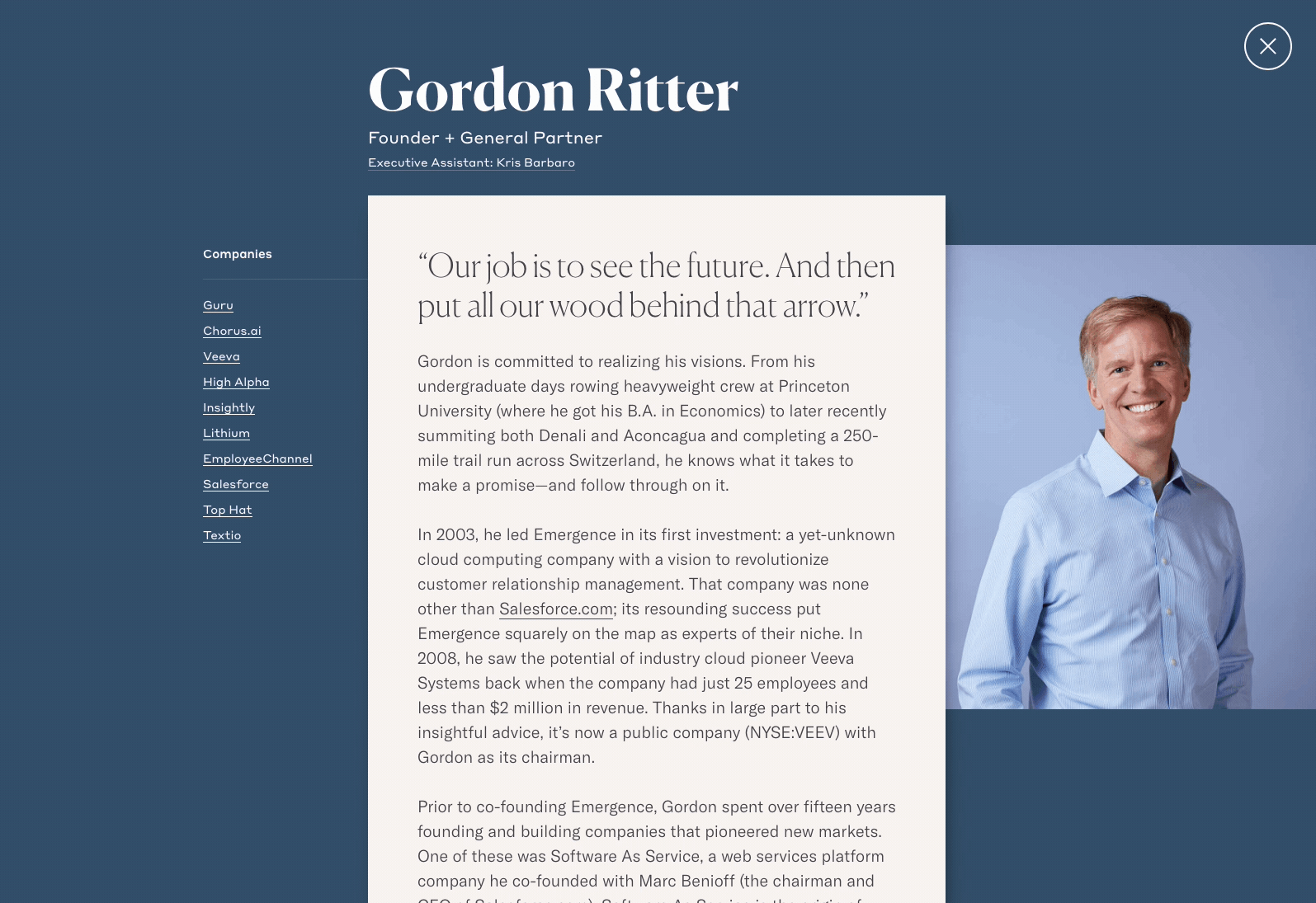
In the VC industry, startups choose a firm largely based on its partners—yet we found that partner bios tend to be dry and factual. To warm things up, we showcased distinctive character traits and memorable stories of personal triumph or challenge. Adding direct quotes helps humanize the bios.
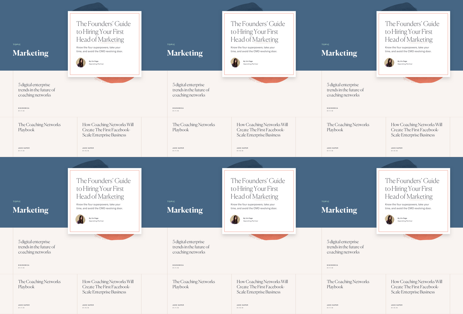
Emergence is a thought leader, but the inflexibility of their previous blog dampened their enthusiasm to post. So we built a robust new system with flexible components for videos, images, featured companies, numbered headings, lists, quotes, and more. Now, team members could realize their vision easily—and beautifully. For evergreen pieces, we designed a special introduction with a note from the author, complete with their signature. Just one last personal touch.

The result is a standout site that’s refined, bold, and modern. It speaks to a broader, younger audience while honoring the values on which the company was built.
It was a pleasure to build this site with Emergence. The partners were open to new ideas, and we got to learn first-hand how they put their values into practice. (It isn’t just lip service!) Since its launch, the new site design has been warmly received by the partners at Emergence and has garnered attention from around the internet, including typography trendspotter Typewolf and the design inspiration site siteinspire.