Skip to content
Home
About
Work
Contact
Menu
This page is password protected
Submit
Menu
Home
About
Work
Jobs
Blog
Contact
Engineering
Newsletter
The Art Direction Show
Timber
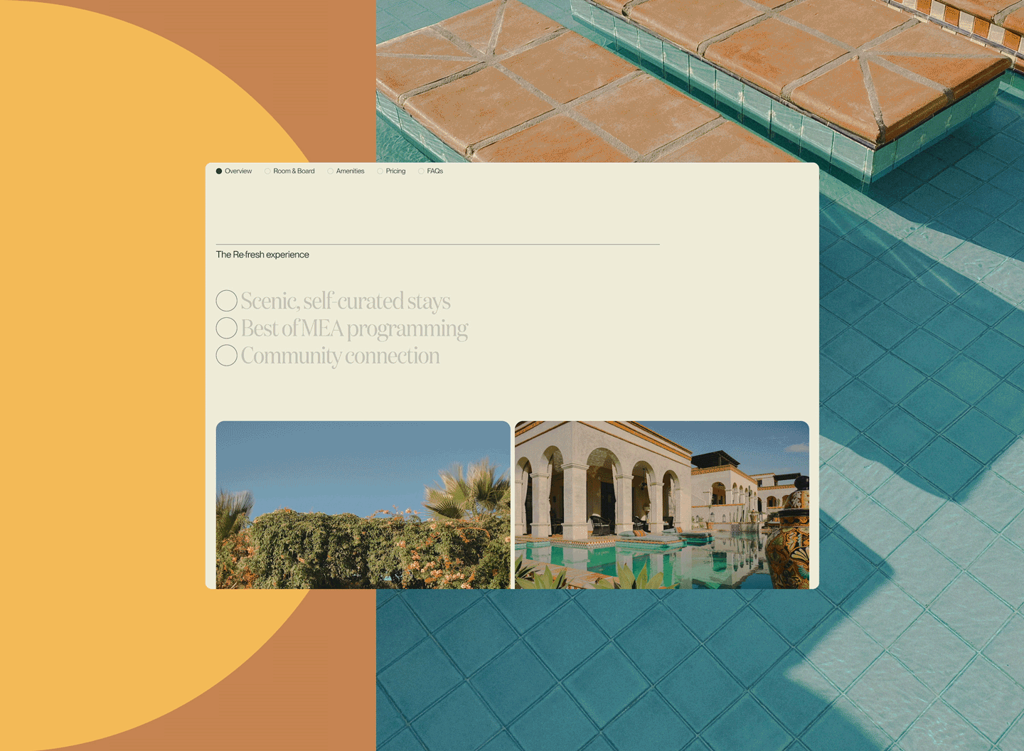
Modern Elder Academy:
A redesign that makes midlife something to aspire to
Follow us on instagram
Follow us on linkedin
Follow us on arena
Follow us on github