
Modern Elder Academy: A redesign that makes midlife something to aspire to
MIT’s corner of the Internet is a beautiful mess. Thousands of individual sites, millions of pages, and no set standard. You’ll find sites that look ancient, only to realize the information was just updated. Click. Now you’re on an impressive department site with news about a Nobel Prize. Or maybe you’ll land on a student-made web app that has been in use for a decade despite being hacked together. You’ll encounter ingenuity expressed in every imaginable color combination. It’s charming. And extremely challenging to find your way. That’s the thing about MIT. There’s a steep learning curve. And it’s hard to figure out from the outside.
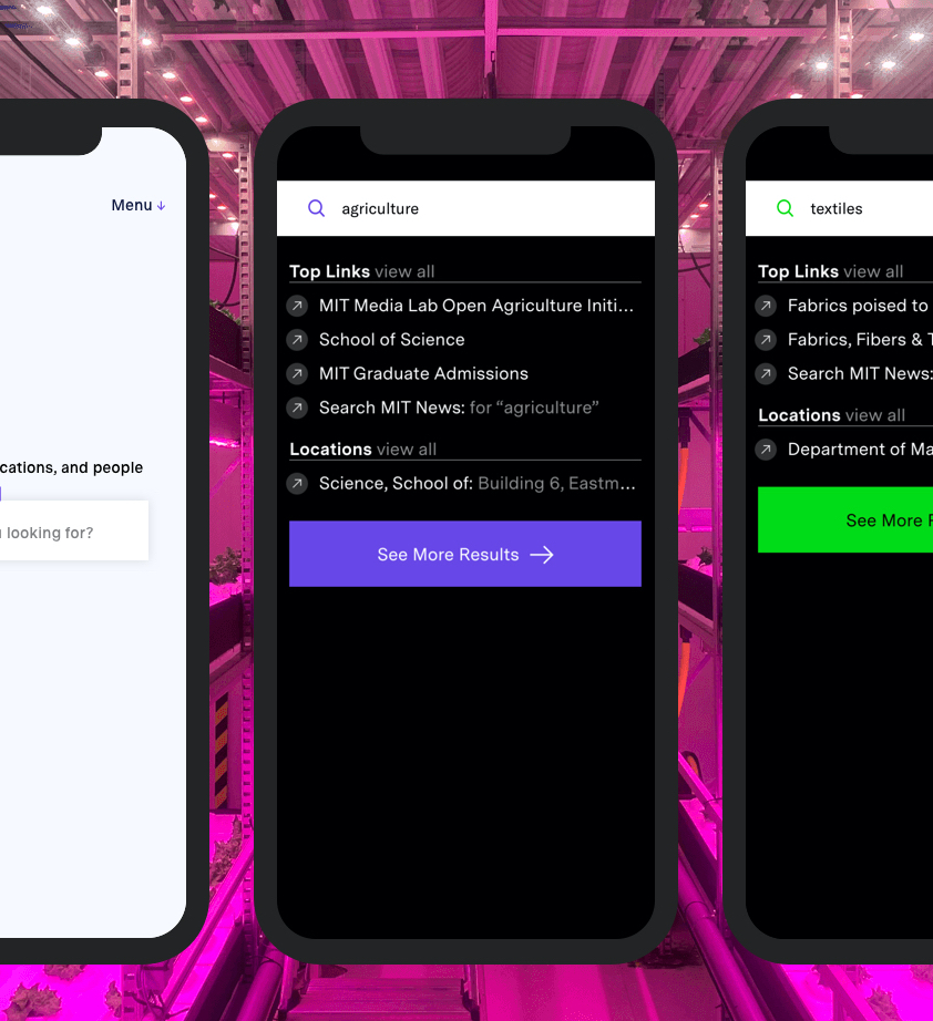
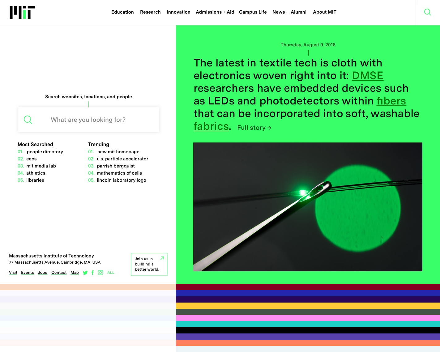
Start with our smart search—the fastest way to find anything. Type a query, and enter search mode.
You’ll see people, locations and hand-picked suggestions from campus insiders. (Watch for easter eggs.)
All interfaces score high for accessibility. Even color combinations are optimized for legibility.
Search websites, locations, and people
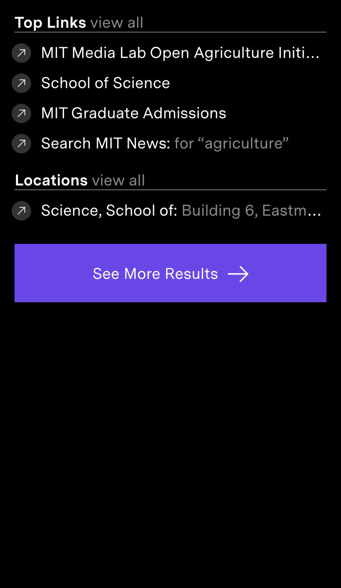
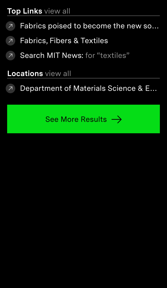




Start with our smart search—the fastest way to find anything. Type a query, and enter search mode.
You’ll see people, locations and hand-picked suggestions from campus insiders. (Watch for easter eggs.)
All interfaces score high for accessibility. Even color combinations are optimized for legibility.
Daily stories, called “spotlights,” cover everything from Nobel Prizes to quirky moments on campus.
Spotlights showcase MIT’s community of diverse innovators, revealing MIT from a different angle every day. This micro-story format is useful, too. Inline links provide topical navigation to prompt deeper exploration. Want more? The spotlight archive goes back to 2003.
We started with data from user intercept surveys and a new analytics rollup account. We found problems with information integrity, workflow, and critical gaps across the domain. But data alone wasn't enough.
So we took a totally different approach to user interviews. In addition to typical stakeholder discussions, we showed up on campus for several rounds of game-like, guerilla style workshops in MIT’s “infinite corridor.” This was the only way we could access and incorporate the perspective of real students and busy faculty. How does the community see MIT from the inside? What are their stories? What would they choose to share with the world? In addition to being a community of high achievers, MIT has a warm and fuzzy side that isn’t always visible from the outside.
During several rounds of user testing we observed that about half of all first time users start by browsing, using standard navigation to fulfill information gathering tasks. So beyond the homepage and search, we developed a suite of top level pages to support user goals. We restructured, redesigned and defined new language for these pages that reflect MIT’s unique offerings, position and personality. They’re as useful as they are inspiring.
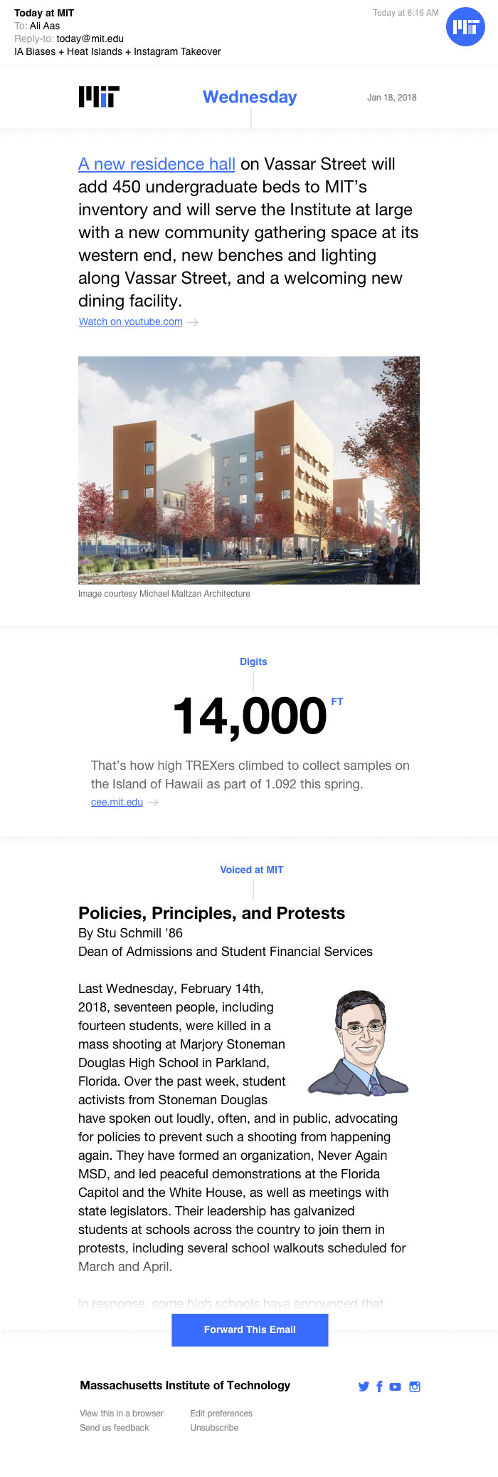
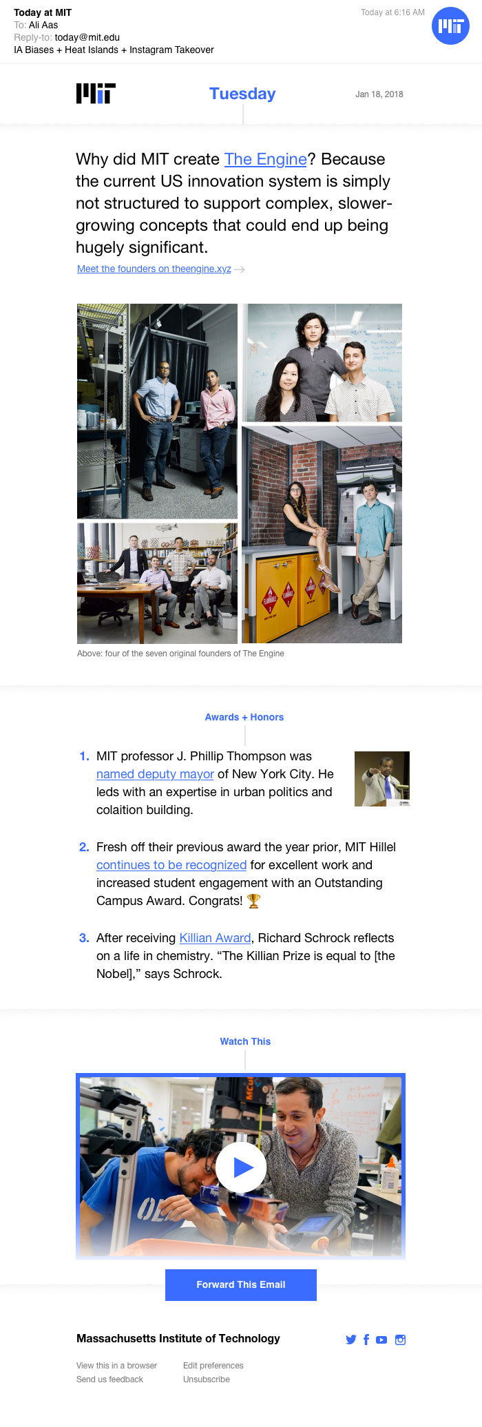
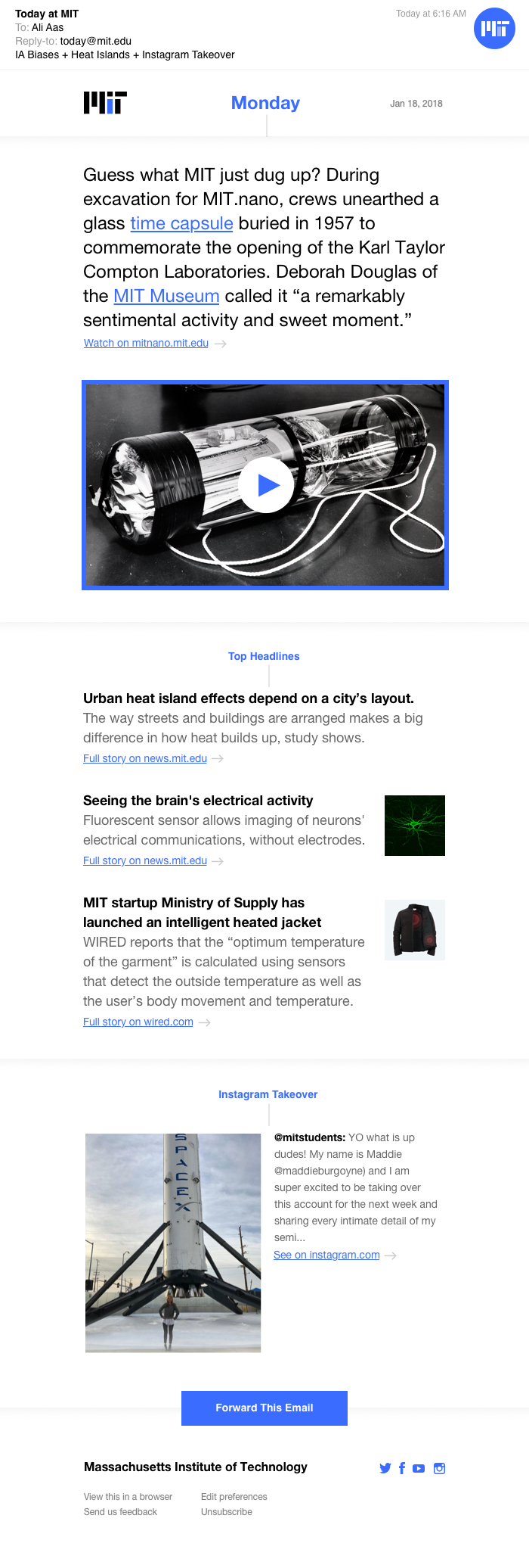
In the course of our work we came to understand that insiders value the spotlight and news, too, but they rarely visit the homepage to find them. At the same time, they continue to rely on email as a primary way to stay in sync with peers. This prompted us to develop a new product: MIT Daily. Inspired by The Download, which we invented with MIT Technology Review, this newsletter delivers the spotlight and highlights from news and social media to community inboxes every day, building a deeper sense of connection within MIT. It’s the perfect compliment to the homepage and top level experience.
