
Modern Elder Academy: A redesign that makes midlife something to aspire to
Work
Turning spirits into love and goodness
When Tito’s Handmade Vodka reached out to us, our creative director and principal, Tito Bottitta, replied immediately: This is the email I’ve been waiting for. It turned out we had a lot more in common with Tito’s Handmade Vodka than just an in-house Tito, and before we knew it we were on a plane to Austin, Texas.
Tito’s isn’t your typical vodka brand. They consider themselves a philanthropic company that happens to make vodka. Tito’s did over 6,000 charity events last year. All online store proceeds go to nonprofits. They support disaster relief across the country. They work with Emancipet to make veterinary care affordable for pet owners. The list of good deeds goes on and on. Tito Beveridge (yes, that’s his real name) is the best person to tell you about why they give back.
Our challenge was to design and build a new digital home for Tito’s Handmade Vodka. It needed to be a place for the Tito’s team to share all of their amazing stories, and it needed to stay true to the fun, quirky, warm brand that is distinctly Tito’s.
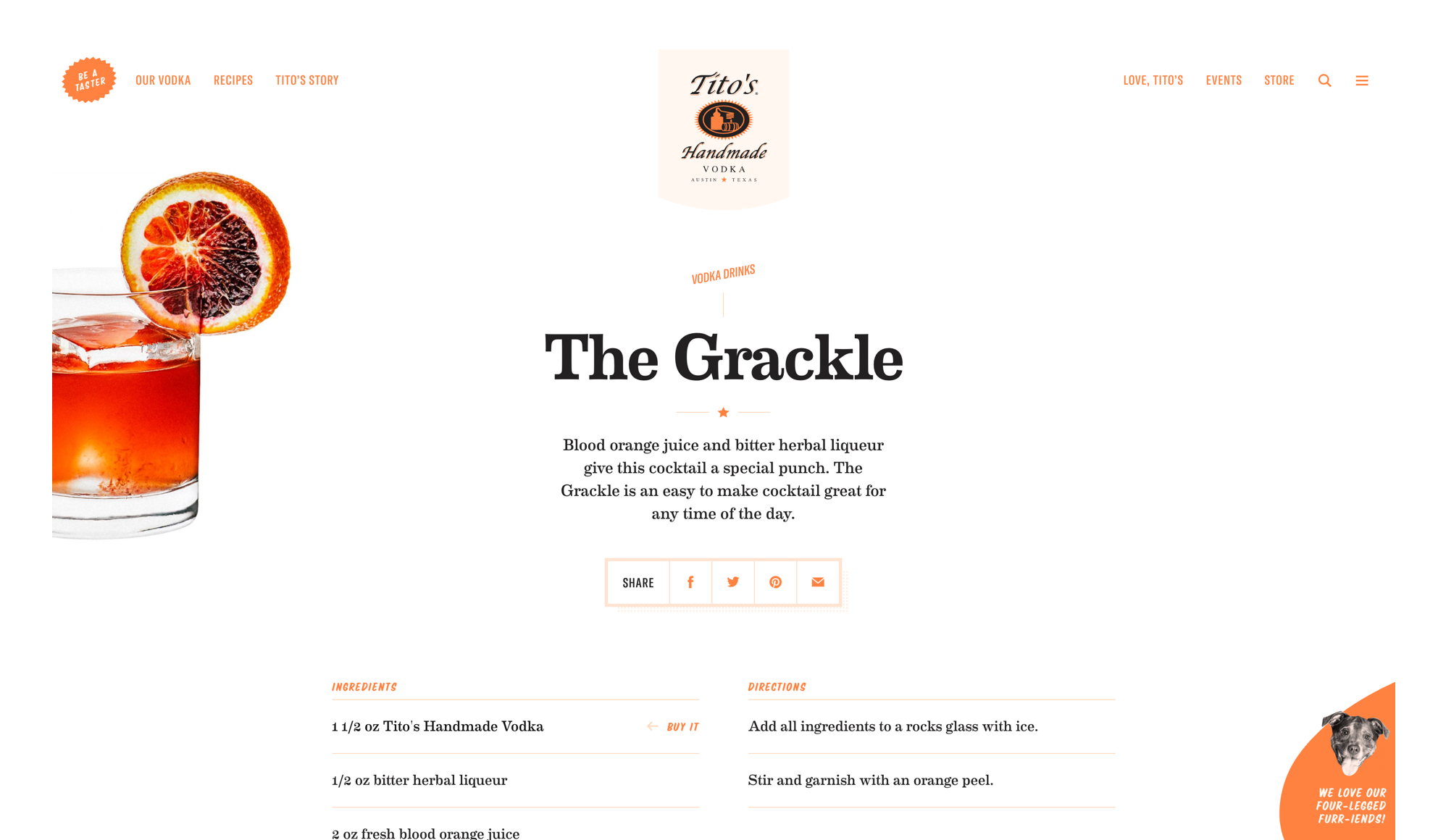
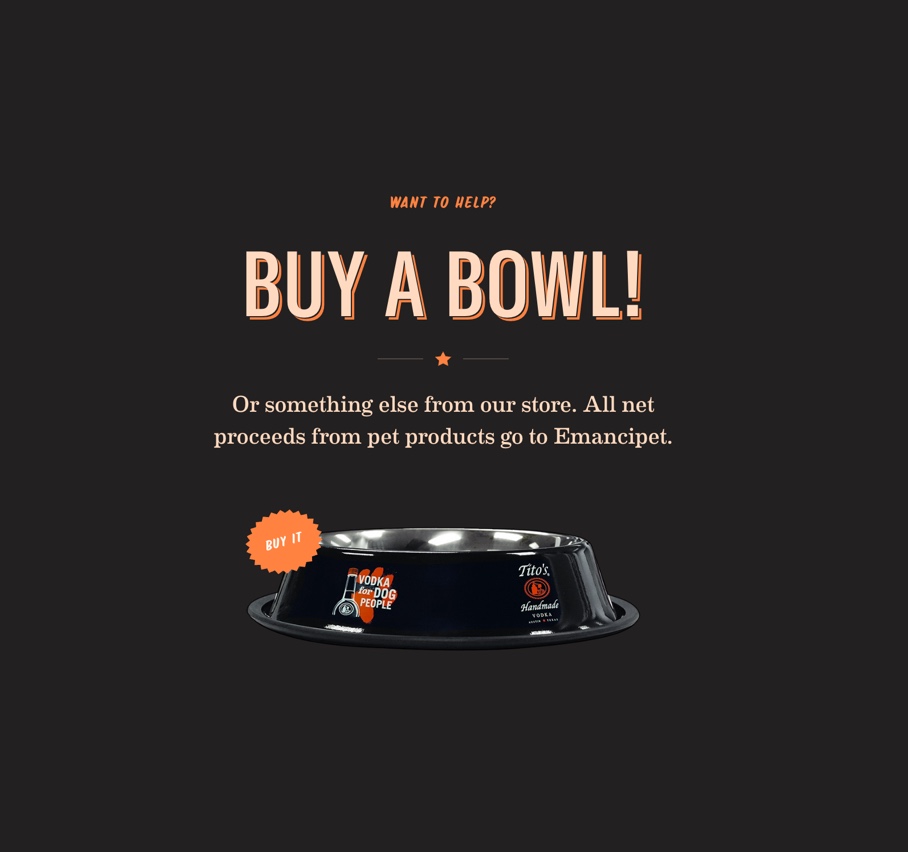

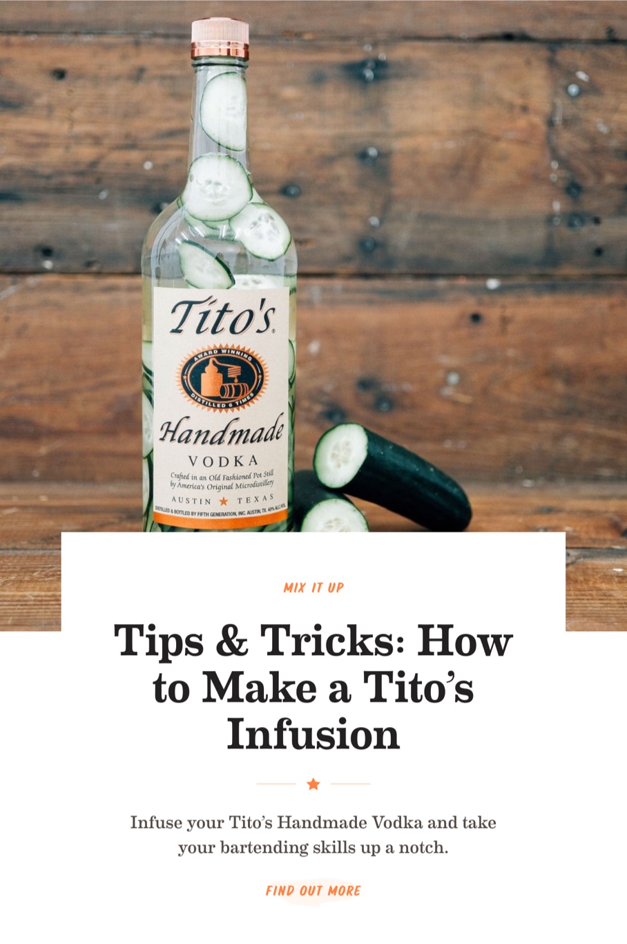
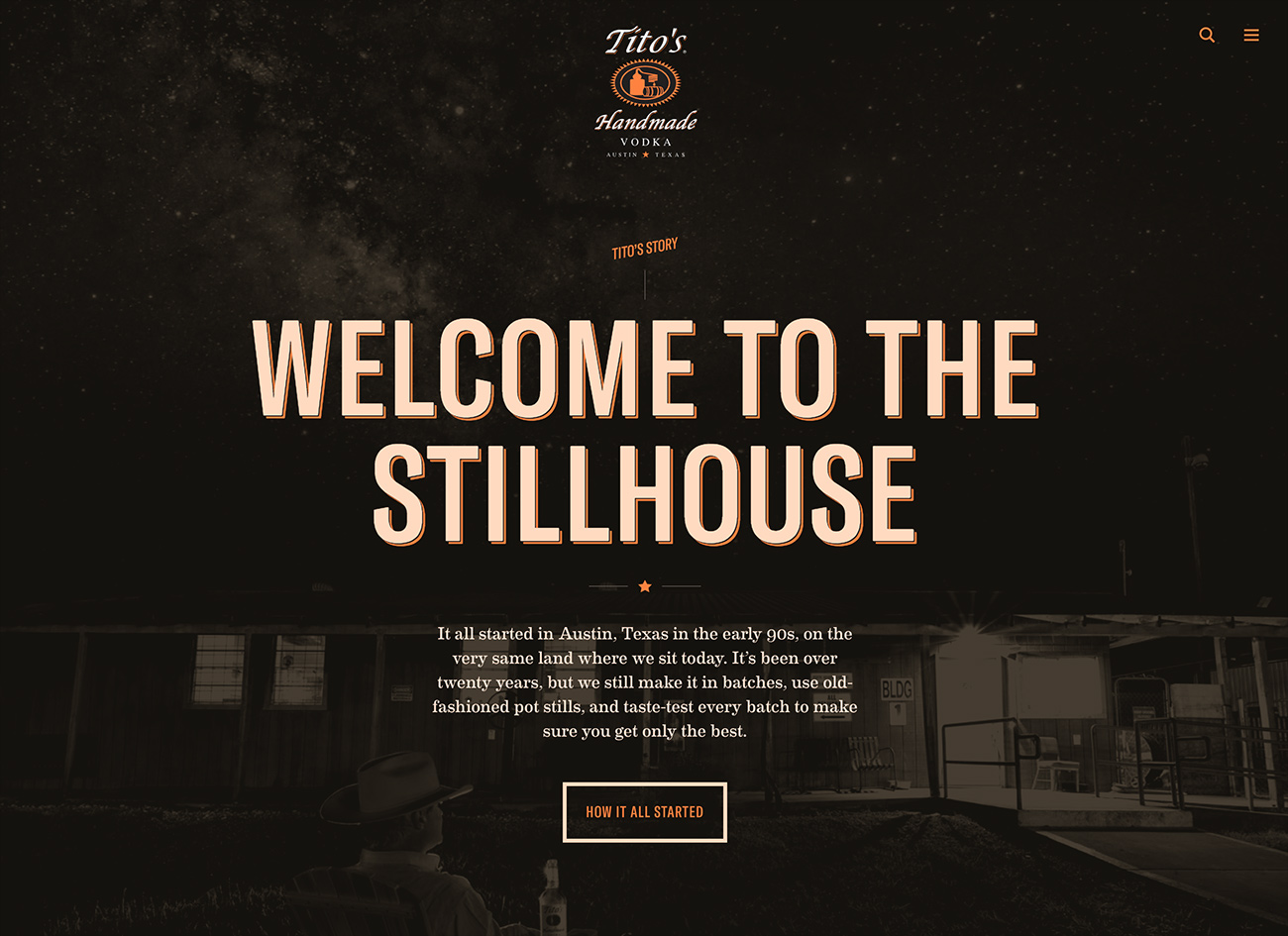
Tito’s has a home-spun vibe that we didn’t want to lose (the logo was done by Tito himself). Our design needed to feel like a natural progression of the brand—one that complemented unchanging elements like the logo. To do that, we started with a few small but important upgrades to the type and color palette.


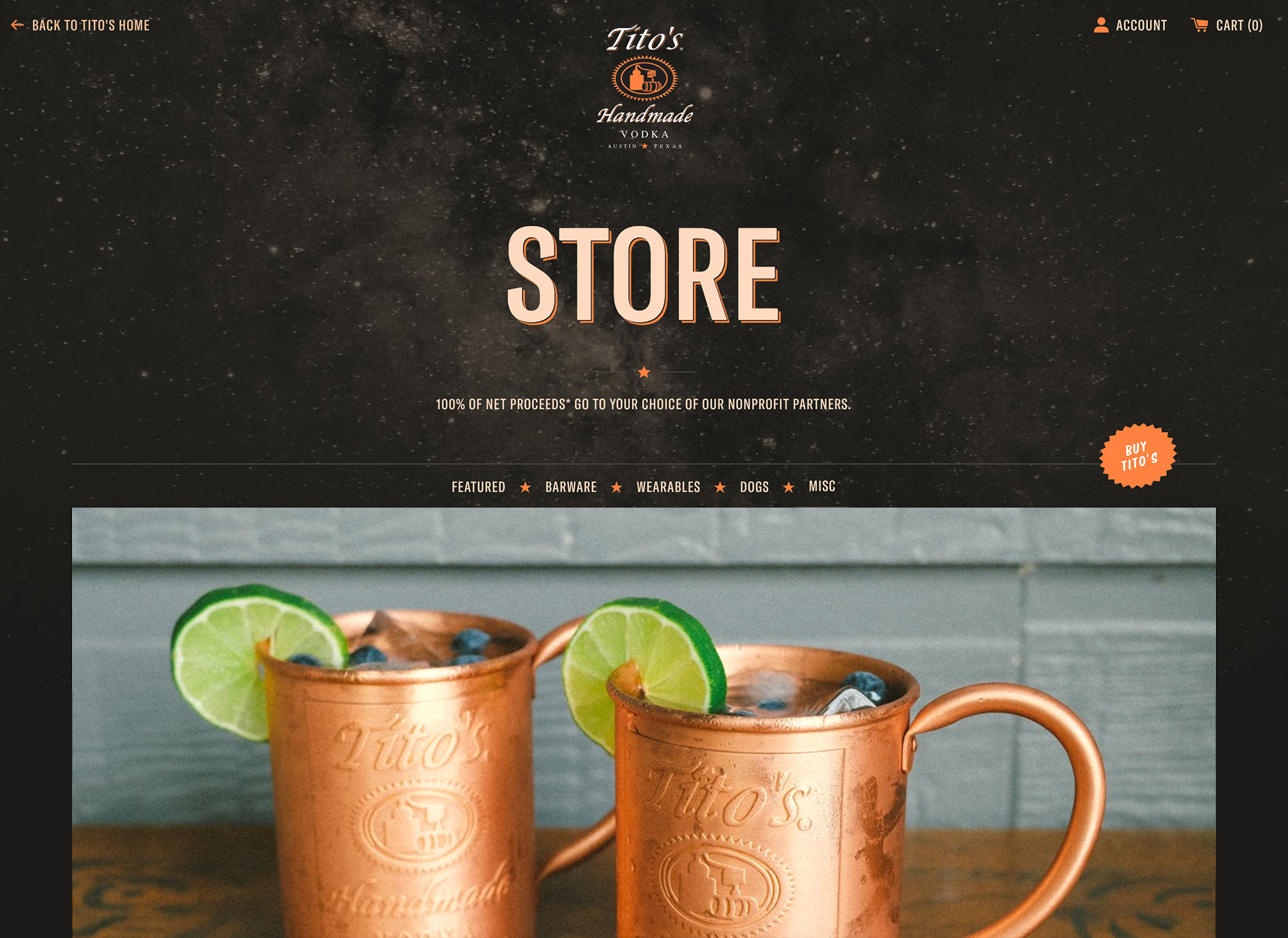
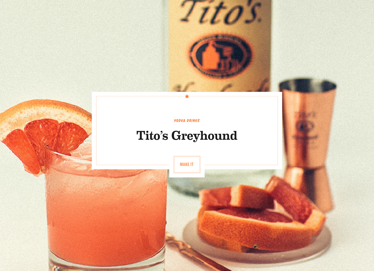
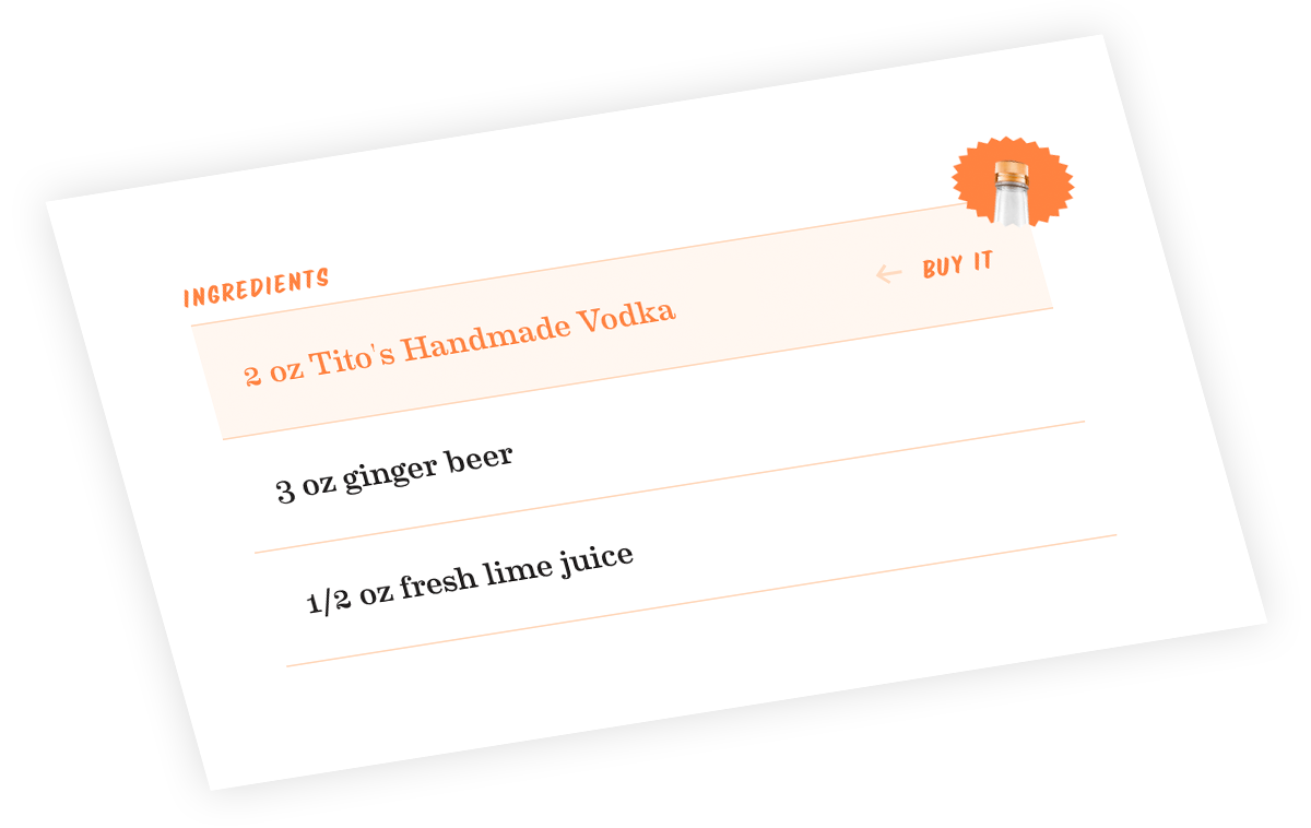
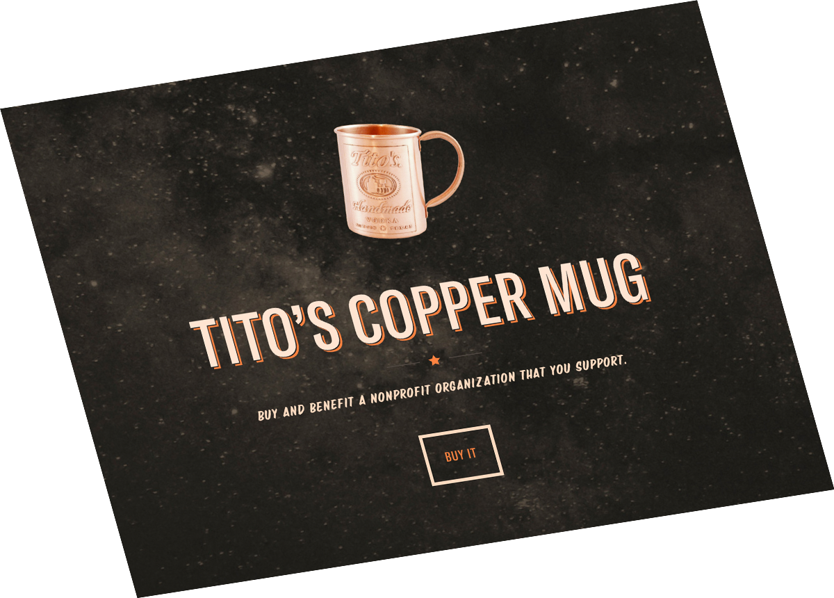
The Tito’s site brings in a lot of visitors through its cocktail and infusion recipes. Our goal was to to establish a stronger relationship between recipe content and store content, so we built a system that allows any part of a recipe to be potentially purchasable. That means you can buy the copper mug and the vodka for your American Mule directly from the recipe. Previously, this content was isolated in separate areas of the site.
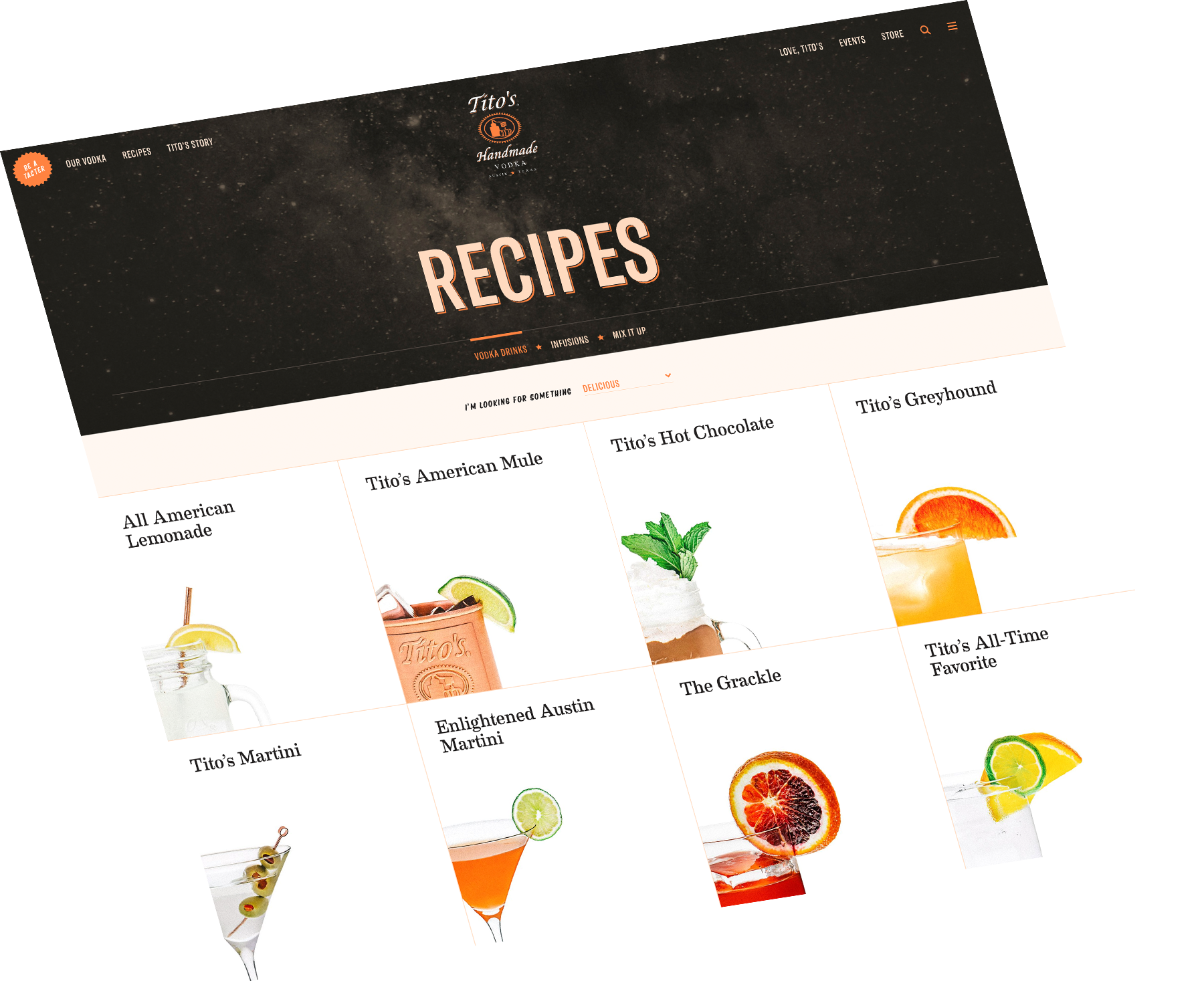
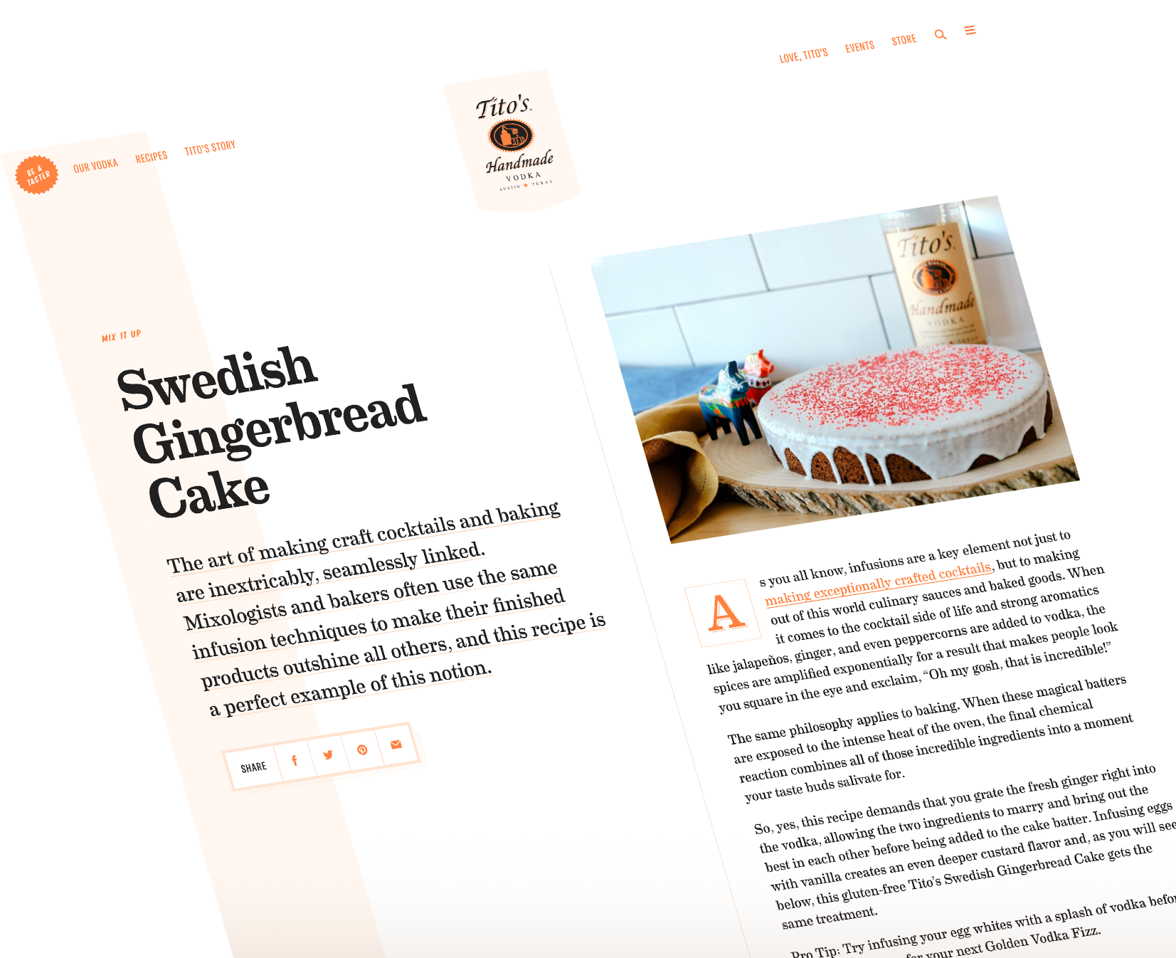

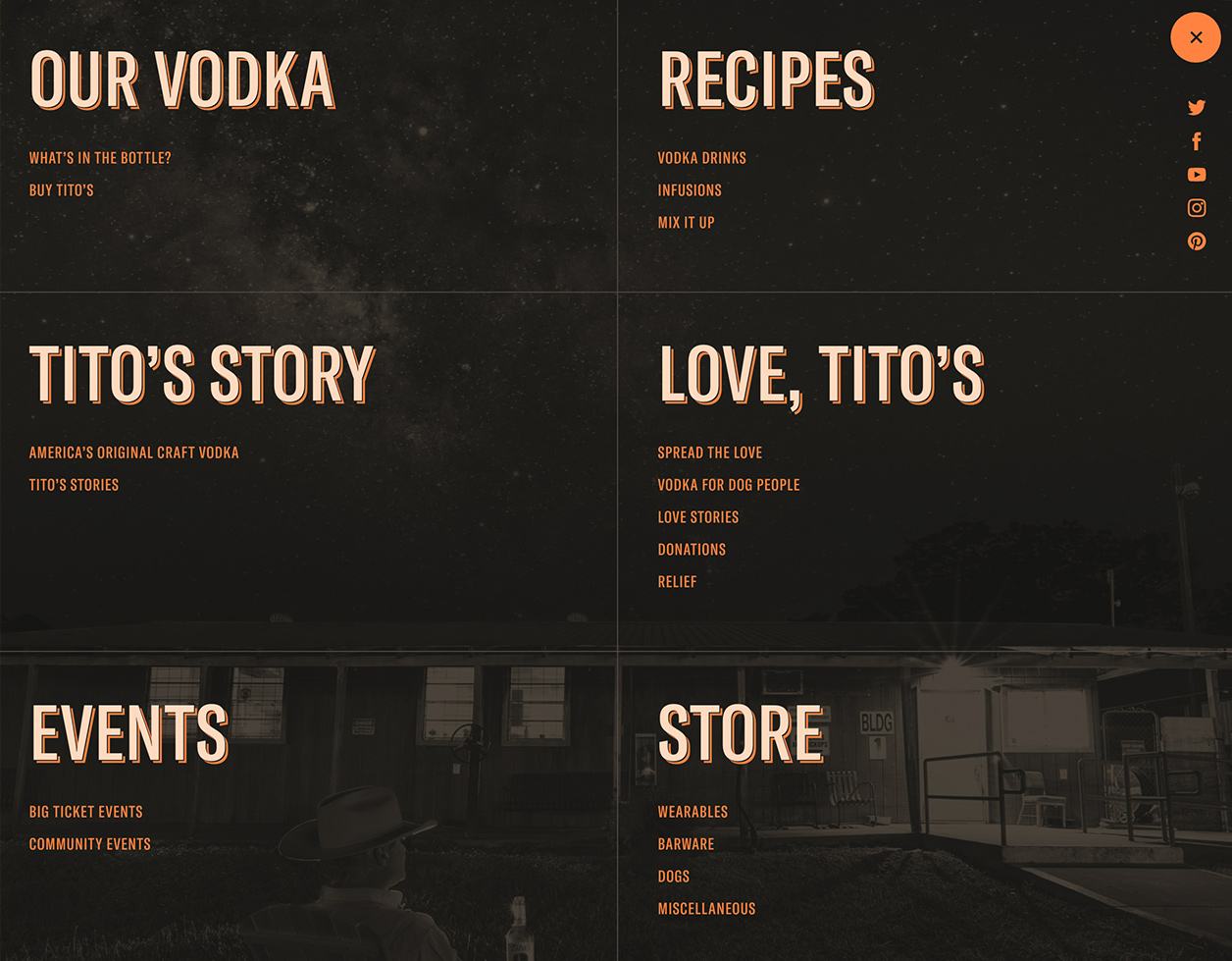
Tito’s has a lot going on—from events to dog charities to the vodka itself. We knew people were often grabbing a recipe from the site and leaving, and wondered how we could guide them to other areas of the site. We wanted people to know about Tito’s philanthropic work and about the backstory of the brand. Almost every page has a fixed tease that serves as a path to another corner of the Tito’s universe. We also cleaned up navigation and built on-site search to help users move seamlessly through the site.

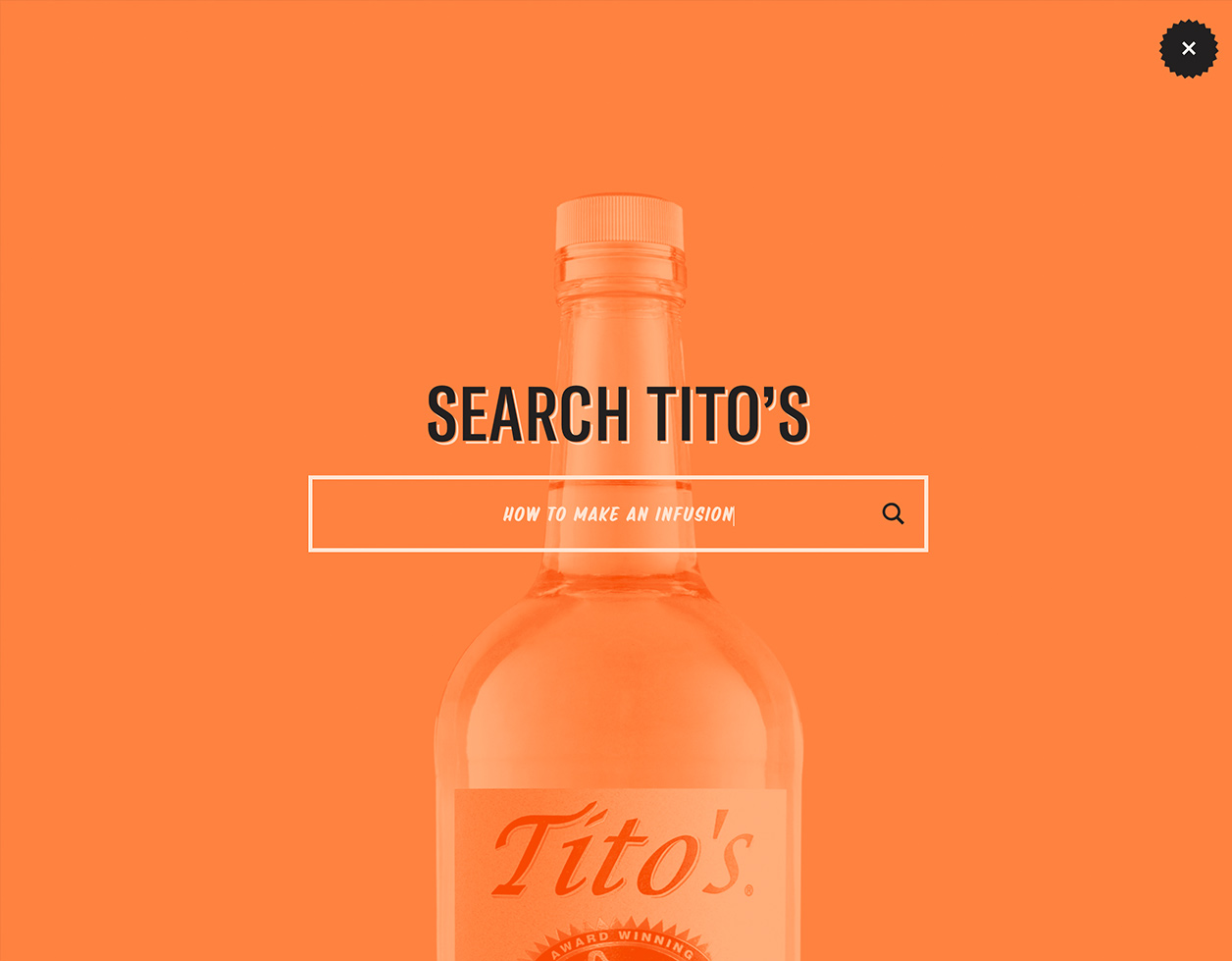
After the initial launch of titosvodka.com, Upstatement’s Growth Team took the reins and set to work enhancing the site. One of our larger tasks was to rebuild Tito’s online store using Shopify. We helped simplify their e‑commerce workflow to make space for more creative opportunities.
