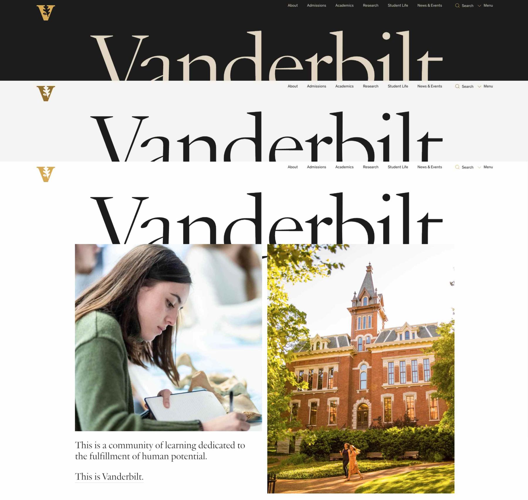
The new design system unifies the main public-facing web properties and the new university-wide intranet. At the same time, we created unique elements that delineate between the experiences. This means a more impactful and bold voice for prospects and deeper support for the current community.
The comprehensive pattern library helps the school speak to external audiences across Vanderbilt’s many properties. From the homepage to admissions to individual programs and schools — they needed a rich system that brought these together. Building a library of components isn’t always enough. We’ve seen even the most carefully designed systems fall apart during real-world use. That’s why we stress-tested each component in a series of prototypes utilizing real content and constraints. These prototypes gave Vanderbilt’s teams clear examples to models for similar pages — and ensured the system could sustain the intentional evolution of a large website like vanderbilt.edu.

The design system showcases how components and component groups need to function together to make any interface offer a context-specific balance of utility and emotion. Our series of prototypes are where we put these components to the test, demonstrating how different components fit together and expressing content strategy through real-life use cases. This empowered them with the tools they need today and can grow with them as their needs evolve into the future.
From a design perspective, we wanted to provide their team with a wide range of tools that could support any scenario. The result is a spectrum of pages — from a highly functional page to describe an academic program to a super visual article experience designed to introduce prospects to the city of Nashville.
Amazing partnership, insights, and execution.
Steve Ertel Vice Chancellor for Communications and Marketing![]()
Flexibility was also important to individual schools, colleges, and offices who wanted to work within our consistent visual system, while also expressing the unique personality and mission of their area. Our system allows these groups to use distinct landing pages that set them apart while also giving them powerful tools that enable them to leverage on tools and content that already exists — like pulling in a feed of stories or a live program search. We built each page to work in both dark and light color themes to offer even more variety.


One of the most rewarding outcomes of the project was the relationship we built with Vanderbilt’s team. We collaborated with the core team on everything from stakeholder management to content development and presented all of our work as a unified group. Every decision was driven by thorough collaborative workshops, interviews, audience surveys, user testing, and other research conducted throughout the course of the project.
We didn’t build just a website, but a digital ecosystem that can be used to evolve their web presence for years to come. We’re so excited to see how it grows along with them.


