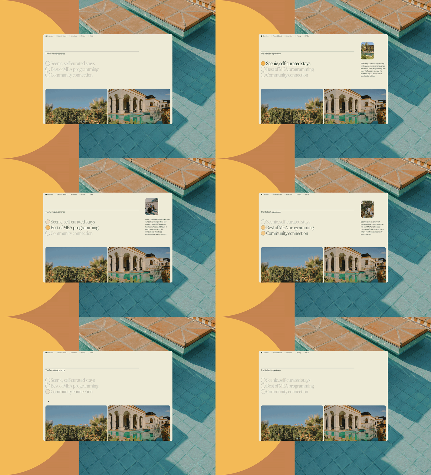
For many of us, it’s hard to imagine navigating the internet without being able to see. But an estimated 295 million people globally live with a vision impairment, and they need to be able to get around online. They aren’t the only ones who will need to rely on assistive technology at some point in their lives; 1 in 6 people worldwide experience disability. Just recently, one of Upstatement's engineers made heavy use of voice dictation to write text and use the web during a wrist injury. An unexpected injury that forces one to use often-overlooked assistive tools can be a reality check. So can a lawsuit.
In the United States, ADA-related lawsuits have been increasing every year and are targeting businesses of all sizes, highlighting how important it is to provide accessible online content. Many of the companies whose websites were targeted, including Domino’s, failed to provide alternative text. Alt text is a core part of web accessibility: It’s simply a description of an image for those who can’t see it. It’s first on the list of Web Content Accessibility Guidelines and is required for Level A conformance, the minimum level of accessibility compliance. And because browsers and search engines can’t see images, alt text also plays an important role in SEO, improving search results rankings. It’s clearly beneficial for everyone to ensure that alt text best practices are in place. It’s achievable for every organization, but there are a few things to keep in mind. This is how we approach writing alt text at Upstatement.
Experiencing alt text
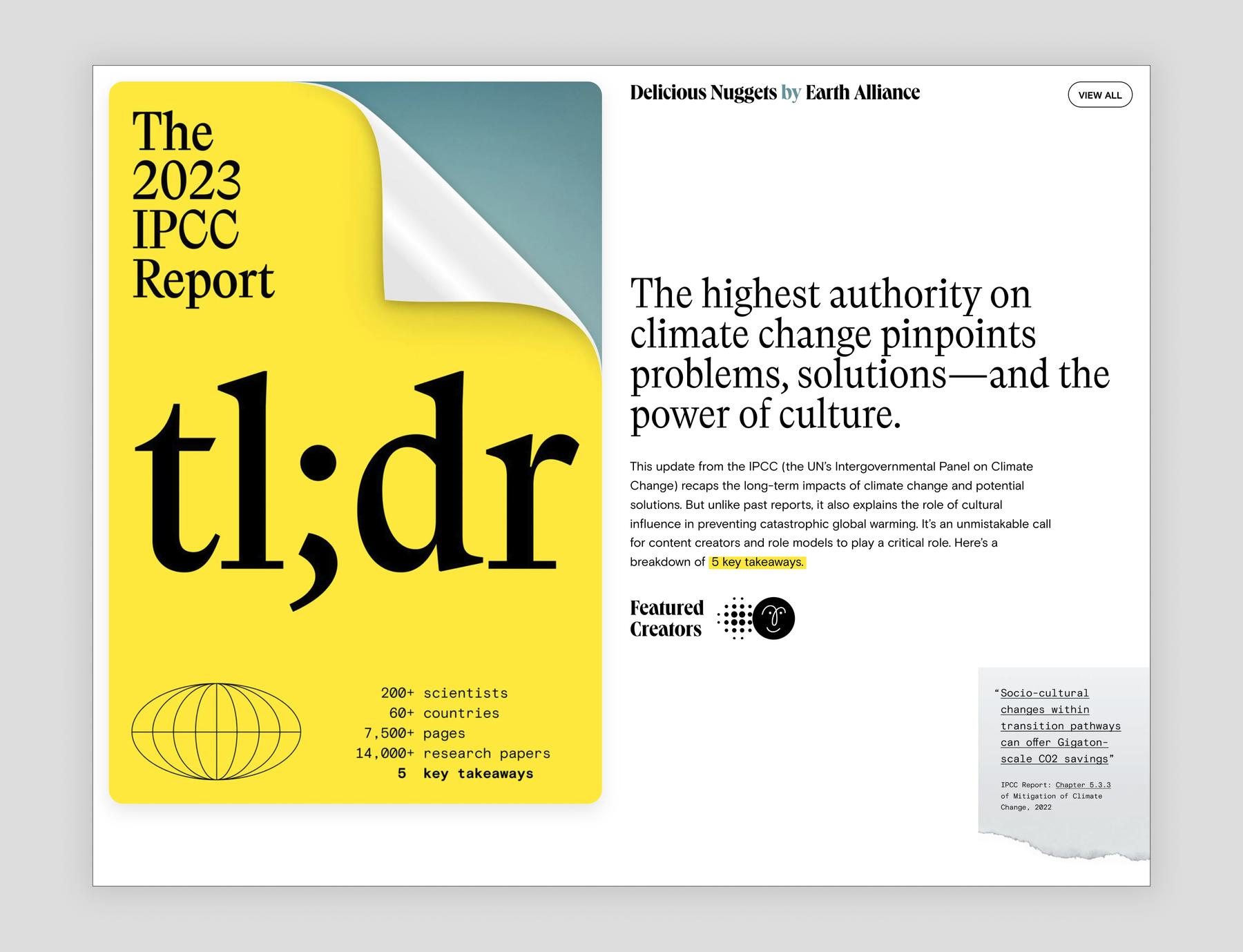
First, if you don’t personally rely on alt text, it’s helpful to familiarize yourself with the typical user experience. A third of all home pages on the web have images with questionable or missing alt text, according to the WebAIM Million: The 2024 report on the accessibility of the top 1,000,000 home pages. While a sighted user will see something like the image above when visiting a page, assistive technology might replace the images with the text below if the page has bad or missing alternative text.
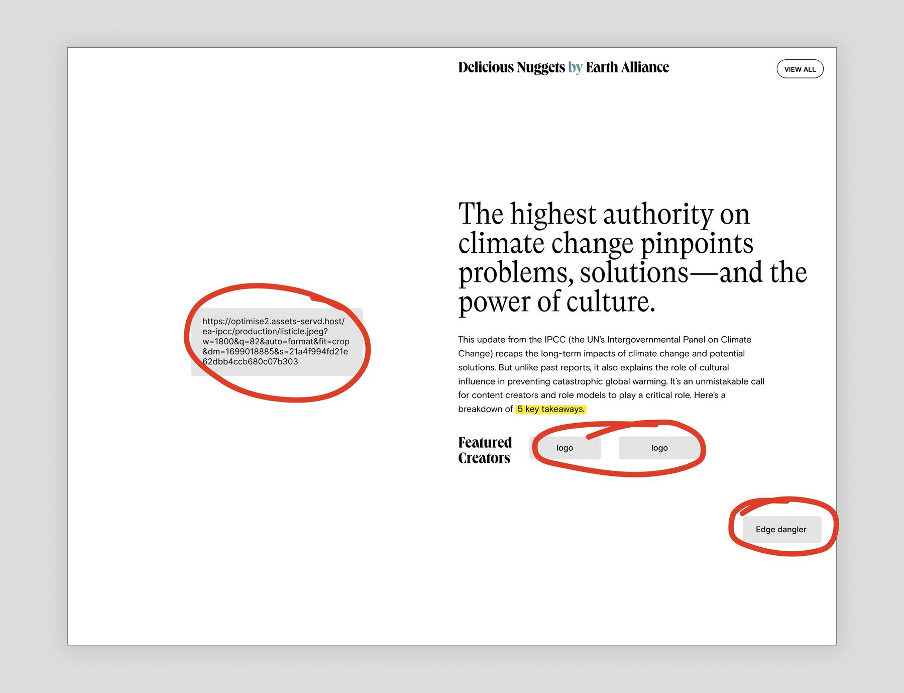
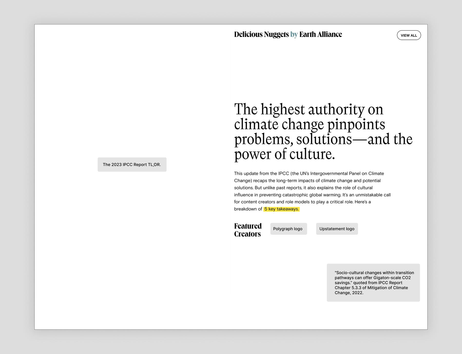
Long file names, repeated unhelpful descriptions (“logo”), and generic internal terms (“edge dangler”) are common occurrences in non-compliant alt text. This is confusing for users and can result in them completely missing important content (such as what the page is about, who the creators are, or where the link at the bottom right sends you). Luckily, our friends at Earth Alliance have clear and thorough alt text in place, as you can see below:
How to write good alt text
Typically, images are classified as either informative or decorative.
Informative images are the most common. They convey meaningful information, are considered an integral part of the page’s content, and require an alternative description so that non-sighted users can access the content.
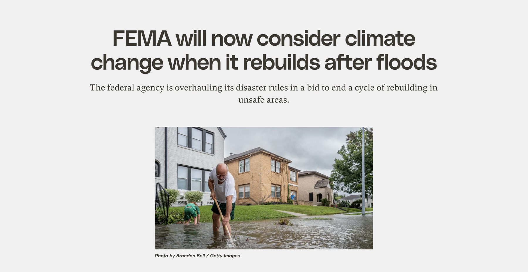
The image below is informative. Similar to a detailed caption, well written alt text might draw information from the article and read something like this: “Jack Reyna and his son work to drain floodwater in their neighborhood of Houston, Texas, after Hurricane Beryl swept through the area on July 8, 2024.”
Decorative images don’t convey meaningful information: they’re purely aesthetic elements, so they don’t need alternative text. Assistive technology focuses on the content of the page and doesn’t communicate colors or other visual styles. Judiciously omitting alt text for decorative elements helps streamline the screen reader user experience.
A rule of thumb for differentiating decorative images from informative images is to ask whether removing the image would remove useful context. For example, the sparkles in the background on the image below aren’t referencing anything from the article, and they don’t add any new information. They help set a stylistic tone and support the article’s topic of creativity, but they aren’t illustrating anything specific.
So can you just skip the alt text then? Not exactly. An important technical distinction to make with decorative images is that having empty alt text is not the same as having missing alt text. You have to designate the image as decorative rather than just skipping over it altogether.
The raw html of an image with alt text looks something like:
<img src="<https://upstatement.com/image.jpg>" alt="A dog running on a beach." />One could remove the alt attribute altogether, so the image html reads:
<img src="<https://upstatement.com/image.jpg>" />But that isn’t ideal because assistive technology will interpret it as the author having forgotten to include an alternative description. So, in an attempt to be helpful, the assistive technology will usually read the entire file name aloud. The best thing to do is to include an empty alt attribute, like this:
<img src="<https://upstatement.com/image.jpg>" alt />Assistive tech will understand this to mean that the image has explicitly been marked as decorative, so screen readers will ignore it and users won’t have to slog through file names.
Luckily for editors in content management systems, this distinction is usually handled in code. Generally, we can safely assume that leaving alt text blank in the CMS will generate the correct html with an empty alt attribute and the images will be understood as decorative.
Now that we know which images need alt text, let’s dig a little deeper into how to write alt text that’s useful.
Keep it literal
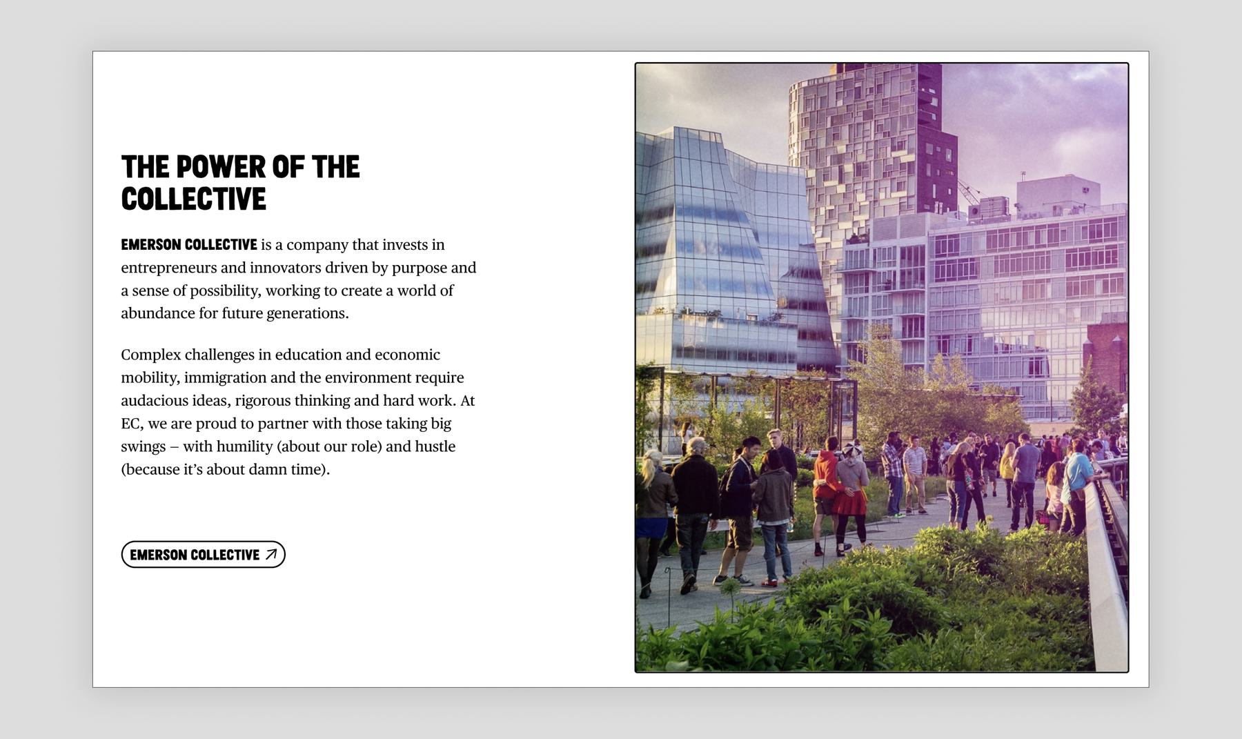
Alt text should be an objective and literal description of an image. It’s not the right place for marketing language, interpretation of an image, or poetry. For example, for the image below, strong alt text would be something like, “People walking on the High Line in NYC with high-rise buildings in the background.” It would be counterproductive and repetitive to have alt text like: “Emerson Collective is a company that invests in entrepreneurs and innovators driven by purpose and a sense of possibility.” That’s text pulled from the article alongside the photo, so the user would have already heard it. Even if it wasn’t on the page already, marketing language like this isn’t good alt text: while that’s the concept the image is illustrating, it’s not describing the image itself.
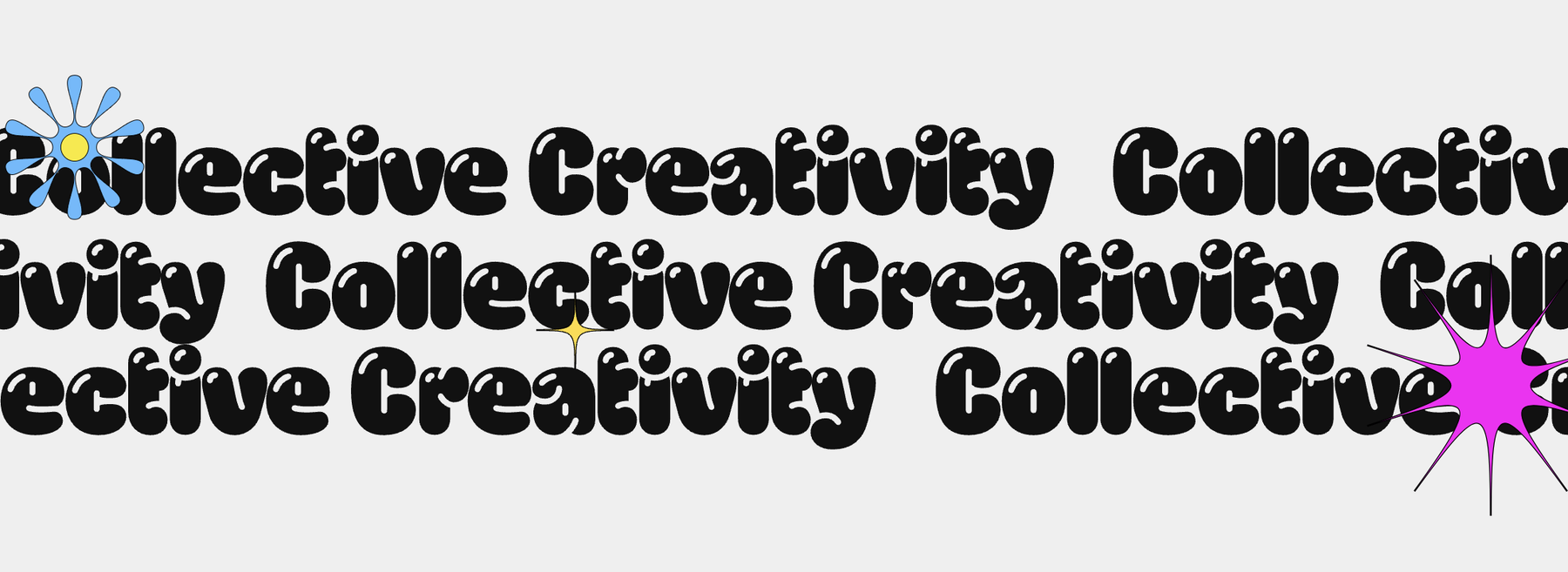
If the image contains text that is relevant to the page, it’s usually a good idea to include it in the alt text. Details on the visual style can usually be excluded, unless they contain important information. In the image below for example, the fact that the words are repeated and written in a bubbly font is more a stylistic note than useful information, so just “Collective Creativity” would be a good description.
Keep it concise
Too much detail can be confusing and make a site less accessible. Screen readers don’t provide a way to skip through the alt text for images, so users have to listen to the whole description to know if it contains useful information for them. One or two short sentences is a good standard to aim for.
If there’s too much information in the image for all of it to be included in the alt text, try to summarize it or focus on key takeaways instead. When writing alt text for this line chart about carbon emissions by year, it would be more helpful to mention trends and key numbers rather than enumerating data points year by year: “Line chart with an increase of 1.1° celsius between 2011 and 2020 and a projected 5° celsius increase by 2100 if the trend continues. Under 2° celsius is necessary and 1.5° celsius is the ideal target.”
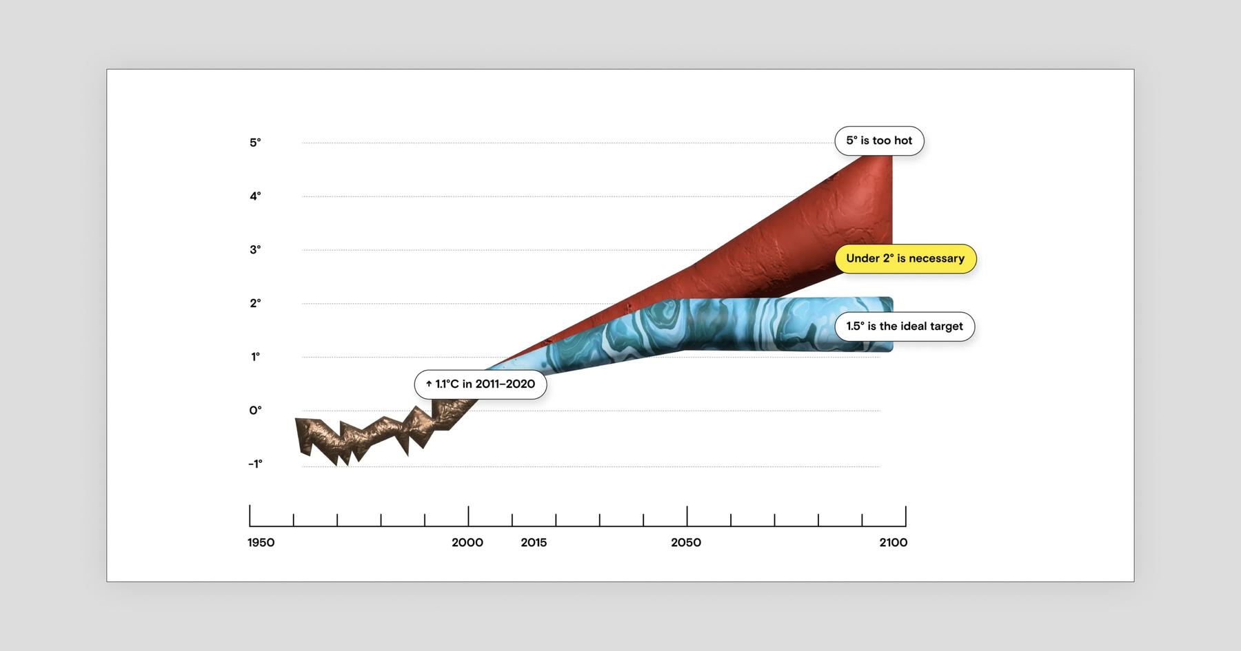
Users might be curious about the value of a specific data point in an image chart, but alternative text is not the right place to add this type of detailed information. Instead, add the data in a table format under the image or on a linked separate page.
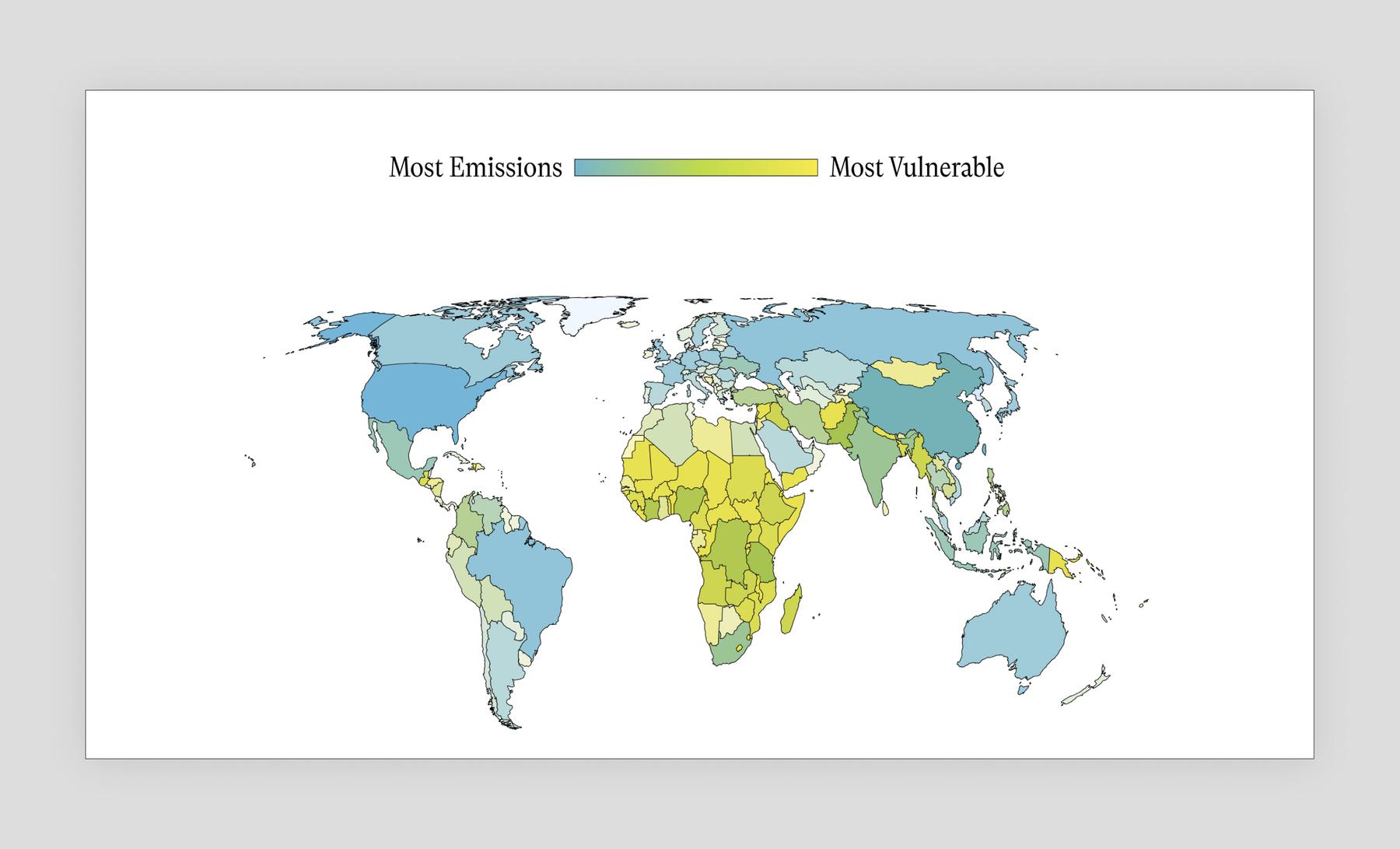
Keeping the user’s perspective top of mind is key. Information not relevant to non-sighted users should be left out. For example in a choropleth map, it doesn’t matter what color is associated with a certain country; what matters is what the color means. In the image below, alt text that describes Africa as being green and North America being blue wouldn’t be helpful or relevant. Instead, synthesize the information: “Map of the world with countries in North America, South America, Europe, East Asia, and Oceania having the most emissions, and countries in Central America, Africa, the Middle East, and South Asia being the most vulnerable.”
Keep it useful
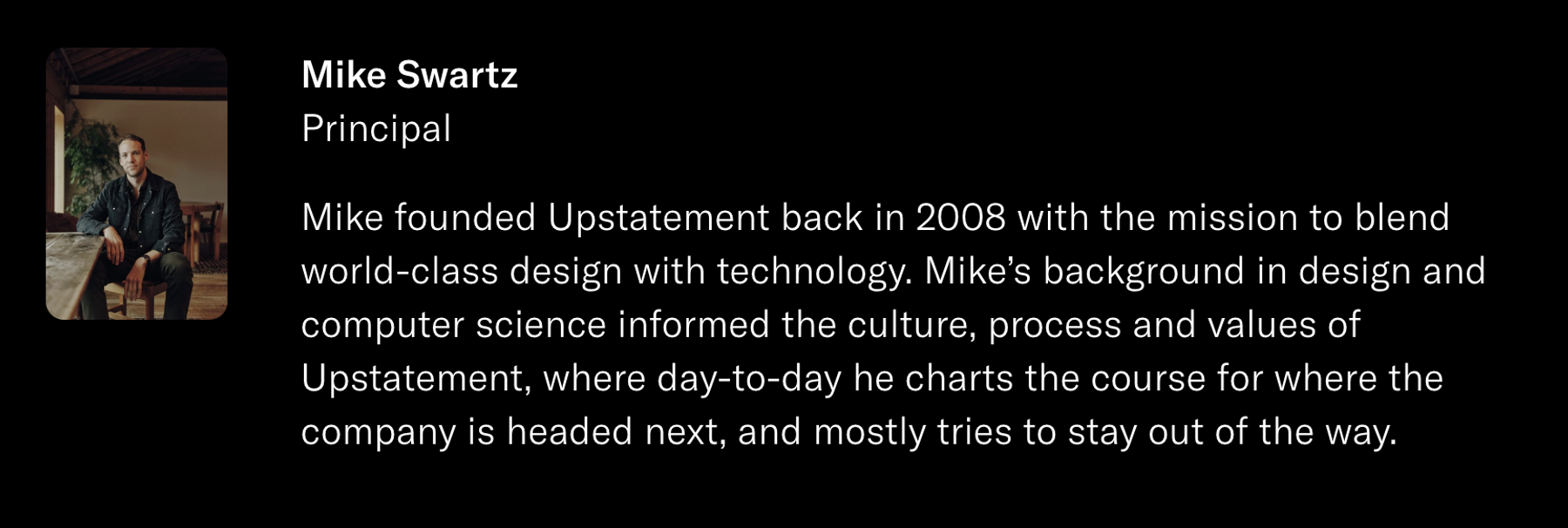
In an effort to be thorough, it’s easy to write alt text that creates a redundant and lengthy experience. Skip information that’s already mentioned in surrounding text, and remember that no alt text at all can be a valid choice. For instance, as seen below, when there’s a headshot on a page, the subject’s name is typically included in plain text next to it. Repeating it in the alt text of the headshot would not be helpful, so it can be left empty.
Avoid mentioning identities (gender, race, age, etc.) or disabilities unless relevant to the context. And unless you know for sure how a person identifies, use gender-neutral descriptions to avoid misgendering someone or using the incorrect pronouns. Defaulting to gender-neutral descriptions also helps avoid subconscious biases, such as labeling an image of a female-presenting doctor as “female doctor” but a male-presenting one as “doctor.” In the image below, instead of saying, “A woman reviewing petri dishes and recording data,” you could refer to them as a researcher or a person.

Grammar matters
Another simple guideline is to use proper punctuation and end the alt text with a period when it’s a complete sentence. Punctuation helps assistive technology read aloud in a more natural way.
It might feel natural to start alt text with “Image of…” but it’s best to avoid that type of introductory language. This is something screen readers add automatically, so users would hear, “Image, Image of…”
Context matters
Images on a site aren’t encountered in isolation; they’re part of a bigger experience. There will always be something left out of alt text descriptions, but that’s okay. The best alternative text prioritizes the details that are crucial to the bigger picture.
This means it’s possible for the same image to have completely different alt text when used in different contexts. For example, if the image below appeared in an article about the decline of tourism in Yuanlin, the alternative text would probably look something like: “Empty Yuanlin station platform in the middle of the day.”

But if it appeared in an article about photography, “Symmetrical film photograph of Yuanlin station platform featuring different tints of green,” would be a better description. Context like this is one of the reasons alt text still requires a human touch, despite the many AI products hitting the market that are designed to automate alt text. They’re getting better by the day, but at Upstatement we’ve found that they’re more helpful tools than fully autonomous solutions.
Even done manually, alt text is a simple step that has a major impact for both users and organizations. Get in touch with any questions, or check out w3.org to keep up with the latest progress. And if you’re using a screen reader to read this, let us know how we did on our alt text!


