When we build a new CMS for a client, we don’t just view it as a means to an end—something they need to manage their new website. We see a well-built CMS as an important tool for content editors in achieving the strategic goals of the experience we’re building together.
That’s why we push content editors to get in the CMS and test it out early and often. As we build out new features that are powered by the CMS, we ask editors to enter real content so we can see how it performs in real-world scenarios. We look for how editors interact with the CMS from a usability standpoint, and also for the kind of content the CMS elicits—all with the goal of making it effortless to create content in service of our overall strategy. And because we build in an iterative way, we can incorporate feedback and updates as we go, ensuring we’re working towards a system that truly supports editors.
Here are the key things we look for when we test our CMS builds with editors.
Does the CMS make sense? Is it easy to use?
First we want to check on basic usability. Where are editors getting tripped up? Do the fields and options make sense? Do editors know what each field is asking of them? Where could we update language, choose a different field type, or improve helper text to make the content process more intuitive?
We like to keep documentation as close to the editor as possible and strive to limit the guesswork that’s often involved in producing content in a CMS. By adding helper text within the CMS and building features that make it easier to get the content right on the first try, we lower the burden on editors and help them produce better content.
Here’s an example from a project we worked on with the Arnold Arboretum. We wanted to empower their content editors to pinpoint unique attributes of plants that their audience might encounter in the landscape. We imagined an interface that allowed users to hover over highlighted parts of the plant and see a description.

We needed a way to ensure editors could pick specific spots on an image, and ensure the description would show up in the right spot no matter the aspect ratio. So our engineers decided to overlay the image with a grid once it was uploaded to the CMS. From there, editors could click to pinpoint the specific coordinates of the characteristic they wanted to highlight.

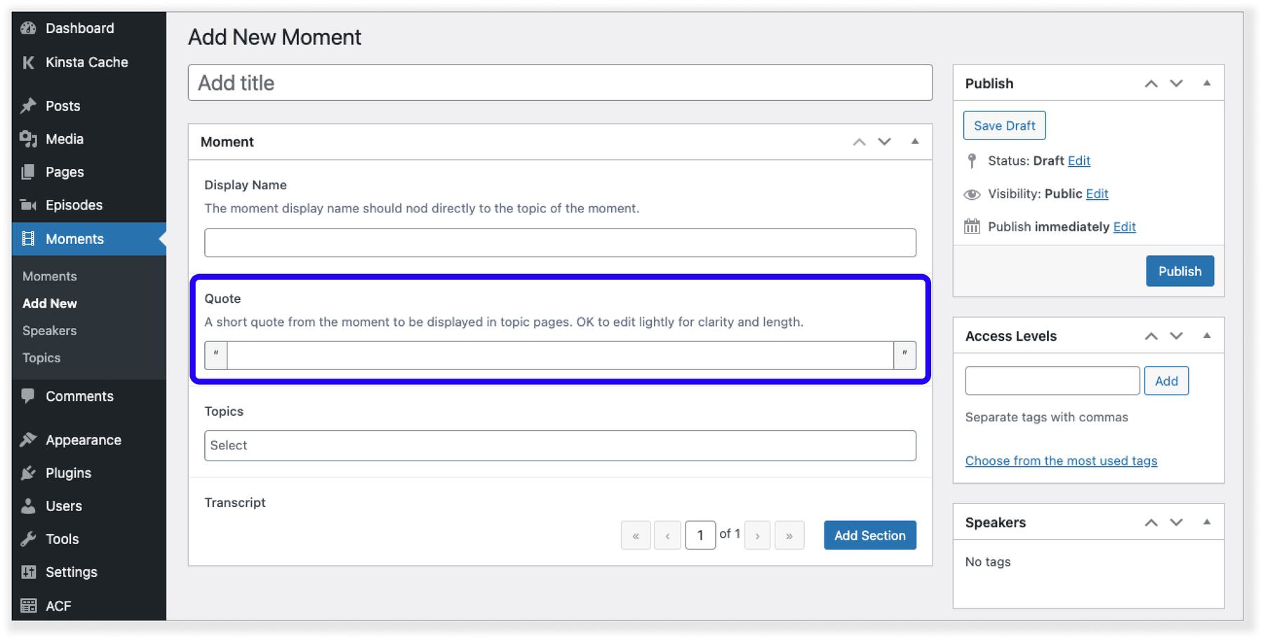
On another project, we needed to indicate to editors that they didn’t need to include quotation marks in the text of their pull quotes because we were adding it in the code. We could have just added a note in the helper text, but we know sometimes the helper text gets missed—and we didn’t want the site sprinkled with double quotation marks. To help ensure that didn’t happen, we added visible quotation marks on the text field to more clearly indicate that the quotation mark would be there on the front end and that editors shouldn’t include it in the CMS.

Does the content match the expectations of our design and strategy?
Sometimes the content that editors end up entering into the CMS doesn’t quite match up with what was anticipated in the designs. We take steps before the CMS build to catch these issues—like always designing with real content—but I’ve never worked on a CMS build where minor issues didn’t come up once editors were entering real content at scale.
When this happens, it’s usually the case that either the design needs to change or the content needs to change. And figuring out the best path forward usually means going back to the goals of the content you’re working on. Here are a couple of examples.
Example 1: Update the Design
Sometimes random words can end up in an early design and manage to make it through to build without anyone interrogating what those words are there to do. These are usually small moments that end up missed in the big picture, like an overline for a page title.
Once a content editors gets into the CMS, they might realize they don’t have words that make sense there. Stepping back, they might see that the words aren’t really doing much on the page—they don’t really serve the overall goals or help users better understand the content. This might be a case of needing to change the design—the overline isn’t necessary, so get rid of it.
Example 2: Update the Content
Other times, testing out the CMS shows the need to push the content so it’s more in line with what was originally imagined in the design process.
For example, say you’re an editor testing out a new content type. You enter all of the content and it goes smoothly, but when you preview the page, you realize things are all out of whack. Turns out you entered 500 characters where the design anticipated closer to 150 characters. Perhaps you were just copying and pasting content from your old website, and you realize that strategically it would be smart and more helpful for users if you cut down on the language. So you go back into the CMS and edit down the text. The essence is still there and it’s easier to understand. A win!
When we see this happen in testing, we like to also make sure the CMS is inviting the right kind of content. For example, was the field in question a large text box that seemed to ask editors to write a lot of text? Could we change it to a single line text field that makes it more clear within the CMS that this is meant to be a shorter amount of text?
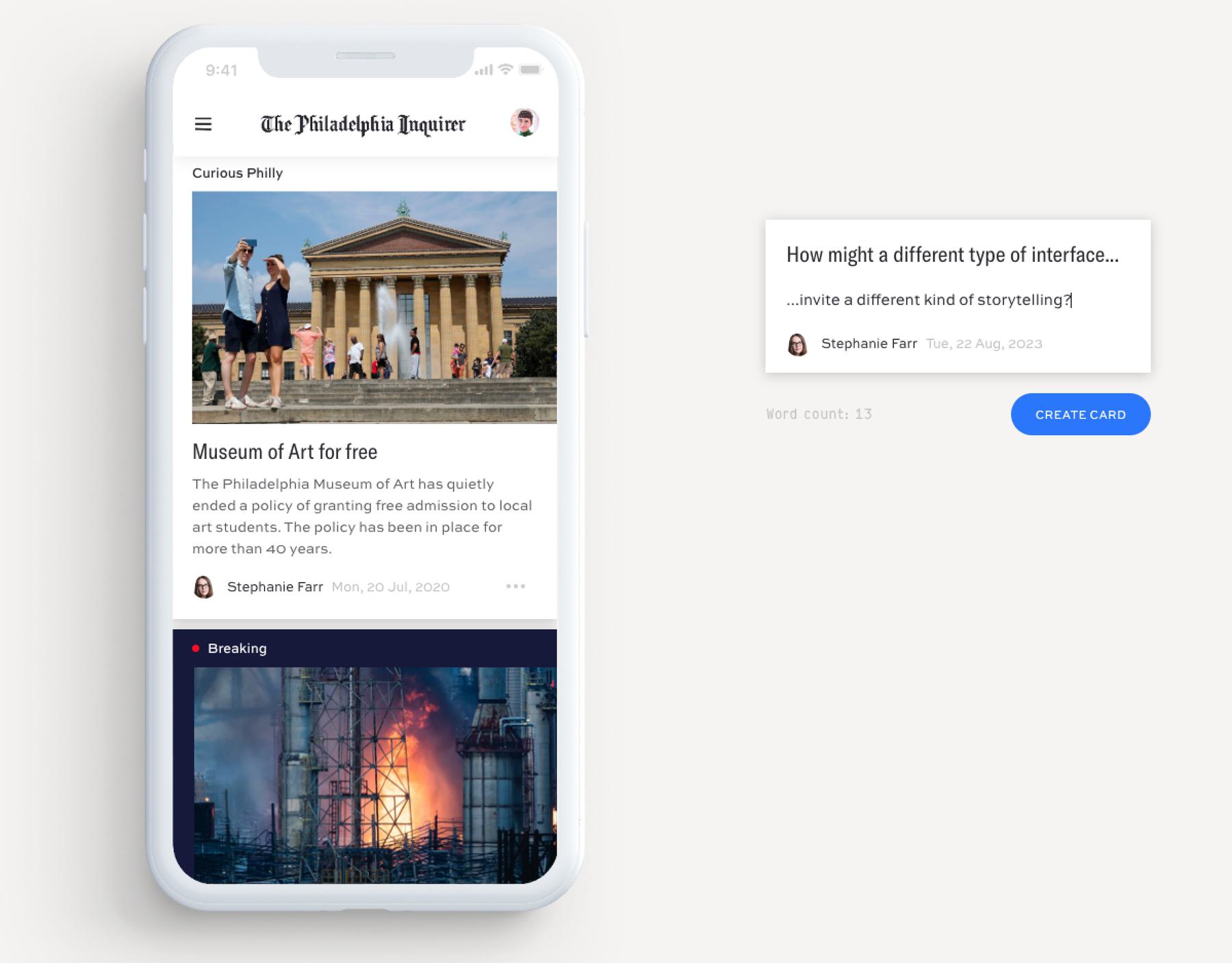
When we worked with the Philadelphia Inquirer to develop a new vision for their digital experience, this is something we thought a lot about. We were looking for ways to encourage reporters to write shorter stories and updates. But their CMS had basically one view: a giant empty text box that invited an entire article, not a couple of quick sentences.
In working with the Inquirer, we developed a prototype to show how they might create tools that better invited the different kinds of content they were looking to get from their staff.

That and other levers, like suggested character limits, can all help make the content experience more intuitive for editors. In the past, we’ve built a plugin that can offer guidance on the ideal character count for certain fields without locking into a specific max—giving editors a little bit of wiggle room but still advice on how to create the best possible experience.
Happy Editors, Better Outcomes
Working closely with content editors during the CMS build is a big opportunity to earn their trust and help get them excited about the new experience we’re creating. Building a new website and new CMS usually means a lot of work for content editors leading up to launch. And even if their current CMS isn’t great, they’ve gotten used to it.
By inviting them into the new CMS early and actively seeking out their feedback to make it better, we get them invested in the new platform, ease concern about the change, and help ensure the content aligns with the goals of the experience we’re building. We think this is just as important as the testing you do with your end-users, and that’s why it’s baked into our process whenever we build a new CMS.


