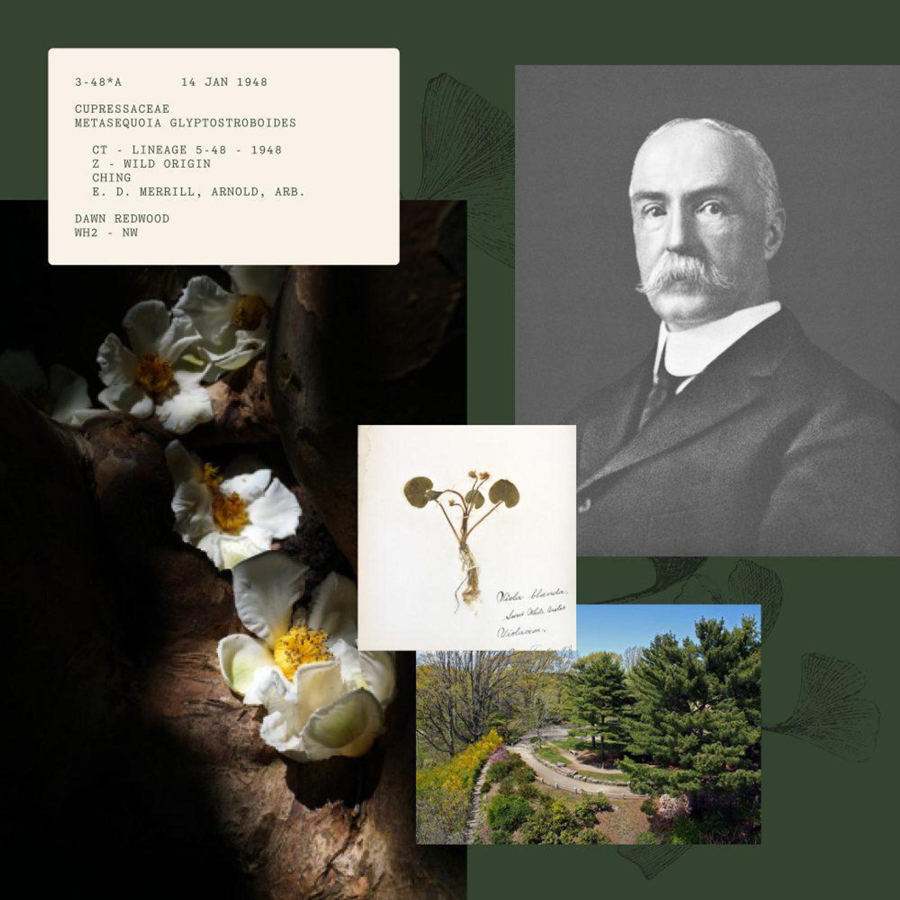
The Arnold Arboretum holds many distinctions. Its living collections of plants are some of the most comprehensive and best documented of their kind. It’s one of Frederick Law Olmsted’s most enduring works (he later designed New York’s Central Park). It’s the result of a unique public/private partnership between the City of Boston and Harvard University. It’s free and open to all every day of the year. It’s a living, breathing, ever-changing museum of trees right in our own backyard here in Boston.
A new visual system
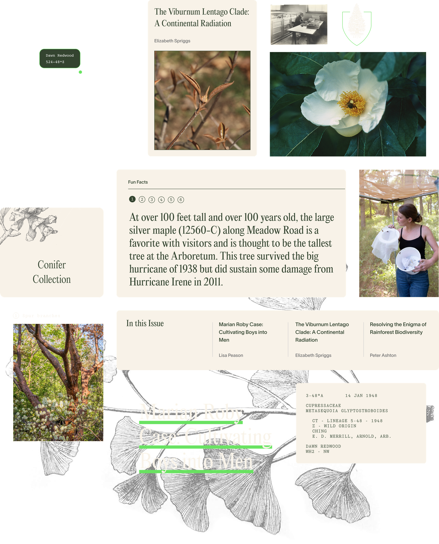
With their 150th Anniversary on the horizon, the Arnold Arboretum approached us with the task of re-establishing their brand and digital landscape. To look forward, we had to look back. The Arboretum’s extensive archives carefully catalogs over a century of plant resources and educational materials. Their collections include historical illustrations, databases, statistical information, maps, photographs, specimens, records of explorations, and more. The new design system embrace this vast and ever-expanding collection by creating housing for all types of information and by promoting an organizational structure that enables the past and present to live in harmony.
Radical accessibility
When we talk about accessibility on the internet, we typically talk about guidelines that ensure a site can be enjoyed by people of all abilities. For the Arboretum, we began with WCAG 2.2 standards, but took the idea of accessibility even further. Inspired by the Arboretum’s democratic ethos, the website has the power to turn every visitor into an explorer — to make the deep history and knowledge held by the Arboretum staff and researchers easily accessible by all.
We noticed that many people who visit the website are doing so before or during a trip to the Arboretum, and they tend to be searching for a few key things: hours, parking, bathroom, can I bring my dog (yes, but on a leash!) and “What is there to see today?” That meant implementing features like an improved live search to ensure people could quickly and easily find exactly what they’re looking for, but also dreaming up new types of content that people could use to guide their visits.
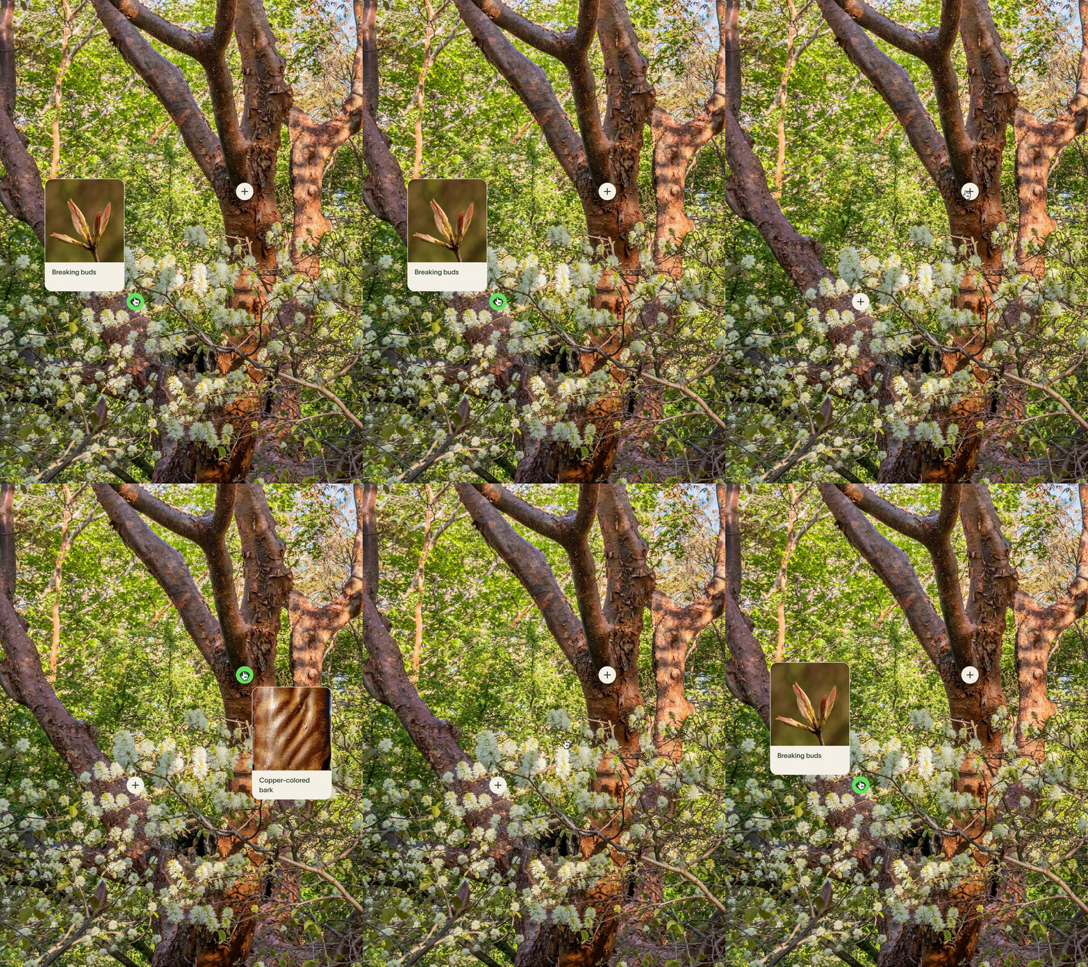
Inspired by this, we helped the Arboretum team think about a new content type called walks — a mobile-first way for people to go on a self-guided tour with some of the best and brightest Arboretum staff right there in their pockets. To dive deeper, we developed plant bios so visitors could learn about the unique history and story of individual plants in language that they could understand. We also built ways to translate special content into the many languages spoken by neighboring communities as a way of inviting them inside.

A streamlined content experience
The Arboretum website had been growing organically for more than a decade. What resulted was a site bogged down by thousands of pages hidden in different pockets that weren’t connected in ways users might expect. The site had a dozen different blogs, but some of their best storytelling was hidden in PDFs. Important content for researchers was sprinkled throughout the site in a way that could easily overwhelm your average visitor.
We worked with the Arboretum team to tend to their website as carefully as they were tending to their grounds. Together we audited, streamlined and reorganized the site content in a user-centered way. The result is a digital experience that’s welcoming, alive, and thoughtfully curated — just like the living collection.
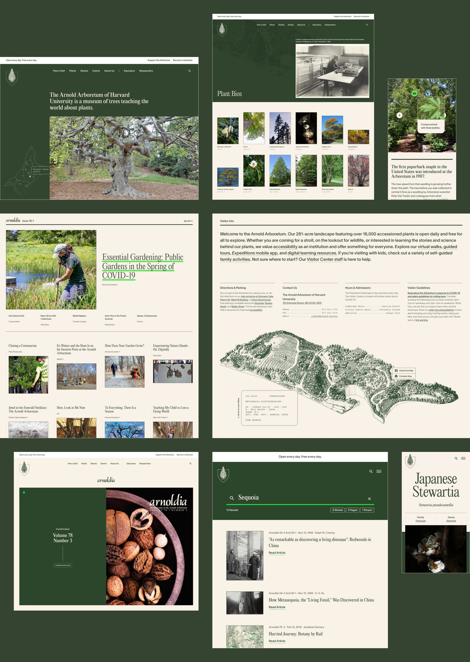
Anyone can enjoy the Arboretum – and there’s a wide spectrum of ways to do it. You might just want to take a walk, or you might want to learn about the journey a single plant took to end up in the Arboretum’s landscape. It was such a delight to collaborate with the Arnold Arboretum team to dream up ways to inspire explorers of all stripes. We’ll see you out there.
