Beacon owns and manages dozens of Class-A high rises and office complexes in cities across the country. You’ve probably seen some of their buildings; they’re responsible for some of the most beautiful spaces in New York, Boston, San Francisco, Los Angeles, and across the country.
Upstatement came aboard to design a digital product to help people returning to work check into the Beacon buildings — and get on with their day.
From start to finish, the Upstatement team was an absolute pleasure to work with and had a best-in-class product up and running for us in a matter of weeks.
Simon Yeo Beacon Capital Partners![]()
In this process, we prioritized speed above all else. While we knew we wanted to build an app for both Apple and Android, our experience told us that we shouldn’t start there.
Upstatement had already launched several products related to the COVID-19 pandemic, including one of the very first contact tracers, an app to help doctors make life-saving decisions, and a version of Yelp for Covid safety. We knew that getting even legitimate apps accepted by the Apple and Google stores could take weeks.
We began the process with a web app. That decision meant that we could go to market immediately, without waiting for approvals. It also allowed us to rapidly test, iterate, and push updates as we received feedback from tenants, who had already started returning to work.
The decision sped things up from a technical standpoint, too. We built the progressive web app on React, which provided a strong foundation when we transitioned to React Native for the mobile product.
As a premium landlord, Beacon wanted a premium product that reinforced their brand values. That meant designing every interaction with the user at the center of the story. We interviewed tenants to understand their habits, which led to some great time-saving features. For instance, your pass automatically pops up when you get close to the office. And you can configure push notifications that remind you to get your passport — and save you from fumbling with your phone at the entry.
The design reinforces that user friendly vibe. We wrote copy that clearly communicates the building rules and takes special care to talk to users about how their information is used (its totally anonymous and no personal information is stored). We even designed lobby signage that oriented guests and helped them quickly download the app. QR codes FTW! Custom illustrations from Adrien Ghenassia connect the physical and digital spaces while providing a little humanity in an uncertain time.

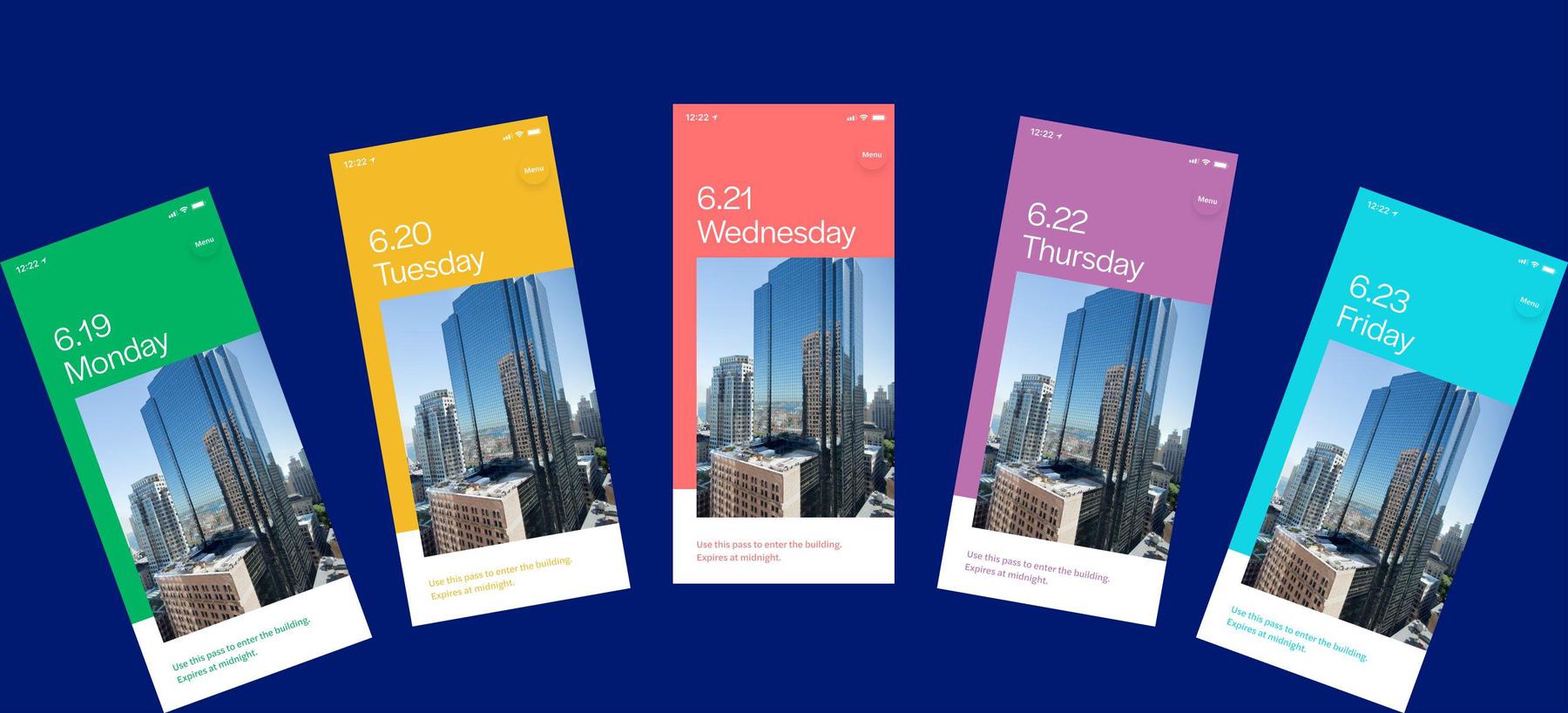
While we had to make it fast and easy for tenants, the same was true for the Beacon staff. During on-site testing, we identified potential bottlenecks. To address this, we keyed each day to a new color which helped security easily validate passes — even from across the lobby.


