An app-like experience on every device. The site is teeming with new videos, stories, and media around every single performance, supported by a blazing-fast infrastructure. Even if everyone can’t attend in-person, the site brings you closer to the experience of hearing the symphony play.

The ticket buying experience is transformed. The new BSO feels equivalent to industry leaders like Ticketmaster and is focused on making the entire concert-going experience more cohesive. It’s not just buying a ticket. It’s ordering food to have at the concert, learning the history of the music, making a donation along the way, and coming back to see a recording of the performance the following week. All touchpoints are unified.
In the first 3 months (compared to 2019)
-
+20%conversions
-
+14%transactions
-
+4%revenue

A treasure trove of new content. You don’t just find a concert and leave. You fall down a rabbit hole of deeply interrelated content, learning more about the history of the work, the composer, the story of this performance, other similar composers, upcoming performances of their work, who in the orchestra is playing the work, that there is a livestream coming up next week, and so on.

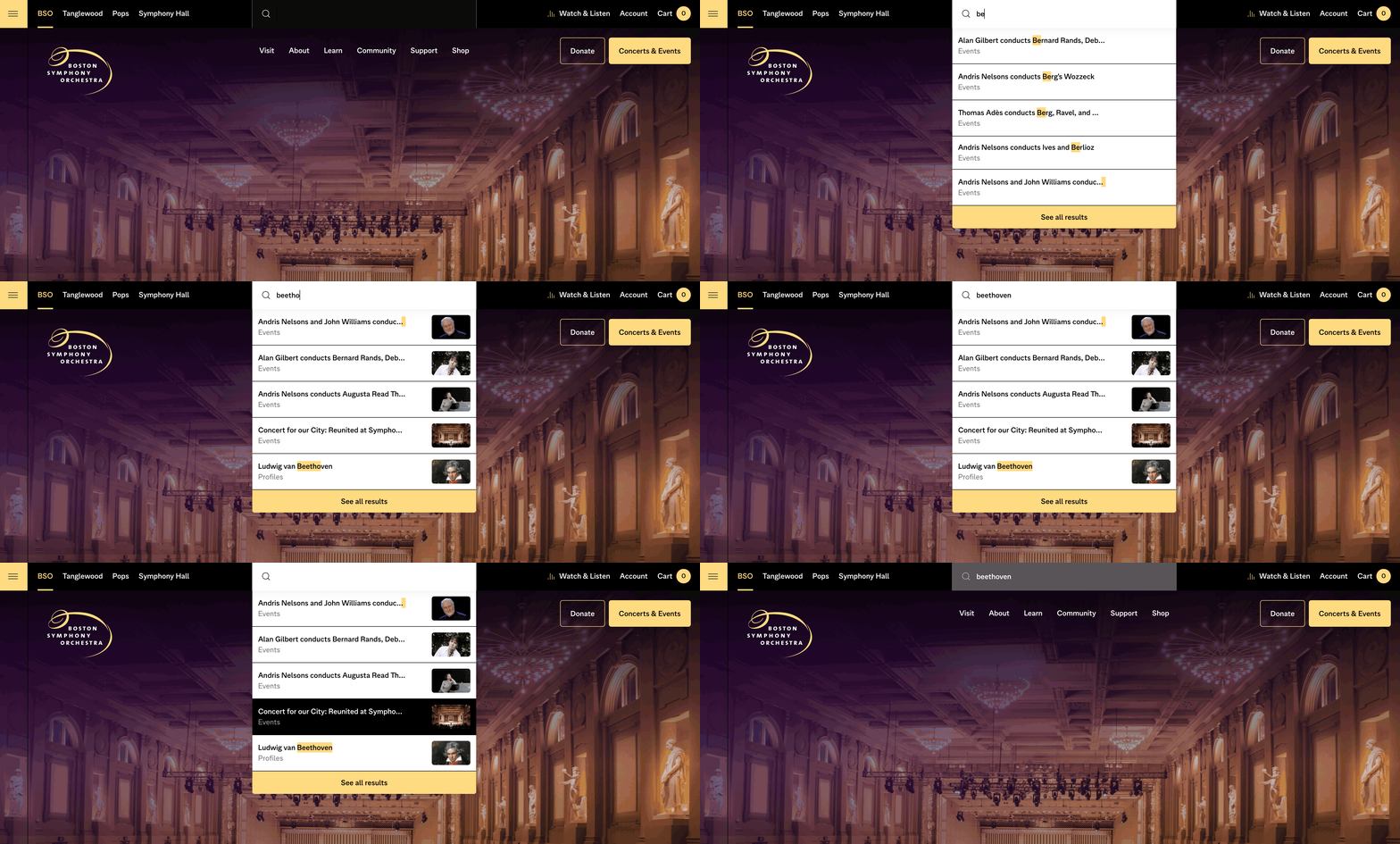
And it’s much easier for patrons to find exactly what they want. On-site search feels as powerful as Google and puts musicians, venues, program notes, performances, and more at your fingertips.

The most important part of this redesign is BSO’s ability to maintain and extend the foundation we’ve laid, using the tools and systems we delivered. This is just the beginning. The new website demonstrates how the BSO is using technology to do more for the region and spread music and music education far-and-wide.

How did we get here? It’s challenging for an organization this large and this established to make nimble change. We conducted deep research, built a lot of empathy, and guided the BSO through a major shift in process, tooling, and storytelling. This organizational change was propelled by a clearly articulated vision that made everyone see what was possible.


