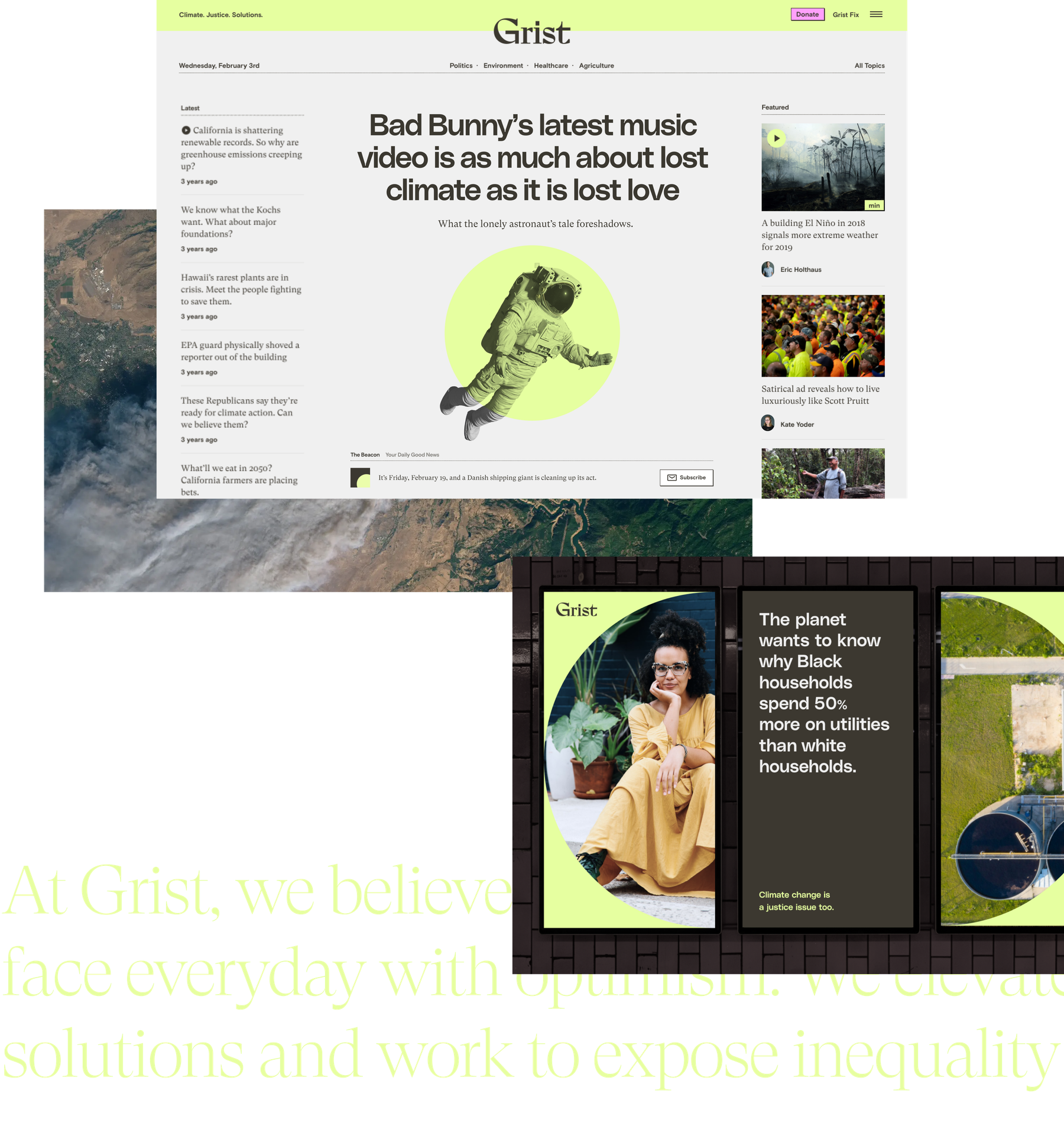
Grist knows the climate crisis isn’t anything new — they are the first digital-only platform dedicated to covering it. But the conversation around the subject is evolving rapidly, thanks in part to activists and influencers alike who are sharing stories online like never before.
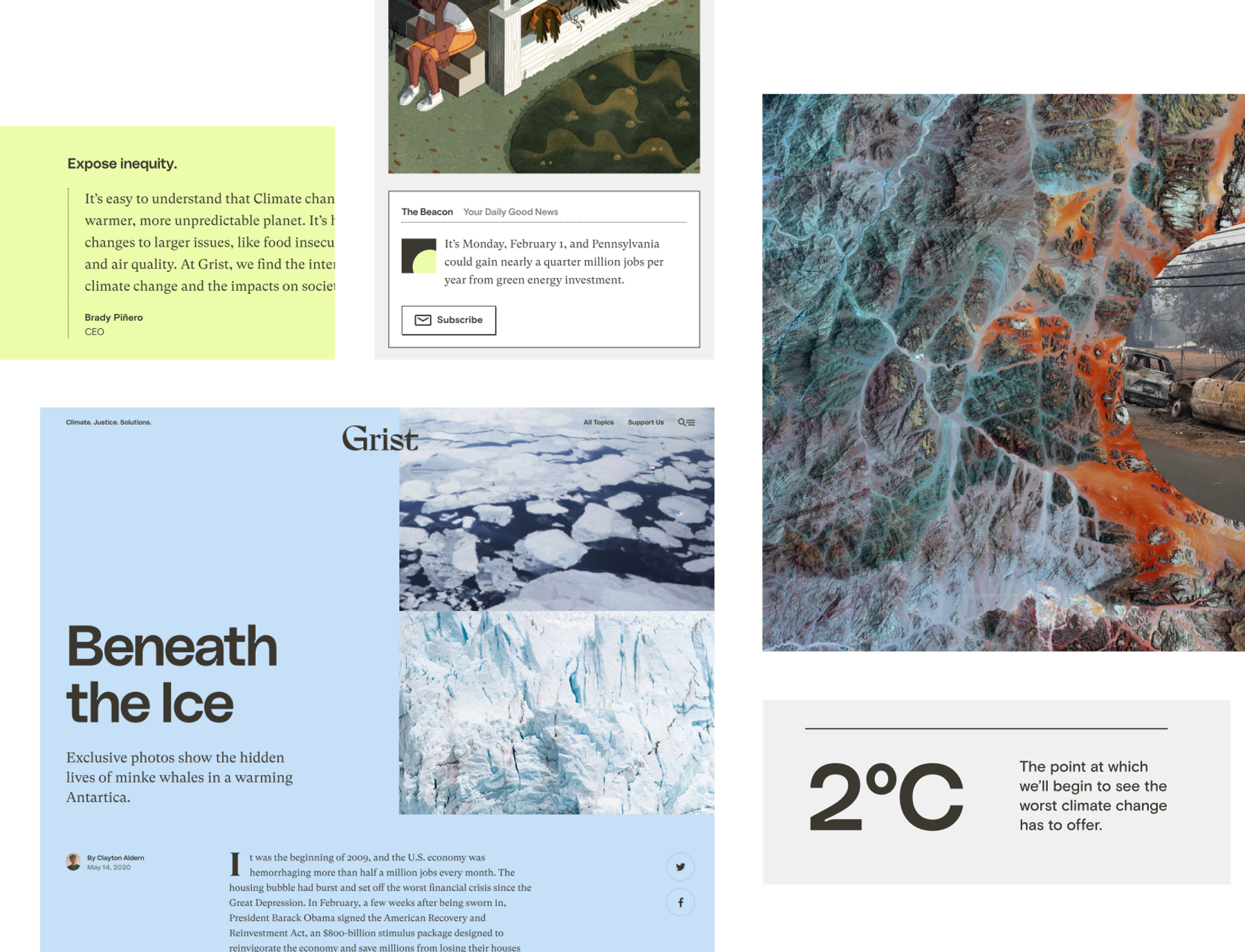
We looked to unlikely sources of inspiration to capture this growing demographic: newspaper front pages contrasted with neon tints (or as we call the signature shade, “celery”).
We designed article toppers that look as great on your computer and phone as they do as screenshots in your Instagram feed. And we developed a system of brand messaging that communicates Grist’s authority while retaining its approachability.
We knew the “old Grist” brand wasn’t serving us well, but we didn’t know what we were going to evolve into. Upstatement asked us the right questions that helped us get to that answer.
Christian Skotte Director of Innovation and Growth at Grist![]()


We emerged with a custom-drawn logotype, updated art direction, and new content strategy, all hosted on on a redesigned platform that makes it easier for their editorial team to tell dynamic stories. And with a suite of customization tools for their homepage and articles, the site, built upon a rock-solid foundation provided by WordPress VIP, never looks the same for too long.
We know it takes more than design to drive a great publication — it takes a great community. And by developing a new brand, site, and content strategy in tandem, we crafted a platform that considers every aspect a part of the Grist experience. Whether it’s a daily greeting of “today’s good news” or unexpected moments of animation, Grist serves you the facts with a side of optimism. A voice longtime readers will find familiar, and newcomers will find welcoming.
Check it out for yourself at grist.org.


