The concrete production process is a major source of C02—even worse than airplane travel. There’s a solution that’s simple, but incredibly difficult to actually execute: make concrete sustainable. Sublime developed the technology to make that possible, and they needed to position themselves as a leader to industry partners, investors, and potential hires.

We iterated on their existing brand messaging to define the fundamental story of Sublime in a way that would be compelling across all of their different audiences. Future-oriented, action-driven language can both introduce the stakes and share their inspiring solution.
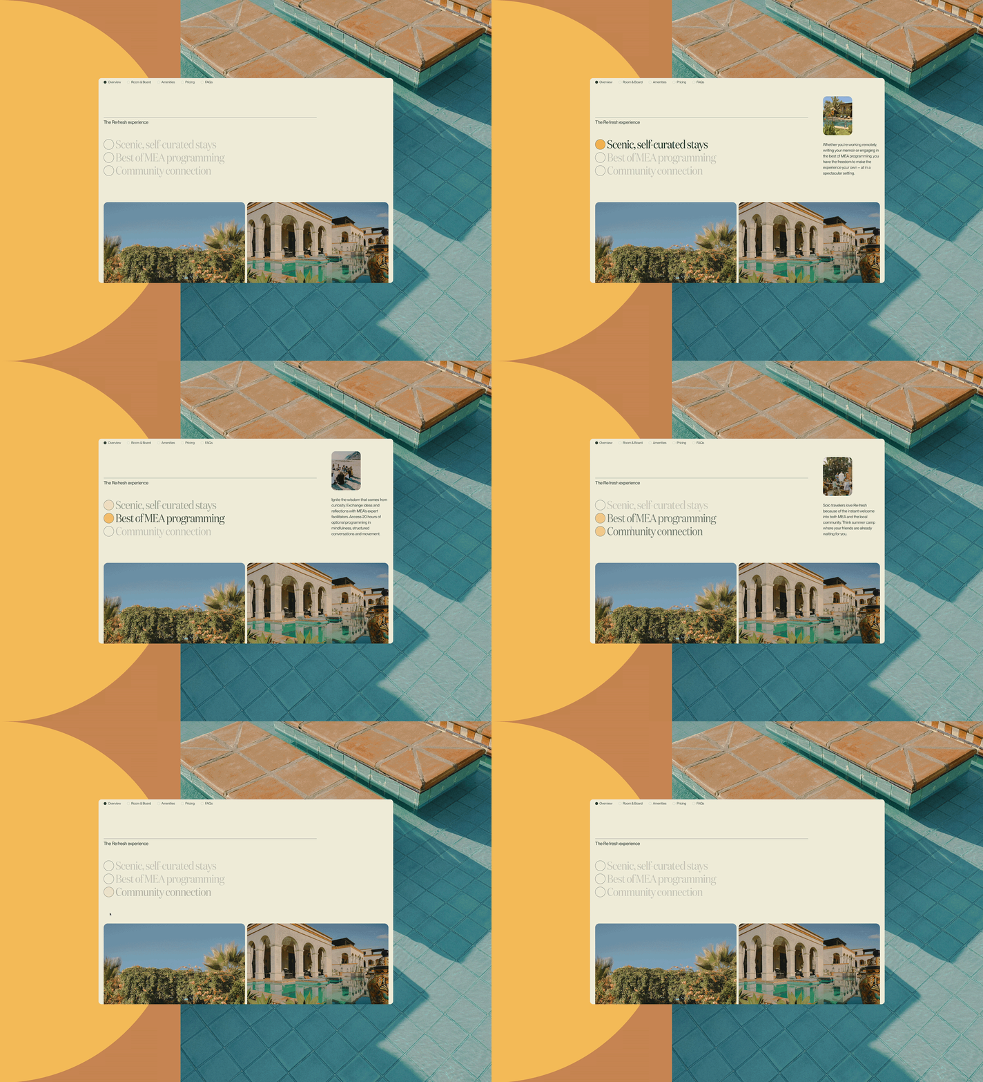
The website is structured to feel clean and straightforward, allowing the core mission and technology to unfold via an engaging and impactful narrative.

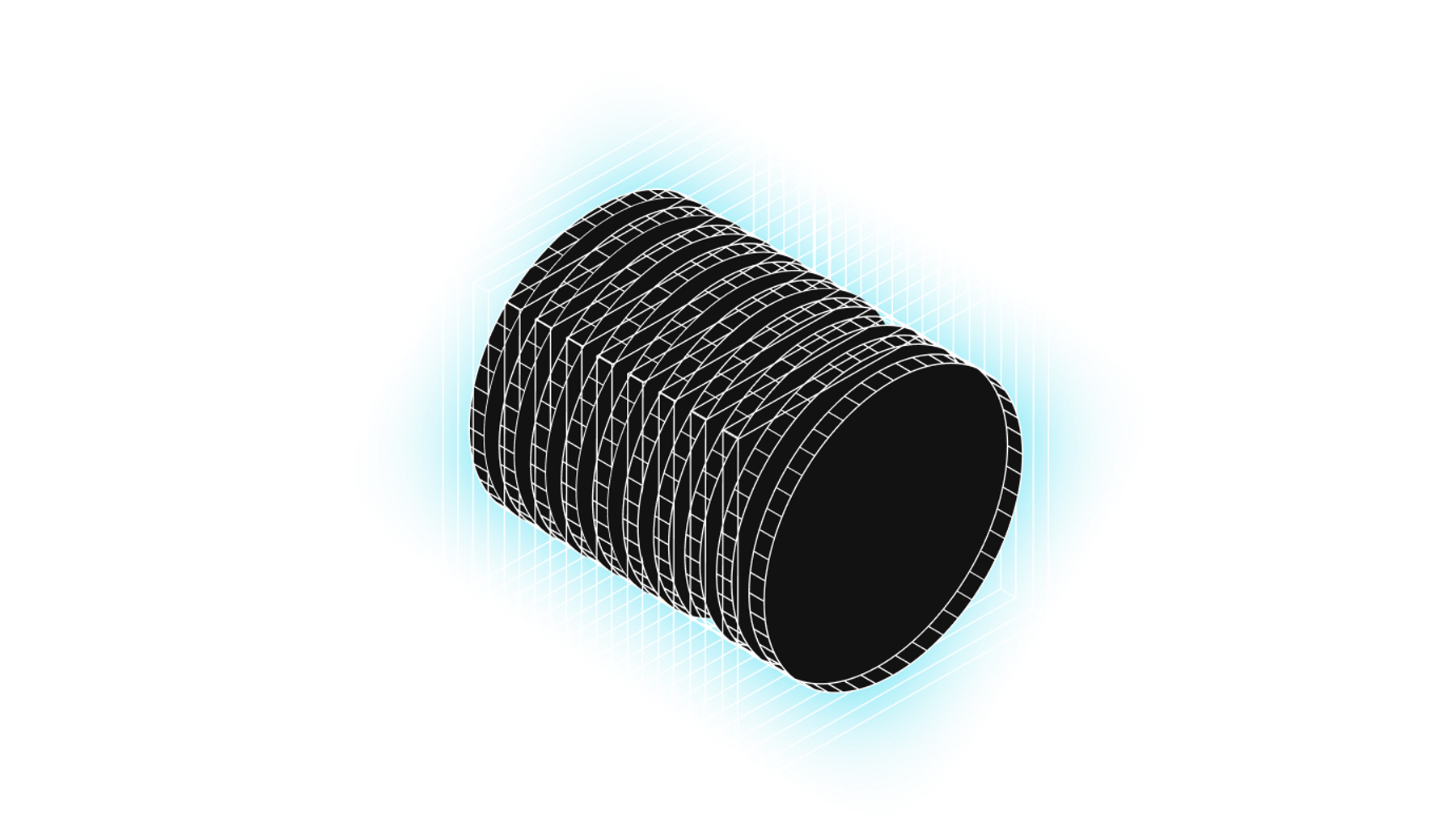
We created a striking brand system that gives a sense of Sublime’s huge potential. Their technological breakthrough is a big deal, with global implications, and it needed to feel that way. The visual identity is centered around expressing the scale of Sublime’s work. Imagery drawn from cultures and topographies around the world, and core brand photography from aerial perspectives, reinforces the scope of a sustainable cement product.

We also provided art direction and guidance around expanding the brand universe, guiding the production of a brand video and commissioning editorial-driven photography from Tony Luong.

Environmental impact was top of mind as we engineered the new website to be as green as possible. The unique motion details were developed using sustainable animation principles, so the animations are as low-bandwidth as possible while still holding true to UX principles.
We came out of the project with a fresh appreciation for the interconnected technologies literally shaping our world. And in the time since this project wrapped, Sublime has been named to TIME Magazine’s 2024 list of America’s Top GreenTech Companies, established a partnership with Microsoft, been awarded $87 million U.S. Department
of Energy to accelerate commercial
decarbonization efforts, and raised over $200 million in funding.
Learn more about the Sublime story here.


