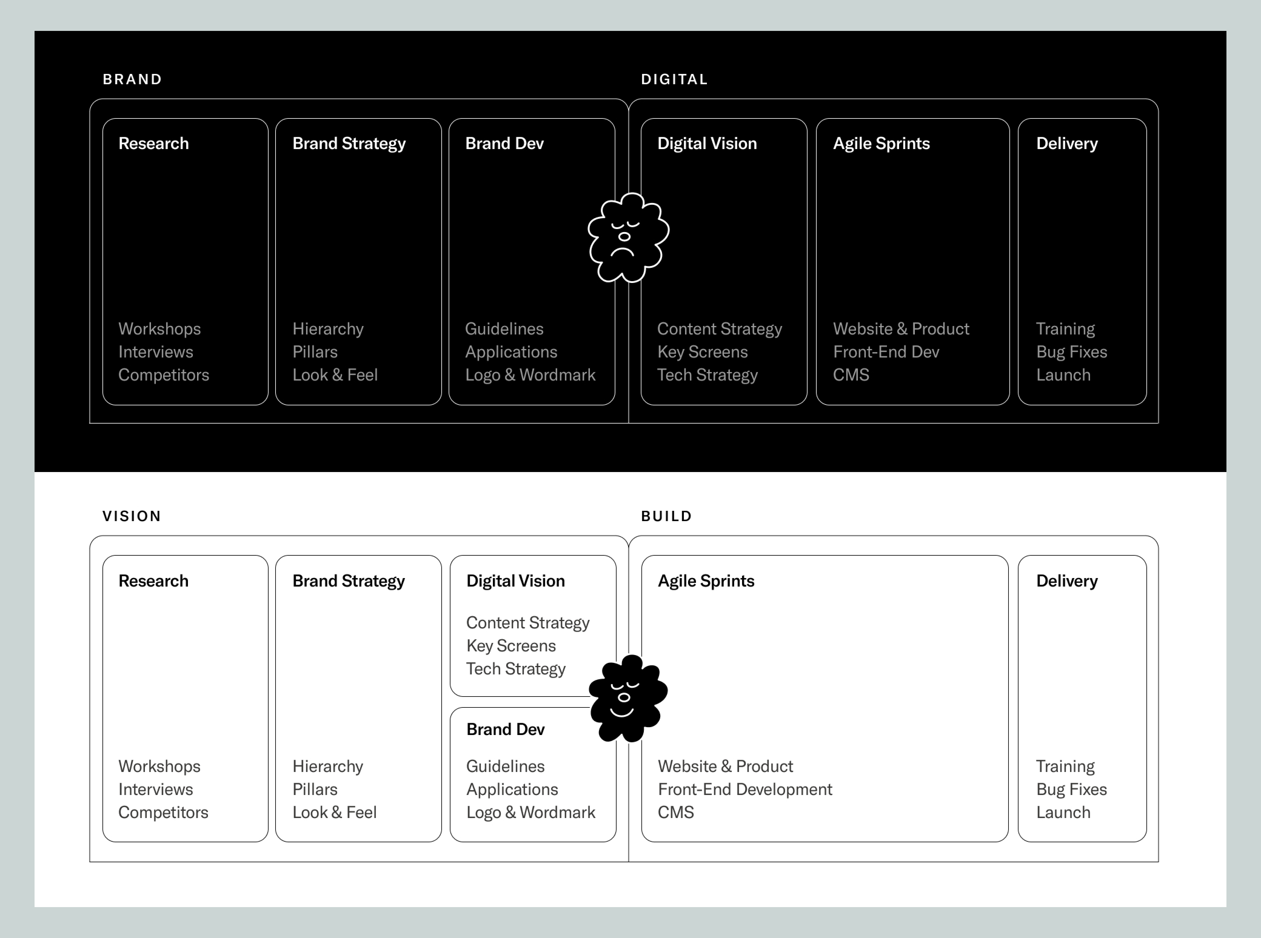
Because most modern brands are first experienced in digital spaces—that’s where many people encounter a brand, explore it, and figure out what it stands for. So to build a new visual identity and rich brand, we make the website first, then extend the system everywhere else. This is what we call “brand through digital,” and it’s an approach that pays off in three ways:
- It forces you to think holistically about a brand’s voice, key messages, values, utility, and identity all at once. Lorem ipsum won’t cut it.
- It’s flexible and testable. You can rapidly iterate through key variables in the brand system and evaluate them using different tools before rolling out the brand in the market. This is particularly useful if your brand will ultimately require production in physical spaces or across a wide network of brand surfaces.
- Your brand will be stronger and more effective. If the digital presence and brand are built together, they will be cohesive and powerful. More than a website, your brand will have a “soul place.”
Exploring voice, identity, and message
We won’t rehash the old mantra about how a brand is more than a logo. If you’re reading this, you probably know that. But it’s worth expanding on exactly how prototyping brands in digital environments forces us to develop richer brand voices, test brand promises, and evaluate key messages.
Many traditional brand processes start with exploring the visual identity, verbal identity, messaging, and applications in somewhat separate streams. By the time the brand is imagined in digital spaces, it’s usually late in the project—after brand guidelines are written—with some perfunctory (and usually templated) mockups of the identity on a website or a smartphone. In a digital-first world, though, this approach is backwards; a website is actually the ideal multisensory system for defining and focusing your brand. Visuals, identity, message, motion, and utility come together on one screen.
Beyond being valuable for brand definition, taking a digital-first approach ensures the website isn’t treated as an afterthought, which is critical: a user typically makes decisions about a brand in milliseconds. There’s no room for error or brand ambiguity.
So, after the initial stage of getting to know our client and gaining a deep understanding of their landscape, we immediately start thinking visually. We sketch and simultaneously prototype various brand directions and articulations, using digital environments as our canvas and foundational premise. This means exploring form, color, and language in a range of specific digital contexts. If the brand is for an organization like a university or a venture capital firm, we’ll start imagining how the homepage would look, how the identity works with potential navigation structure, and how all the writing on the site supports the brand’s purpose and promise.
This leads to the discovery of some pretty fun and effective applications. The architecture firm Sasaki has the tagline “Better Design Together.” We used that as our North Star, and in that spirit, we shaped the site navigation to work as a thoughtful toolkit and elevated the Sasaki logo into a character on the site.
Create flexibility to iterate and validate
A holistic digital-first process doesn’t limit a brand’s scope; it supports it. Sometimes we build a brand that will be extended into the physical landscape, as was the case with Commonwealth Fusion Systems (CFS). As we worked to define the story of CFS and put language around its promise of limitless clean fusion energy, we simultaneously began exploring its mark and potential imagery. That inspired us to start writing about what the world would look like if CFS succeeds in its mission, and to draw upon CFS’s physical engineering technology for support in telling that story visually.
We eventually homed in on the arrangement of magnets inside CFS’s tokamak—the apparatus that contains a miniature sun and harnesses its power. Highlighting aspects of the device itself was key to sharing the complete story of this uncommon company and its purpose. It also produced a pleasing symmetrical identity, with a built-in optical illusion: an interference field is created around the center of the CFS circle as you look at it.
We hammered out all of this in the site, sketching in the new identity and prototyping the visuals and system that would ultimately become CFS’s new identity. This happened in parallel with the site design and copywriting, thereby informing the visual metaphors and language, and giving our design team more range of motion when it came to expressing and articulating the company, its vision, and its purpose. These degrees of freedom are incredibly important when bringing a brand to life and ensuring it functions everywhere it needs to—in real life or on the internet. If we design the identity out of context, we risk making a brand that doesn’t work when we try to apply it to the actual use case. The classic trap is looking at a mark or brand system on a mood board or a shopworn tote bag mockup and then realizing it looks terrible on the site or in the app.
We pushed around the identity in these digital spaces, letting it and the site design inform each other in a virtuous cycle. By the end, we had a visual mark, a story, a site, and a technical platform that serves CFS well (going on five years at the time of this writing). And when they built their new Devens campus, they used the logo, which had been considered from every angle during our branding process, as a load-bearing part of the facility (literally), creating opportunities for brand storytelling around every corner.
Build a strong digital soul place
Branding is worldbuilding. We’re constructing a world where this brand and its products, people, culture, and vision make an impact. To do this we need to activate all of the senses and authentically share a story about the brand and what it is, where it’s headed, and why it exists. Even highly physical brands like CFS are primarily experienced digitally—in ads, websites, references in media, and shared word-of-mouth links. Our process acknowledges this and seeks to go beyond simply creating consistency and recognition on the website (which are table stakes) to creating the brand’s home, its soul place.
However people become aware of the brand, and wherever they are in the traditional user journey of awareness→consideration→decision, the site plays a critical role in establishing the brand’s worldview, tone, culture, and of course its products, services, or employment opportunities. The site is the most charismatic and comprehensive interface for the brand, and also the most intimate, being experienced mostly solo and with some amount of focus (even if that attention span is shrinking these days). People will come to the site at different points in their journey, and from the first impression to daily use, it has a unique ability to speak to the brand’s audience and become the brand’s soul place.
This concept of a “soul place” is an important one, gifted to us by our Japanese colleagues at Hakuhodo DY. As we described our approach and how it has worked for various brands, they observed that the website is the soul place for many modern brands. We really loved this, and it gave voice to our brand-through-digital intuition.

Who should do brand through digital?
There are many approaches to brand development that work, and the right method depends on your goals, your organization, your timeline, and your resources. Brand through digital works best for information brands, complex companies, and organizations or initiatives that have story at their center and are reaching their fans and customers primarily through digital channels. We also believe that brands with strong digital community movements benefit from this approach, as it lifts up the digital gathering spaces and the interfaces that community members use to interact with the brand and one another, and treats them with appropriate respect and care.
Because there are high stakes and a huge range of possibilities, it can be overwhelming when considering your brand direction, its purpose, and how it should be experienced. Patreon’s way of thinking about its redesign is illuminating:
We were born on the internet—a rich, ever-evolving ecosystem full of life and passion and endless human creativity. We want our brand to challenge these old-media conventions and celebrate today’s dynamic, disruptive creative reality. Our goal is not to be defined by a shape or a color, but rather by a visual language… one as diverse and expressive as the creators it represents. By designing a fluid brand native to the digital screen, we’ve created new opportunities that just aren’t possible with print.
We’ve also written about the frameworks that guide us through building a brand experience and story—and we’re always here to talk things through. Get in touch, and in the meantime, browse a few of our favorite brand-through-digital projects to get inspired:
- For the Arnold Arboretum, we changed everything but the historic logo and created a new way for people all over the world to explore the wonder of plants.
- Vanderbilt University was initially a platform-only project, but when we evolved the brand on the new website, it inspired a complete rebrand throughout the institution.
- The Sublime Systems site is a fundamental brand expression and proofpoint, engineered to be as green as possible. The unique motion details were developed using sustainable animation principles, so the animations are as low-bandwidth as possible while still holding true to UX best practices.