We’ve been exploring how to tackle community-centered design without losing sight of the fact that communities are made up of individuals. What’s the right way to approach users in the context of communities, and what’s the right way to describe that approach?
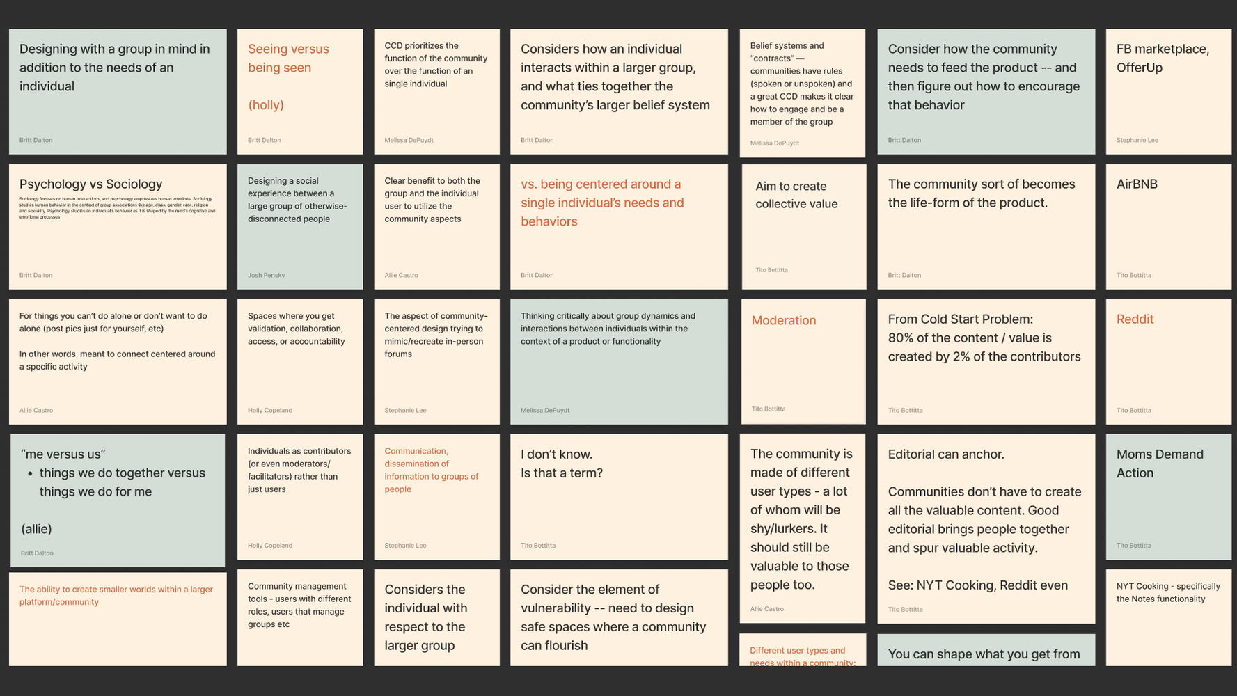
A few terms come up a lot in the product design world: human-centered design, user-centered design, and community-centered design. We wanted to dig deep and establish a team consensus around what each of these means—as vocabulary, as principle, and in practice. So we got together with representatives from our product, design, engineering, and project management teams and met in FigJam. These are the results from our mini workshop on the following prompt:
Understanding individual user needs is important, but what happens when we put those needs in the context of a larger community they’re a part of? How does that change the way that we think about digital product design? How should community-centered design be different from user-centered design?
What do you think of when you hear ‘community-centered design’?
Allie Castro, Senior Project Manager: To get existential about it—what is it really? I feel like the label is very benevolent and aspirational, and it doesn’t always match up with what those products end up being.
So I’m wary of the label of community-centered design. In abstraction it feels really positive, but in execution, another word for it is often social media.
Britt Dalton, Product Management Director: I started googling the term “community-centered design” because we talk and think a lot about user-centered design and community design. In the way that we approach projects, we try to think about the user first. But when we talk about community products, it feels like we’re not just thinking about an individual, we’re thinking about how that individual plays in the context of this larger community.
Human-centered design and user-centered design is the current way of thinking, versus community-centered design. Because when designing for a community, if you’re abstracting yourself too far from an individual’s needs, then are you really understanding the community they exist within? Melissa, I want to know what you think.
Melissa DePuydt, Senior Engineering Director: Human-centered design is the evolution of community-centered design. But a critical difference between what we are describing and the classic definition of community-centered design is the way that community-centered design was defined around the group acting unanimously. I think we’re describing human-centered design for groups. We’re just not thinking about the individual user because we’ve started to identify that there are multiple types of individual users in a community.
So when I think of community-centered design, it’s thinking about: what are the ways that different people on the platform will interact with each other? For instance, working on [a recent product for a fashion publication], in terms of these communities and channels where you could join a topic that you’re interested in. It’s design that elevates the user-to-user interactions as one of the benefits of the product. We get to that point with a lot of the products that we identified (further down on our FigJam board) where some sort of interaction is the product.
When you enter a community, your needs change.
Britt Dalton
Allie: Are those two approaches fundamentally different, human- or user-centered versus community-centered? Or is it an extra layer on top of user-centered?
Britt: To me it feels like a layer.
Melissa: One hundred percent.
Okay, so let’s say I log in to Presbyterian Healthcare for my medical records. That’s not a community product; it’s primarily focused around me and my needs. I need to interact with my doctors and schedule an appointment. The extra step that a community product or community-centered design has is not just, how does Melissa build her profile, but how does she get to interact with other people who are also building their profiles? So to me, yes, it’s a layer: taking the empathy of the user-centered design approach and applying that to the community, a group of users, if that makes sense.
See or be seen
Britt: Holly was framing community-centered design in terms of spaces where you get validation, collaboration, access, or accountability. Because when you enter a community, your needs change—or at least the way that you present and conduct yourself feels a little bit different than you might feel as an individual just using a tool. All of a sudden you’re showing up in a certain way and you’re feeling more conscious of that fact. Your environment is playing a role in your interactions with the product.
Holly Copeland, Design Director: I think the difference between other products, like a healthcare portal, and community products is that in a community experience, the primary benefit to the individual is usually to see or be seen. You witness what other people are contributing, or you want yourself to be seen in some way. Products for communities, all the different ones that I can think of, all fit into one of these categories. People are looking for validation, looking to work with other people, looking to get inside access or insight into something they wouldn’t otherwise, or to be held accountable in some kind of way.
For that validation, I think of Instagram or LinkedIn. Same with access. Collaboration—FigJam. Accountability might be an exercise app or Dry January support. There are different forms, but it’s all centered around either seeing other people do stuff or wanting yourself to be seen doing stuff. And a mixture of the two.
Tito Bottitta, Chief Product Officer: That’s cool. I love the see-and-be-seen aspect of that, Holly. It’s a really great way to think about some of the emotional triggers that might prompt you to pick up a community.
Holly: And some people go into it knowing they’ll just be on one side of it. I never post on Instagram, but I’m constantly on it. Compare that to Slack; I feel really obligated to be contributing to that space in a way that I don’t feel in others.
Britt: Steph, I’m curious—as a designer, when you’re tackling something that’s more community-oriented, does your mindset change at all in how you approach the design? Does anything extra come into play?
Stephanie Lee, Senior Designer: In terms of general rules or patterns, there’s obviously the interaction pieces, like reactions and comments and followers and those kinds of tangible features being important. But then there’s also the thinking around the branding of groups or communities and how that begins to play a role in how you think of these different units. There’s the additional unit of maybe a group or community that’s on top of the individual user. This is breaking my brain a little bit.
I think Facebook Marketplace is an unsung hero, maybe the best thing that Facebook has ever built.
Tito Bottitta
Britt: There’s a level of vulnerability that happens when you enter a community that impacts design. It came up a lot during [a recent product for a fashion publication] because fashion is such an outward-facing way of self-expression. In some of our user interviews, folks were saying things like, “I might be hesitant to post in this place because I don’t know if I’m ready for people’s feedback or input on my style or the way that I look.”
There’s a design element there: How do you create the right kind of comfort and trust within a community? What are some of the design elements you can put in place to make it so that people feel like they can belong there and participate?
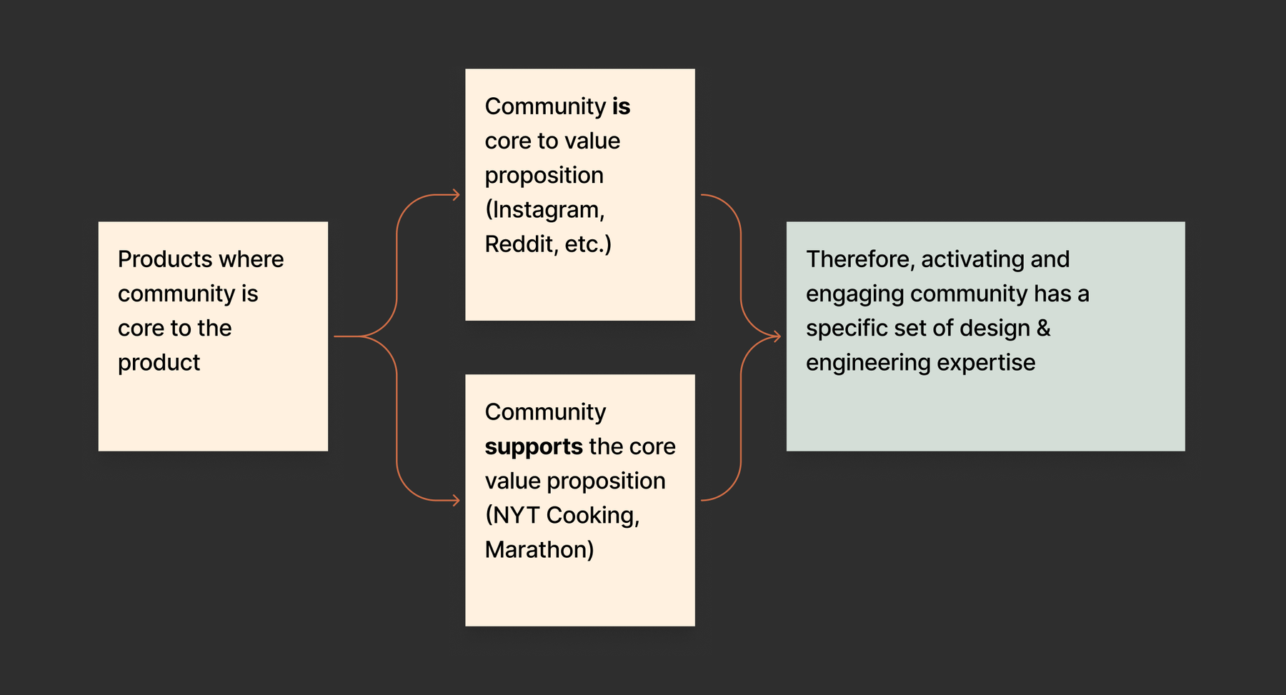
Tito’s flowchart piece ties in to how prominent the community aspect is.

Tito: I was trying to create a definition of what a community-centered product is. It’s not exactly the answer to the question of what do you think of when you hear the term community-centered design? I was like, “I don’t know what I think of. Do we need to coin a new term?”
It’s easy to mistakenly think that this is only social media or places where the core content is being created by the community. There are actually two major categories: either the community is the value proposition or the community supports the value proposition. Like Strava, for example. Someone might start using it purely as a tool to track their activity but end up with an enriched experience because they end up engaging with friends. Ultimately, they might stay longer and use the product more because of that community aspect.
Social media is, by definition, community. But I think community goes broader than that.
Britt: When I think of Threadable or Moms Demand Action, they still live in that top post-it ☝️where community is core. Because for Moms Demand Action, it’s a space for organizing and a space for messaging and communication. And Threadable—if I wanted to read a book alone, I’d use a different app. But neither app feels like social media to me.
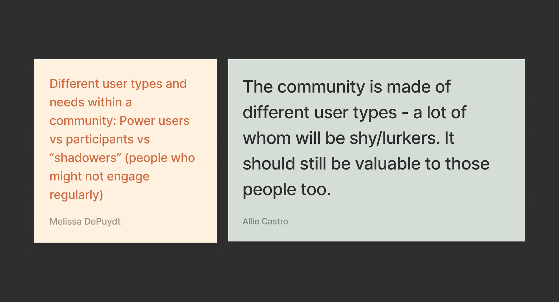
Allie: What about “me versus us”? Like Holly’s comment about social media being either “see or be seen”—that’s more about me versus other community products that are about us and the things we do together. But maybe that’s just two sides of the same coin.
Holly: Social media is a blank slate built on features. TikTok, Instagram, and Facebook all have their own features, and some are more specialized for video or events or whatever, but they’re blank canvases for communities of any kind to form within them, whether that’s a Facebook group, your entire network, or an event you RSVP to. Other more niche platforms are designed with a particular community in mind.
Allie: Social media is just social fill-in-the-blank, whereas Threadable is social reading or Strava’s social running.
Tito: I think about the starter kits we have for building editorial products that we created because we knew that every editorial project needs these certain tools. The more we explore community online, the more we’re going to find things we could template-ize, and I’m curious about what those things will be.
Content as campfire
Stephanie: With community products, my mind jumps to the real, in-person experiences these products are trying to recreate. Facebook Marketplace is very literally recreating a market, and it’s interesting because it uses your Facebook account, but that wasn’t your original purpose for joining Facebook. It’s actually the total opposite purpose. Rather than having a global reach, you’re focused on your local geography.
Melissa: I want to highlight one post-it I see about how editorial can anchor a group. It’s a really interesting point that the community doesn’t necessarily have to be creating the content. What is the future of editorial communities beyond comments? Or actually, how will we build better comments? Because comments are of course notoriously a cesspool, so how could good design or a good product improve that experience?
Tito: That was my post-it. I was really inspired by the conversation with Amanda about New York Times Cooking. They have what they call “notes” instead of comments, and they wanted that term to shape how the comment space was used. But about editorial as an anchor—Amanda was saying that when they were looking at how to stand out in the marketplace, they realized the New York Times can’t have a community app where the recipes come from random users. People are coming to them for the quality of the content. So they used their own recipes, despite all that extra work it entailed, and that editorial source differentiated them from other big recipe sites like Allrecipes. But community is still an important part of it, with popular figures like Sam Sifton engaging the community with a newsletter and that kind of stuff.
Britt: I love that. I always quote you, Tito, when you say that stories are the campfires that communities gather around. It’s just so good at expressing that editorial is almost a magnetic way to bring people together.

Why Craigslist is ‘delightful’
Tito: The core product piece of it that I think Facebook did really well is that it’s super fast to post something, it asks you for just the right information, and its categories are awesome. There’s all this infrastructure that makes it easy for a community to use it. If Craigslist had actual product designers at some point it might have evolved into that. It’s the kind of thing that doesn’t succeed without the community posting things, so you really need people, and the community is the core creator of value there, but there’s a content management system and a searching system in a posting universe that makes it so successful. I think it’s an unsung hero, maybe the best thing that Facebook has ever built.
Britt: Craigslist is an interesting one. There’s unspoken rules of how a Craigslist buyer and seller interact that are fascinating. I know there’s Craigslist killers, etc., but I’ve never had that experience before. It’s always been a really delightful experience to meet people on Craigslist.
Allie: Delightful? That’s a bold statement.
Britt: Everyone has always been pretty generous. I feel like there’s something about being on this anonymous platform…
Our roundtable ended before we could fully debate how delightful the Craigslist community is, but we’ll be back soon.
In Upstatement Roundtable, we swarm around a problem or concept that’s been on our minds.


