This week we’re re-launching Grist, the latest in a series of non-profit journalism platforms. It’s inspiring to watch the space mature with new publishing models and areas of reporting. From this body of work—products like PBS NewsHour, The Center for Public Integrity, The Markup, 19th News—we’ve identified three key ideas that drive effective design and product creation.
Design for the Content
There’s a trick I learned back in my days designing newspaper and magazine article spreads: start by reading the story. When designing a home for an entire publication, the lesson is the same on a larger scale. Before you can design the right product for a publication you have to be intimately familiar with its content: What’s the nature of the subject matter? Voice and tone? Length? Pace? Variance? Visual expression? Without understanding, the work isn’t design — it’s decoration.
We have a rule at Upstatement: no lorem ipsum. That’s the name for generic placeholder text that often fills headlines and text boxes in design mockups. Lorem ipsum blinds you from the nuances in the content. The worst kind of lorem ipsum is automatic image generation that fill empty boxes with pictures of trees, cats, bacon, or other silly images. These might work fine for testing a grid, but they’re terrible for editorial because they have nothing to do with a story. When we approach news, we design like journalists.
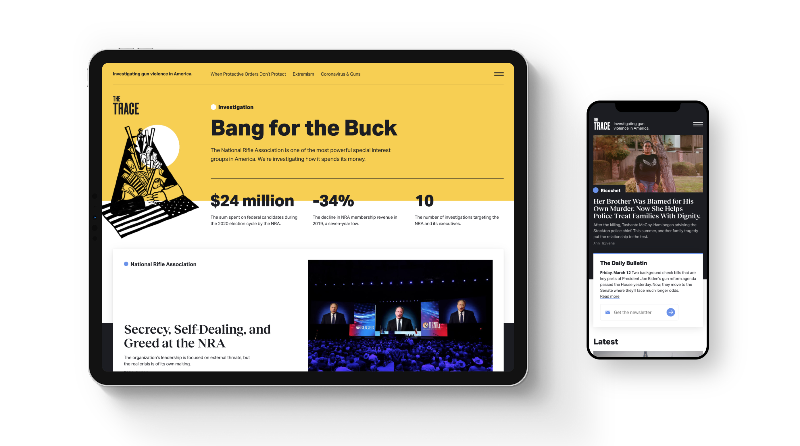
You can see the importance of this in a publication like The Trace. Since 2015 they’ve covered America’s gun violence epidemic through award-winning reporting on its causes, victims, perpetrators, and profiteers. If there’s a more sensitive subject, I don’t know it.
To start our recent redesign, we began by pulling down a comprehensive sample of The Trace’s articles since their founding. We paid special attention to the highest value content as designated by editors, traffic numbers, and volume. This ensured our design was optimized for what mattered most to both the client and the users while covering day-to-day use cases. We used the real content and photography to design against in software like Figma and in-browser with code. Lorem ipsum would have been a blocker; without it, we were forced to parse nuanced topics and complex data visualizations from day one, baking optimization into the design from the beginning rather than jamming it in during end-stage content migration.
Our work coincided with a shift in The Trace’s editorial position; no longer strictly gun news, they significantly expanded their coverage of the people and communities most impacted by gun violence. We envisioned a design system that would not only serve their content, but sharpen and amplify their editorial mission. In particular, the art direction and brand strategy emphasize this reframing of perspective. We sought appropriate and effective ways to visually frame young victims, grieving communities, and violent events. The most impactful solution usually was a minimalist one; to step out of the way and give the imagery and words all the room they need and deserve.
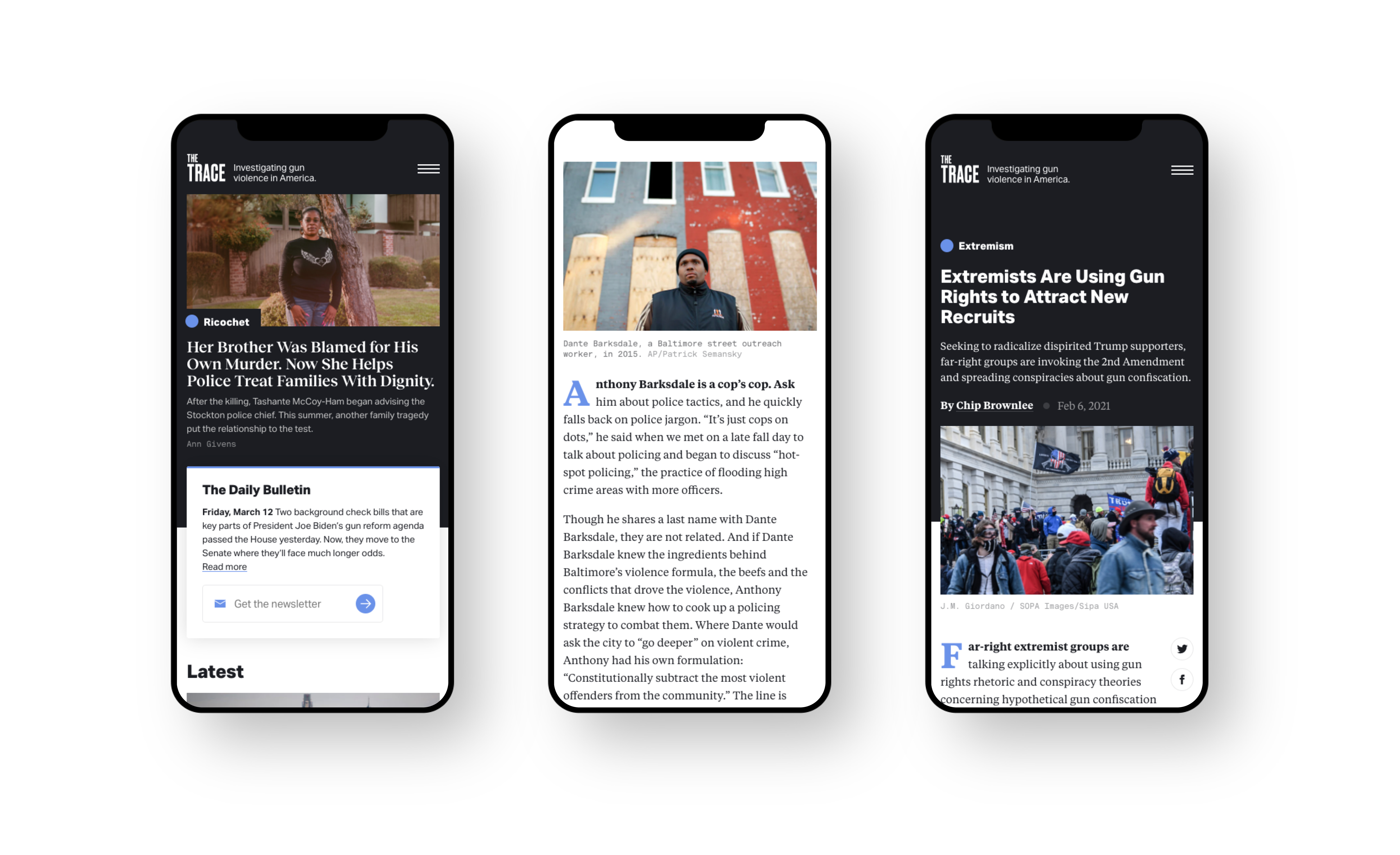
In designing for tough topics, the stakes are high. A design that strikes the wrong tone would actively detract from the impact of the journalism. Like great reporting, great content design needs to get out of the way. If a design overpowers or distracts from the substance of a news platform, priorities are backwards.
The power of the design lies in restraint that benefits the reader, optimizes for ease, and helps create relevant connections. And you can’t get there without reading the story first.
Design for Engagement
For a nonprofit news organization to succeed, it needs a business model. Even those sponsored by foundations or philanthropists must diversify their revenue by creating a broader ecosystem for its readers. Beyond their website, these publications deliver through podcasts, email, video, social, news apps, publication partners, events, live streams, and media yet to come. The design system must consider expressions across all of these platforms and be able to grow with the channels themselves.
To sustain this approach, publications need to design engagement funnels and reach potential members who value the content enough to pay for it. Once anathema, editors are becoming comfortable thinking in these terms, creating editorial and business opportunities to deliver valuable content.
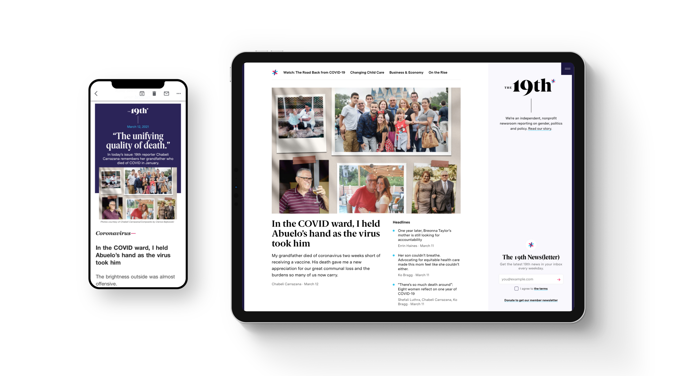
We’ve learned that tools to promote engagement can’t be an afterthought; they’re elements that need to be deeply woven into the product. You can see this on a site like The 19th. Since they launched last year, they’ve made a huge splash reporting at the intersection of gender, politics, and policy.
In designing a platform for an entirely new publication, it was important to carve out dedicated space for them to explain who they are, encouraging and inspiring readers to join their community. If this need had to constantly compete with reporting or paid advertising for space, it would lose.
We designed a persistent sidebar that, in addition to holding their logo and tagline, can be used to promote membership, newsletters, donations, or events. No matter what page readers arrive on or how far they scroll, this important context and engagement opportunity is always present.
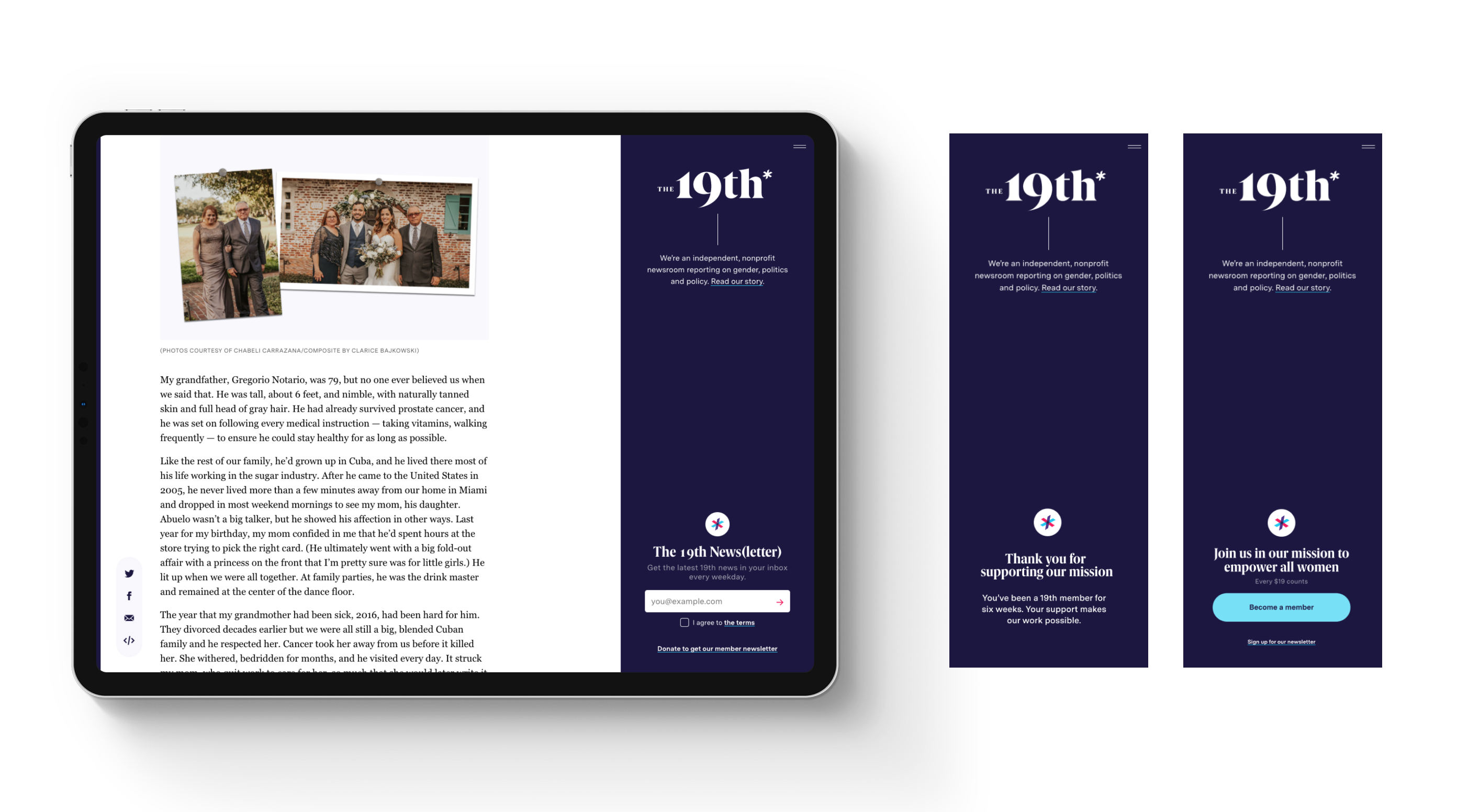
Placing it on the right-hand side isn’t just unconventional (most websites would place this on the left), it’s also far less distracting as the eye naturally starts on the left to read the editorial content. Since it’s a fixed piece of site furniture, marketing or development departments don’t have to negotiate for takeovers, modals or other obtrusive user experiences. This creates a permanent brand-building space that naturally promotes their larger mission.
Design for Durability
Big companies have the scale to take on just about any tech stack. Publications like The Washington Post and New York Times have design/tech departments numbering in the hundreds. The nonprofit newsrooms we work with usually have a sliver of this staff (and often they do double-duty as graphics or data reporters too).
The tech stacks these publications need aren’t one-size-fits-all — they’re key considerations to ensure long-term stability and can even reinforce the mission of the publication itself.
When The Markup launched in early 2019, they promised to take on big tech and questionable practices in privacy, security and ethics. How could they do this without participating in the same set of practices and tools they were working to challenge?
We created a headless architecture that allows for maximum flexibility and empowerment of their technical team. To start, the site eschews the trackers and other counter-privacy elements overloading most webpages. In addition to protecting readers’ privacy, it makes the site Super. Duper. Fast. It’s in the top ten of news website article performance, zooming ahead of established competition (The NYT) or younger startups (Quartz, Axios).
This perfectly expresses another key rule: in designing a tech stack, design it as simply as possible. Too often technology roadmaps prioritize anticipating future needs or jumping on the hot new thing. We call this “buying too much house.” Every feature or technology chunk creates an invisible cost in performance, risk and maintenance obligations. Every minute (or dollar) spent chasing down a bug is a minute not reporting. It starts simple, but these components quickly multiply as systems expand over years.
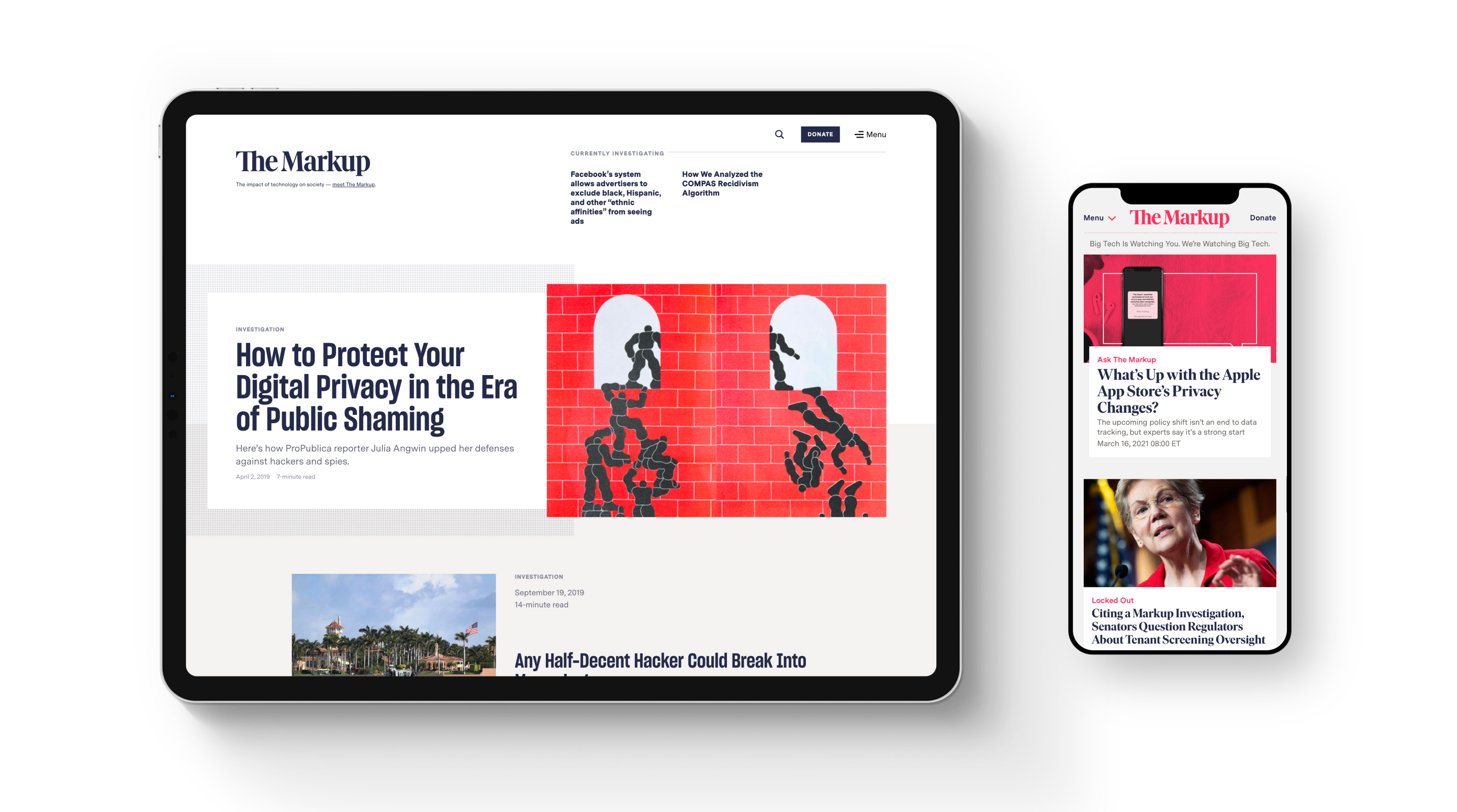
The headless architecture means The Markup isn’t fully reliant on any one technical component. They can evolve their stack over time without creating the feared “redesign cliff” where the slate has to be wiped clean. This flexibility creates more space for individual pieces of content to live in isolated zones. This has helped them created rich article experiences, data-rich stories and pieces that blur the line between content and product.
All of these examples and guidelines around durability and engagement are reliant on one key thing: content. I don’t know a single human who chooses a publication based on its design. Yes, it might attract attention, but it’s not enough to keep readers coming back. While design, business, and technical considerations can help, content is the true heart of any great editorial product. Without it, none of these rules will work.